Finding the perfect typeface for your design can be a daunting task. With so many font options, it’s easy to get overwhelmed and spend hours searching endless galleries.
But fear not! Here, we will dive into font galleries and show you how to choose the perfect typeface for your design needs. From understanding font categories to selecting the right font for branding, print material, and digital media, we’ve got you covered.
We’ll also share some dos and don’ts of font pairing, tips for creating a consistent font system, and common mistakes to avoid. So get ready to explore the world of fonts and find the one to make your design stand out.
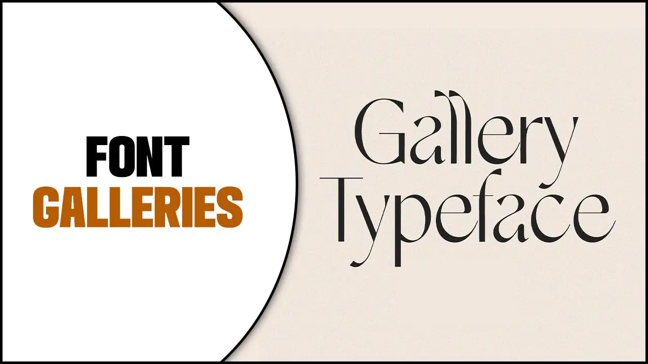
How To Choose The Perfect Font Galleries For Design
Choosing the ideal font for design is crucial in capturing the essence of your message. Dive into font galleries, explore various typefaces, and discover the perfect font that embodies your vision. Consider the purpose and tone of your design, ensuring that the font harmonizes with your intended message.
Prioritize readability and legibility, especially when it comes to body text. Experiment with combining various fonts to create captivating visual effects and establish a clear visual hierarchy. Remember to take note of licensing restrictions and usage rights when selecting a font from a gallery.
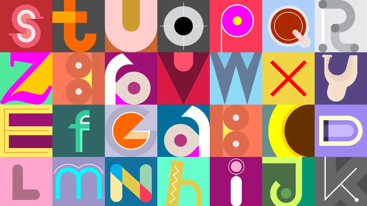
Understanding Font Categories
Font galleries are a treasure trove for designers and typographers alike. These online platforms showcase various fonts, each with its unique style and personality. Understanding font categories can be helpful when navigating these galleries and finding the perfect typeface for a project. Some common font categories include serif, sans-serif, script, display, and monospaced.
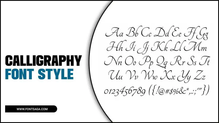
Serif fonts are known for their decorative strokes at the ends of letters, while sans-serif fonts have a clean and modern look. Script fonts mimic handwriting with flowing and cursive styles, while display fonts are attention-grabbing and often used for headlines or logos. Monospaced fonts have equal spacing between characters, making them ideal for coding or technical documents.
Choosing A Font For Branding
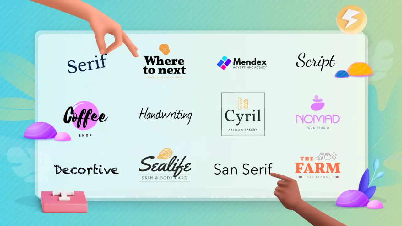
When it comes to effective branding, the font you choose plays an instrumental role in capturing your audience’s attention. Enhance your brand’s impact and captivate your audience with these font selection tips: Infuse Your Brand’s Personality and Values: Align your font with your overall brand image for a cohesive visual identity.
The right font should reinforce your brand’s personality, whether it’s a modern, edgy vibe or a traditional, elegant aesthetic. Prioritize Legibility and Readability: Don’t let fancy fonts compromise the clarity of your message. Opt for legible styles that ensure readability even in smaller sizes. Steer clear of overly intricate or elaborate fonts that can hinder message consumption.
Choosing A Font For Print Material
Choosing the perfect font for your print material is crucial in creating a visually appealing and effective design. Consider the legibility and readability of the font, ensuring that it can be easily read, especially in smaller sizes. Complement the overall design aesthetic by choosing a font that aligns with the visual style of your print material. Experiment with different font pairings to create visual interest and hierarchy in your design.
Consider the print material’s specific requirements, such as readability in different lighting conditions or printing techniques. By carefully considering these factors, you can create print material that effectively communicates your message and captivates your audience.
Choosing A Font For Digital Media
When choosing a font for digital media, key factors include purpose, tone, legibility, and style. Align your font choice with the desired vibe of your design, ensuring readability for all text lengths. Complement the overall aesthetic with a font that enhances the visual appeal.
Consider the browsing experience of your digital audience and choose a font that is easily readable on screens of various sizes. Avoid fonts that are too thin or have intricate details, as they may not display well on low-resolution screens. Pay attention to the character spacing and line height to ensure optimal legibility. Experiment with different font weights and styles to create visual interest and hierarchy in your design. Test your chosen font on different devices and platforms to ensure consistency across all digital media.
Conclusion
Choosing the perfect typeface for your design projects can greatly enhance your work’s overall impact and effectiveness. Font galleries are a valuable resource providing various options for different design needs. Understanding font categories and considering factors such as branding, print material, and digital media can help you make informed decisions.
Additionally, following the dos and don’ts of font pairing, creating a consistent font system, and avoiding common font mistakes will ensure your designs are visually appealing and cohesive. So dive into font galleries today and find the perfect typeface to elevate your designs.
Frequently Asked Questions
1.What Fonts Are Used In Galleries?
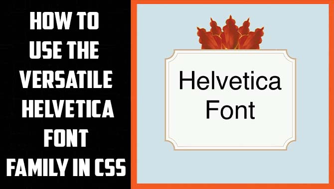
Ans: Font galleries offer diverse fonts, such as serif, sans-serif, script, and decorative styles. Popular choices include Helvetica, Times New Roman, Arial, and Calibri. Additionally, galleries often feature unique and artistic fonts tailored for branding purposes. Consider factors like readability, compatibility, and aesthetic appeal when selecting a font.
2.What Is The Best Font For Art Galleries?
Ans: The font choice for art galleries depends on the gallery’s aesthetic and brand. Sans-serif fonts like Helvetica or Gotham offer a modern look, while serif fonts like Times New Roman or Garamond add elegance. The font should be legible and complement the artwork without being too overpowering.
3.What Are The Top 5 Font Styles?
Ans: The top 5 font styles include classic and professional serif fonts like Times New Roman, clean and modern sans-serif fonts like Arial or Helvetica, handwritten-feel script fonts like Brush Script or Lobster, bold statement-making display fonts like Impact or Bebas Neue, and personality-adding decorative fonts like Comic Sans or Papyrus (use sparingly).
4.What Is The Nicest-Looking Font?
Ans: The perception of the “nicest looking” font is subjective and can vary among individuals. However, popular and visually appealing fonts like Helvetica, Garamond, Futura, and Baskerville are often admired. When selecting a font, consider its suitability for the context and purpose of use, such as formal documents or creative design projects. Experiment with different fonts while considering factors like legibility, style, and brand consistency to find the font that best suits your project’s aesthetic.
5.What Are The Benefits Of Visiting A Font Gallery?
Ans: Visiting a font gallery offers a multitude of benefits. It provides an extensive selection of fonts, allows you to visualize how different typefaces appear in various contexts, and offers previews and sample texts for evaluating readability and aesthetics. Font galleries also inspire creativity and introduce you to new, unique typefaces for your design projects.


Leave a Comment