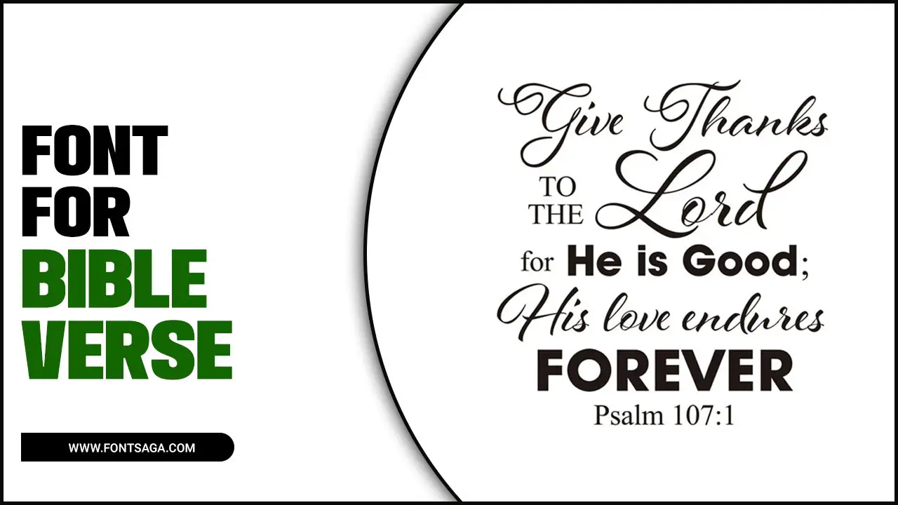
Several factors must be considered when choosing the right font for Bible verses. The font you choose can greatly impact the readability and overall aesthetic of the verses.
It is important to select a font that is clear and easy to read, especially considering the small print often found in Bibles. Fonts with clean lines and a balanced design are generally preferred, as they enhance legibility and make it easier for readers to focus on the words.
We will cover the basics of choosing a font, provide tips on selecting the right typeface, and discuss important factors to consider when creating your artwork. Get ready to elevate your creations and bring new life to the timeless words of scripture.
The Basics Of Choosing A Font For Bible Verse Art
When creating font for Bible verse art, choosing the right font is crucial in conveying the intended message and aesthetic. Here are some basic tips to consider when selecting a Bible verse art. Remember, choosing a Bible verse art involves balancing readability, suitability, legibility, consistency, and personal preference. By considering these factors, you can create visually appealing and impactful designs that enhance the beauty of scripture font.
- Readability: The primary purpose of the font is to make the text easily readable. Opt for clear, distinct letterforms and avoid overly decorative or script fonts that may be difficult to decipher.
- Suitability: Consider the overall theme and tone of the Bible verse art. Choose a font that complements the message and evokes the desired feeling, whether traditional, modern, elegant, or whimsical.
- Legibility: Pay attention to letter spacing (kerning) and line spacing (leading) to ensure the text is legible and doesn’t appear crowded or cramped.
- Consistency: If you plan to use multiple Bible verses in your artwork, strive for consistency in font choices. This creates a cohesive look and prevents distractions from differing fonts.
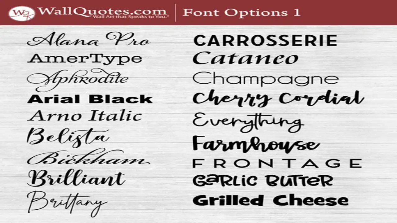
- Experiment: Don’t be afraid to experiment with different fonts until you find one that resonates with your highlighted verses. Test various styles and sizes to see what works best for your design.
Tips For Selecting The Perfect Typeface
When selecting the perfect typeface for Bible verses, there are a few key tips to remember. First and foremost, readability is of utmost importance. The typeface should be clear and legible, making it easy for readers to engage with the text.
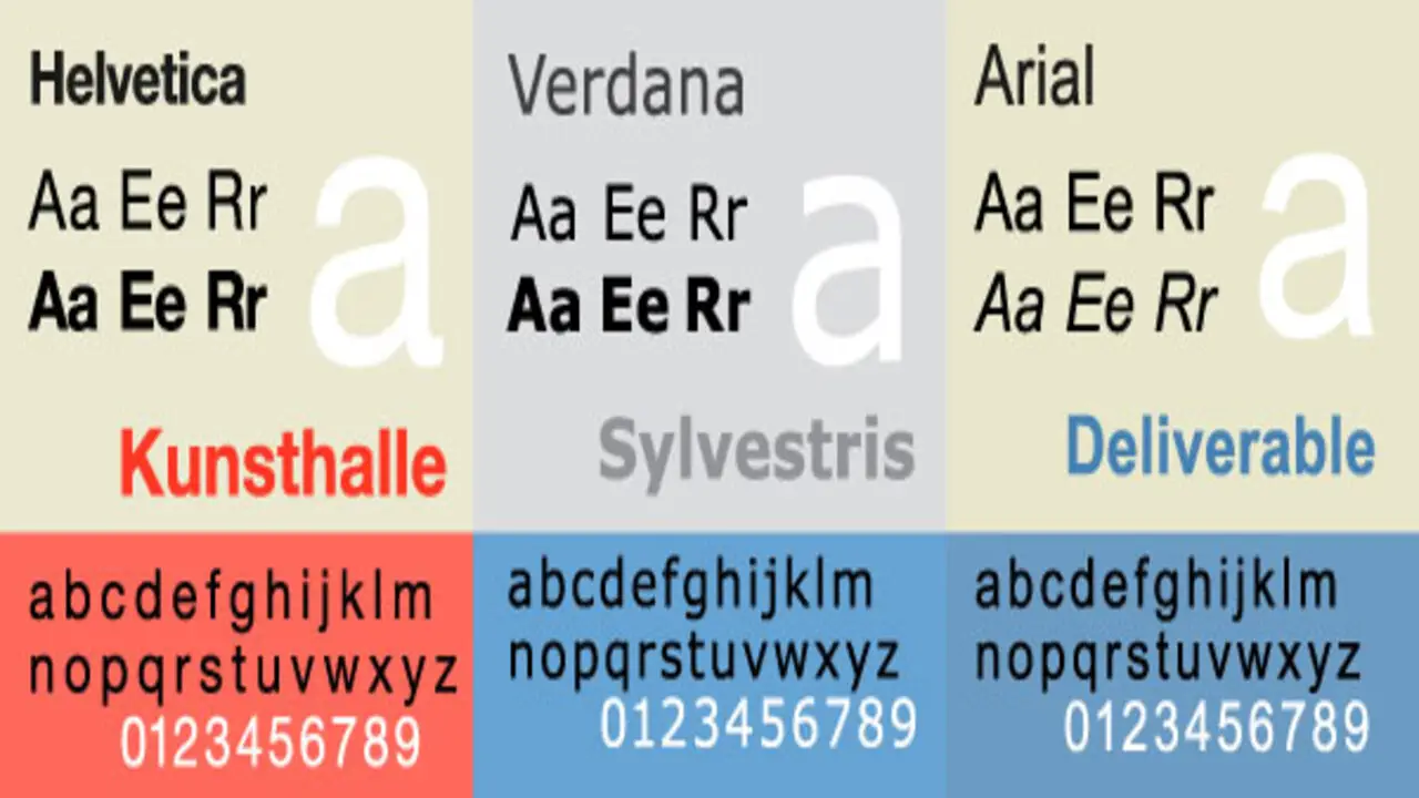
Additionally, consider the tone and aesthetic you want to convey. A classic serif font may be appropriate for a more traditional feel, while a clean and modern sans-serif font may be better suited for a contemporary design. Lastly, consider the medium in which the Bible verses will be presented. Different fonts may work better in print versus digital formats. Ultimately, finding the right typeface is about balancing readability and visual appeal, ensuring that the beauty of the words shines through.
Factors To Consider When Choosing A Font-For Bible Verse Art
When choosing a Bible verse art, there are several factors to consider. First and foremost, the font should be legible and easy to read. Since Bible verses often contain important messages, it is important that the text is clear and easily understood. Additionally, the font should align with the overall style and theme of the artwork. A serif font may be more appropriate if you are creating a more traditional or classic piece.
On the other hand, a clean and simple sans-serif font may be a better choice if you are going for a modern or minimalist look. Finally, consider the size of the text and how it will fit within the overall design. It should be large enough to be easily read but not so large that it overwhelms the rest of the artwork. Considering these factors, you can choose a font that enhances your Bible verse art and effectively communicates its message.
How To Use A Font-For Bible Verse Art?
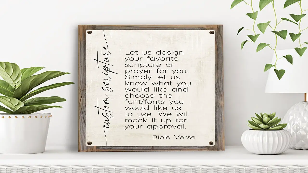
Using Bible verse art can add a beautiful and meaningful touch to your designs. Here are some steps to help you use Bible verse art. Remember to respect copyright laws when using fonts for commercial purposes and give proper attribution if required by the font designer or license agreement. With these steps, you can create stunning Bible verse art using fonts that convey beauty and meaning.
- Choose a suitable font: Select one that complements the style and tone of the verse you want to highlight. Consider factors such as readability, elegance, and appropriateness for the message.
- Install the font: Once you have chosen a font, ensure it is installed on your computer or design software. You can usually install fonts by downloading them from reputable websites and following the installation instructions provided.
- Create your design: Open your preferred design software or program and start creating your Bible verse art. Use the font you have installed to type out the verse, experimenting with different sizes, colors, and styles to achieve the desired look.
- Enhance the design: Add additional elements such as illustrations, borders, or backgrounds to enhance the overall aesthetic of your Bible verse art. Be mindful of not overpowering the verse and ensuring it remains the focal point.
- Print or share your artwork: Once satisfied with your design, save it in a suitable file format for printing or sharing online. Consider using high-quality paper or materials if you plan to print it for display purposes.
Conclusion
When creating font for Bible verse art, you can choose from a wide range of fonts. Whether you opt for classic and timeless fonts like Times New Roman or decorative script fonts like Scriptina, the key is to prioritize readability while enhancing aesthetic appeal. Choosing the perfect typeface for your Bible verse art is crucial in conveying the message and capturing the essence of the scripture.
Whether you want to evoke a sense of elegance, simplicity, or reverence, the right font can make all the difference. Consider factors such as readability, style, and appropriateness for the content. Experiment with different fonts to find the one that resonates with you and enhances the visual impact of your artwork.
Frequently Asked Questions
1.What Is The Best Font-For Bible Verse?
Ans: The best Bible verses vary based on personal preference and design context. Popular options include Times New Roman, Helvetica, and Garamond. It’s essential to select a legible and elegant font that is easy to read, even in smaller sizes.
2.How Can I Change The Font Of A Bible Verse?
Ans: To change the font of a Bible verse, utilize design software or a Bible verse art generator. Choose a font that aligns with the verse’s meaning and style. Opt for serif fonts for traditional looks or script fonts for artistic feels. Experiment with various fonts and sizes to enhance visual appeal.
3.Can You Use Any Other Type Of Font Besides Arial, Helvetica, And Times New Roman For Bible Verse?
Ans: Yes, you can use fonts other than Arial, Helvetica, and Times New Roman for bible verse art. Explore elegant script fonts like Calligraphy or Copperplate for a decorative touch. Sans-serif fonts such as Futura or Century Gothic can provide a modern and clean aesthetic. Choose a font that complements your artwork’s style and theme while maintaining readability.
4.What Are Some Good Fonts That You Recommend For Bible Verses?
Ans: Consider using classic and timeless fonts like Times New Roman, Garamond, or Baskerville for Bible verses. Decorative fonts such as Scriptina, Edwardian Script, or Great Vibes can add flair to verse art. Try sans-serif fonts like Arial or Helvetica for a modern and clean look. Experiment with different fonts to find the perfect match for the tone and style of your chosen verse.
5.How Can I Ensure The Chosen Font Is Readable And Aesthetically Pleasing In My Bible Verse Art?
Ans: When selecting a font for your Bible verse art, prioritize legibility by choosing a font that is clear and easy to read, especially in smaller sizes. Avoid overly decorative or stylized fonts that may hinder readability. Additionally, consider your art’s overall theme and mood, selecting a font that complements it. Experiment with different fonts and sizes to ensure they appear well on your chosen medium.

David Egee, the visionary Founder of FontSaga, is renowned for his font expertise and mentorship in online communities. With over 12 years of formal font review experience and study of 400+ fonts, David blends reviews with educational content and scripting skills. Armed with a Bachelor’s Degree in Graphic Design and a Master’s in Typography and Type Design from California State University, David’s journey from freelance lettering artist to font Specialist and then the FontSaga’s inception reflects his commitment to typography excellence.
In the context of font reviews, David specializes in creative typography for logo design and lettering. He aims to provide a diverse range of content and resources to cater to a broad audience. His passion for typography shines through in every aspect of FontSaga, inspiring creativity and fostering a deeper appreciation for the art of lettering and calligraphy.
