If a font is hard to read or understand, overly decorative or gimmicky, visually unappealing due to poor spacing or uneven letterforms, and doesn’t align with the intended message or brand identity, consider it bad.
The choice of font can make or break any piece of content’s overall design and readability. We will delve into what makes a font bad and discuss the seven worst fonts that you definitely want to avoid using in your designs. So let’s dive in and learn how to create visually appealing designs with fonts that impact positively.
The 7 Worst Fonts You Will Definitely Want To Avoid
There are some that you definitely want to avoid when it comes to fonts. Fonts play a crucial role in the overall presentation of your content, be it a blog, email, or marketing material. Choosing the right font is essential for maintaining legibility and effectively conveying your message.
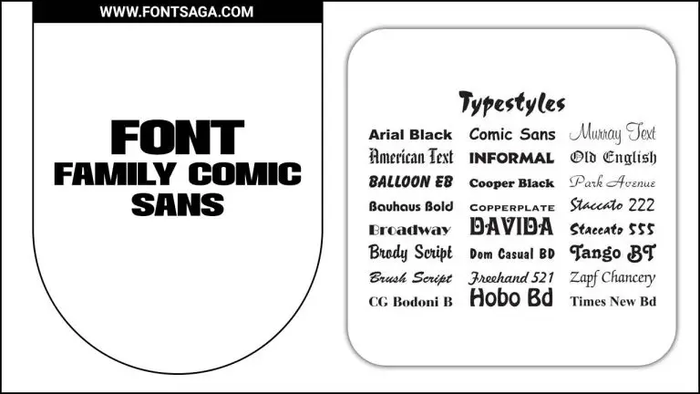
From the infamous Comic Sans and Papyrus to the difficult-to-read Curlz MT and the visually overwhelming Jokerman, these fonts have gained a bad reputation for a good reason. Additionally, Brush Script and Impact, despite their popularity in the past, are fonts you might want to reconsider due to their outdated designs and poor readability.
By avoiding these fonts and making a conscious choice in your typography, you can ensure that your content stands out for all the right reasons. Here are some:
1. Papyrus
Papyrus, infamous for its association with amateurish designs, is considered one of the worst fonts. Its overuse and outdated reputation have made it cliché and unprofessional. The irregular letterforms and excessive curves only exacerbate its lack of legibility, especially in lengthy text passages.
After using it for the movie poster of “Avatar,” it further plunged its reputation by triggering widespread ridicule and disapproval. Professional designers and typographers advise against using Papyrus in favor of more contemporary, easily readable fonts for a polished and modern aesthetic.
2. Brush Script
Although Brush Script may have charm, people often consider it an outdated and overused cursive font. Its intricate strokes and exaggerated flourishes can make it challenging to decipher, especially in smaller sizes or when used for lengthy passages.
Unfortunately, this font has often become associated with unprofessional or amateurish designs, giving it a less-than-desirable reputation. To avoid compromising the impact of your message or the professionalism of your design, it is advisable to explore the wide range of modern and legible fonts at your disposal.
3. Souvenir
Souvenir, a font widely disliked for its outdated and cheesy appearance, gained popularity during the 1970s. Kitschy designs characterize it, with exaggerated curves and serifs that hinder legibility. Consequently, using souvenirs in formal documents or professional settings can undermine a professional aesthetic, so it is ill-advised.
Instead, consider opting for more modern and visually appealing fonts that effectively convey your intended message. By avoiding Souvenirs, you can ensure your designs maintain a contemporary and professional appeal.
4. Tekton Pro
People frequently criticize Tekton Pro for its lack of professionalism and excessive usage in casual contexts. This font has a natural handwritten appearance that can pose readability challenges, especially when used in smaller sizes. Designers widely regard Tekton Pro as outdated and clichéd, as it gained popularity in the 90s and early 2000s.
Its decorative elements and uneven letterforms make it unsuitable for formal documents or professional settings. Exploring more contemporary and versatile font options that align with your design requirements is advisable to effectively convey your message.
5. Hobo
People widely dislike Hobo for its informal and unprofessional appearance. Designers consider it outdated and overused, making it less visually appealing for design purposes. Hobo’s irregular and uneven letterforms can make it difficult to read, especially in longer texts.
Its lack of sophistication and elegance makes it unsuitable for formal documents or professional designs. Fortunately, many other fonts offer better legibility and aesthetics for a wide range of design purposes. From fonts that are more legible and visually appealing to those that convey a sense of professionalism, there is a font out there to suit every need.
6. Giddyup
Giddyup, a font known for its whimsical and playful design, may not be the best choice for professional or formal documents. With irregular letter spacing and inconsistent stroke weights, it can pose readability challenges in longer texts.
Although it can be effective for creative or casual projects, it lacks the sophistication required for business presentations or official documents. Moreover, its quirky design may hinder legibility, particularly at smaller sizes or from a distance.
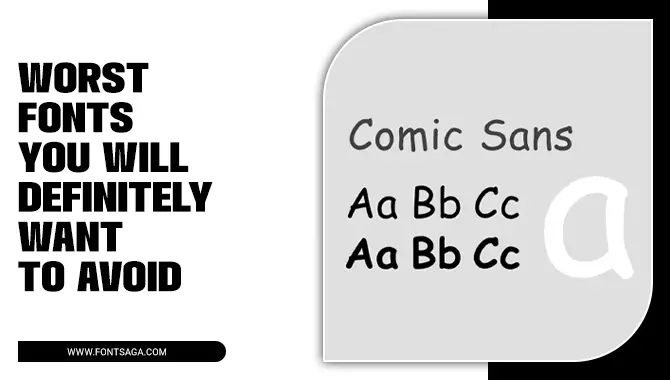
7. Comic Sans
Comic Sans, the font with a notorious reputation, is often bashed for its informal and unprofessional appearance. It is widely considered overused and cliché, giving off an amateurish vibe and suggesting a lack of attention to detail.
Professional designers and typographers strongly advise against using Comic Sans in formal or corporate settings, as its rounded and playful look may not align with the desired tone or message.
Tips For Avoiding Poor Font Choices
To make sure you’re making the right font choices, it’s important to follow a few guidelines. Keep in mind that simplicity is key. Choose fonts that are easy to read and steer clear of overly ornamental or gimmicky options. Consider the context and purpose of your text to ensure the font style and tone align with your design goals.
Don’t overlook the importance of font size and spacing, as these factors contribute to legibility. By following these tips, you can avoid the pitfalls of poor font choices and create visually appealing and reader-friendly content.
Conclusion
To sum up, choosing the right font can significantly impact your content’s overall design and readability. Avoiding poor font choices is essential to maintain a professional and visually appealing appearance.
Consider legibility, readability, and appropriateness for your intended audience and purpose. You can ensure your content looks polished and well-designed by following these tips and avoiding the worst fonts like Papyrus, Brush Script, Souvenir, Tekton Pro, Hobo, Giddyup, and Comic Sans.
Frequently Asked Questions
What Are The Most Annoying Fonts?
Comic Sans is widely regarded as one of the most annoying fonts, while Papyrus and Curlz MT are disliked for their overuse and lack of readability. Although popular in memes, Impact can be challenging to read in long passages.
What Is One Of The Fonts To Avoid?
Comic Sans is a font to avoid due to its reputation for being unprofessional and overused. It’s recommended to select more professional and legible fonts like Arial, Helvetica, or Times New Roman for your design or writing projects.
What Is The Messiest Font?
Comic Sans is regarded as one of the messiest and least professional fonts. Other messy fonts to avoid include Papyrus, Curlz MT, and Brush Script. These fonts can make text hard to read and detract from design impact. Opt for clean, legible options like Arial, Helvetica, or Times New Roman for a more professional appearance.
What Is The Most Illegible Font?
Comic Sans is widely regarded as one of the most illegible fonts. Fonts like Papyrus, Curlz MT, and Jokerman are also difficult to read. Fonts with excessively decorative or intricate designs can pose challenges as well. When selecting a font, it’s important to prioritize legibility and readability based on your target audience.
Which Is Your Least Favorite Font?
Some commonly disliked fonts are Papyrus (overused and associated with cheap design), Comic Sans (informal and unprofessional), Curlz MT (difficult to read in large blocks of text), and Impact (can seem aggressive or amateurish in certain contexts).

Leave a Comment