Typography is integral to the design; the right font can make or break a project. The Salesforce Sans font family is a versatile font that recently gained popularity. It is a collection of typefaces created specifically for Salesforce design by designers at Salesforce. The Sans family includes font weights such as Light, Regular, Medium, and Bold to allow users to use them for various projects.
Here, we will explore the versatility of the Salesforce-Sans font family and its features. We will also discuss downloading and installing it and share some tips for optimizing it. We will provide some design inspiration with Salesforce Sans load fonts and analyze their popularity.
About Salesforce Sans Font Family
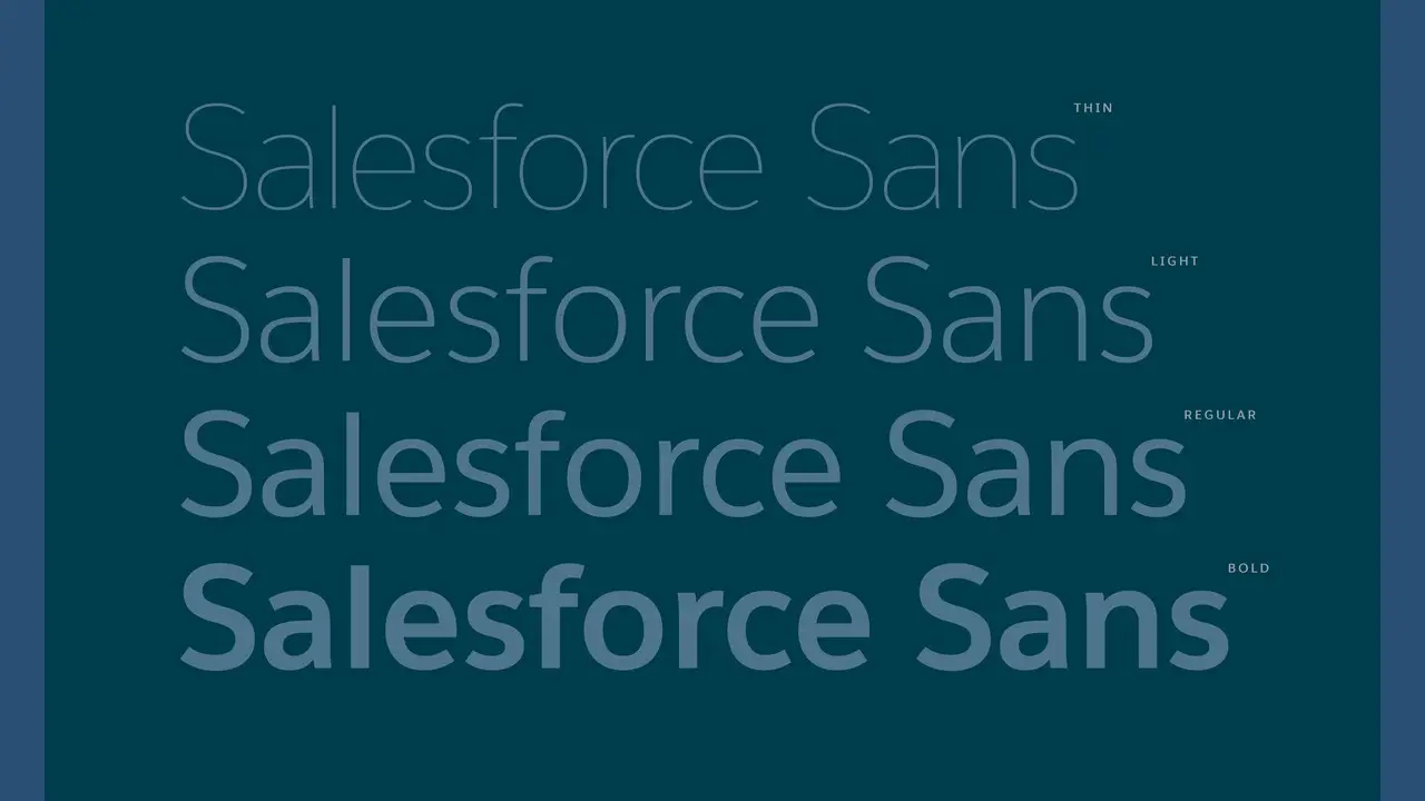
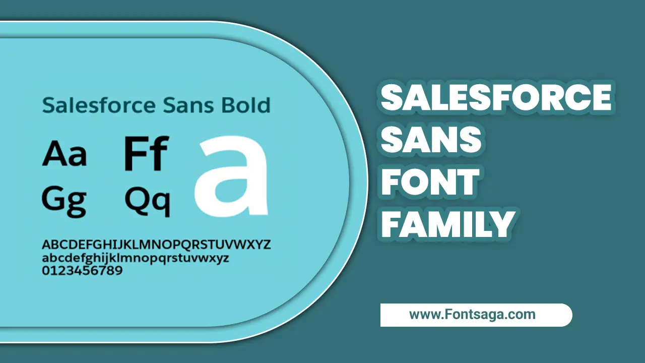
Salesforce Sans is a versatile font family with various inline Bold styles such as Thin, Regular, Light, Bold, and Italic. Its sleek design makes it stand out from other fonts. Monotype Imaging Inc. owns them.
Salesforce Sans is a trademark of Salesforce that consists of 454 characters, including Basic Latin, Latin-1 Supplement, Latin Extended-A, and more. SVIP members can download it, which is available for preview before downloading. This font family reflects the modernity and agility of Salesforce and is used in various contexts, such as presentations, websites, and branding materials.
What Are The Features Of The Salesforce Sans Font Family?
Salesforce Sans font family is a versatile font designed by Monotype. It includes Thin, Regular, Light, Bold, and Thin Italic styles. With a total of 454 characters, the font comes in italic and regular versions. It is identifiable by its clean and modern look. The family includes Basic Latin, Greek, and Coptic Currency Symbols, making it perfect for many applications.
Whether ads, business presentations, or websites, Salesforce sans font can easily convey your message professionally. The font is designed to be legible and easy to understand, making it ideal for use in both print and digital media.
Salesforce Sans Fonts
The Salesforce Sans font family is highly versatile and offers a range of styles, including Regular, Italic, and Bold fonts. It includes character sets such as Basic Latin, Latin Extended, Greek, and more, making it suitable for various language scripts.
Salesforce owns Salesforce Sans, and Monotype Imaging Inc. owns the font software. The font styles offered include Thin, Light, Bold, and Italic, providing a great range of options for the user. This font family is not always readily available since it is not a part of standard fonts installed on most systems. However, excellent download options are available through Salesforce’s SVIP Membership.
Download The Salesforce Sans Font Package

The Salesforce-Sans font family is versatile and has several styles: Regular, Light, Italic, Bold, and Thin. The Regular style is free downloadable and includes 454 characters, including Basic Latin and Latin Extended characters.
Salesforce Sans is a trademark of Salesforce, and its font software is the property of Monotype Imaging Inc. For those interested in downloading the font package, it can be found on various websites that offer free or paid downloads. You can use the Salesforce Sans font family in various settings because of its sleek and modern design.
Benefits Of Using Salesforce Sans Font
Using Salesforce Sans Font can offer several benefits for your brand and design projects. By incorporating Salesforce Sans Font into your design projects, you can enhance the overall visual appeal of your brand while ensuring readability and accessibility for your audience. Here are some key advantages of using Salesforce Sans Font:
- Consistency: Salesforce Sans Font is a versatile font family that includes different weights and styles, allowing you to maintain consistency across various design elements such as headings, body text, and buttons.
- Readability: The clean and well-designed characters of Salesforce Sans Font make it highly legible, ensuring that your content is easy to read and understand by users.
- Branding: By using Salesforce Sans Font in your designs, you can reinforce your brand identity and create a cohesive visual experience for your audience.
- Accessibility: Salesforce Sans Font has been optimized for digital platforms, making it accessible for users with visual impairments or reading difficulties.
- Modern Aesthetic: With its contemporary and sleek design, Salesforce Sans Font adds a touch of modernity to your designs, giving them a fresh and professional look.
How To Install Salesforce Sans Font

To install the Salesforce Sans Font. Remember to restart any open applications before installing the font to ensure that they recognize and display the Salesforce Sans Font correctly. With its clean and modern design, this font family can enhance the visual appeal of your documents and presentations, giving them a professional and polished look. Follow these simple steps:
- Download the Salesforce Sans Font or a trusted font provider from the official Salesforce website.
2. Locate the downloaded font file on your computer and unzip it if necessary.
3. Right-click on the font File type and select “Install” from the drop-down menu. This will install the font onto your computer’s operating system.
4. Once installed, you can use the Salesforce Sans Font in various applications such as Microsoft Word and PowerPoint or design software like Adobe Photoshop or Illustrator.
Design Inspiration With Salesforce Sans Font

The Salesforce Sans font family offers a variety of font styles that designers can use for inspiration. With its wide character distribution range, including Basic Latin, Latin-1 Supplement, Latin Extended-A, and B, Salesforce Sans provides a versatile set of fonts that can be used in various design contexts.
Salesforce owns the font and allows its use under a license agreement. This ensures it remains an exclusive part of the Salesforce brand and its products. The Salesforce-Sans font family includes a range of font styles, such as Regular, Light, Italic, Bold, and more.
The latest version, Salesforce Sans Version 1.01, contains 454 characters, making it a valuable resource for type designers looking to add a touch of professionalism to their work.
Analyzing The Popularity Of Salesforce Sans Fonts
The Salesforce-Sans font family is a versatile collection of fonts with regular and Italic versions. Designed by the Salesforce design team, the font includes characters from Basic Latin, Latin-1 Supplement, Greek, and Coptic, among others.
One reason for the popularity of Salesforce Sans is its association with the well-known Salesforce brand. Salesforce users have made it a popular font across digital and print media. Interestingly, they renamed the font from UI Text to Salesforce Sans to better reflect its association with the brand. Despite the name change, the font’s popularity continues to grow as more and more designers and developers discover its versatility and ease of use.
How To Use The Salesforce Sans Font Family In Your Project?
You can use the versatile Salesforce-Sans font family in various projects. It contains different styles such as thin, regular, light italic, light italic, bold italic, and thin italic, giving designers several options.
Furthermore, the font family supports basic Latin, Latin-1 Supplement, Latin Extended-A, Latin Extended-B, and other characters. Salesforce, the company that owns the trademark, offers Salesforce Sans as a free download under a license agreement. Before using this font in your design project, you must comply with the license agreement terms.
Salesforce Sans is suitable for various projects such as web design, mobile apps, and print materials. You can use it in headings, body copy, or display font. Its versatility, extensive characters, and styles give designers many options for a polished design.
Conclusion
Salesforce Sans is a versatile font family that fits well in various design and branding contexts, such as business cards, packaging design, homepage headers, etc. Despite its sophistication, it is easy to read, making it a must-have font family for corporate communication.
Its minimalist look and feel can help complete a sleek, modern look effortlessly. To unleash the full potential, download the Salesforce Sans font package today and see how it transforms your designs. Optimizing it with the right spacing, contrast, and color makes it more legible and appealing. What are you waiting for? Start designing with Salesforce Sans and impress your clients or audience.
Frequently Asked Questions
What Font Is Similar To Salesforce Sans?
A font similar to Salesforce Sans is “Proxima Nova.” It shares similar characteristics regarding clean lines, modern look, and versatility, making it a suitable alternative for Salesforce Sans.
What Fonts Does Salesforce Use?
Its user interface and marketing materials primarily use the Salesforce Sans font. This font was designed for Salesforce to ensure consistency and readability across their platform.
How Do You Make The Font Bigger In Salesforce?
To make the font bigger in Salesforce, go to the Setup menu and select the User Interface section. You can adjust the font size by changing the “Display Density” setting.
Can You Change The Salesforce Font?
You cannot change the font in Salesforce as it is a web-based platform that utilizes a standardized font across all its applications and interfaces.
Can You Add Fonts To Salesforce?
Using the Salesforce lightning component Design System (SLDS) and CSS file, you can add custom fonts to Salesforce. This allows you to customize the appearance of your Salesforce org by adding and using your fonts.

David Egee, the visionary Founder of FontSaga, is renowned for his font expertise and mentorship in online communities. With over 12 years of formal font review experience and study of 400+ fonts, David blends reviews with educational content and scripting skills. Armed with a Bachelor’s Degree in Graphic Design and a Master’s in Typography and Type Design from California State University, David’s journey from freelance lettering artist to font Specialist and then the FontSaga’s inception reflects his commitment to typography excellence.
In the context of font reviews, David specializes in creative typography for logo design and lettering. He aims to provide a diverse range of content and resources to cater to a broad audience. His passion for typography shines through in every aspect of FontSaga, inspiring creativity and fostering a deeper appreciation for the art of lettering and calligraphy.
