In today’s increasingly digital world, the importance of print may often be overlooked. However, the printed word remains a crucial medium for communication and information dissemination in many industries.
Whether it’s a newspaper, a book, or a business card, the font size used in print is crucial in ensuring readability and effectively conveying a message. While it may seem simple, determining the smallest font size for print can be complex and nuanced.
Here, we will explore the intricacies of font size in print and provide insights into determining the smallest font size for different print materials. From the technical guidelines of font size to the impact of psychological factors, we will delve into the world of print to help you make informed decisions and achieve optimal results.
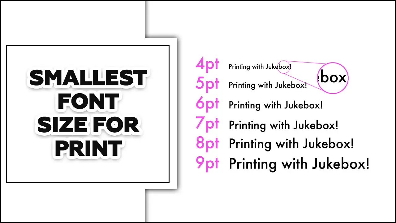
What Is The Smallest Text Size For Print?

There is no definitive answer to this question as it depends on several factors, such as the type of printer, the quality of the paper, and the specific font. However, as a general rule of thumb, the smallest font size that can be used for print is around 6pt.
This may seem incredibly small, but if you look at some fine print on legal documents or product packaging, you’ll see it’s quite common. Of course, ensuring the text is still legible when using such a small font size is important. Otherwise, there’s no point in using it!
One real-life example of where you might see a 6pt font size is on a medicine label. Often, important information must be included on these labels, so a small font size is necessary to fit everything in. However, the text is still clear and easy to read, even at such a small size. So, there you have it! The next time you see some tiny text in print, you’ll know that it’s not as unusual as you might think.
Minimum Font Size That Can Be Used For Print
The minimum font size you can use for print is around 8 points. This is because most printers have a resolution of 300 dpi (dots per inch). So, if you use a font size that is too small, the printer will not be able to print it correctly, and it will look fuzzy.
However, some printers have a higher resolution and can print smaller fonts. So, if you use one of these printers, you may get away with using a smaller font size. Here is an example of the minimum line thickness font size that you can use for print:
- If you print on a letter-size sheet of paper (8.5×11), the minimum recommendation font size you can use is 8 points.
- If you print on a legal sheet of paper (8.5×14), the minimum font size you can use is 10 points.
- If you print on a tabloid sheet of paper (11×17), the minimum font size you can use is 12 points.
As you can see, the minimum thickness font size you can use for print depends on the paper size you are printing on. So, if you are unsure of the size of the paper that you will be printing on, it is best to err on the side of using a larger font size.
Importance Of Choosing The Right Font Size For Print Materials
Choosing the right font size for print materials is of great importance. The font size for business cards directly impacts readability and the overall effectiveness of the communication. If the font size is too small, it can strain the reader’s eyes and make it difficult to comprehend the content.
On the other hand, if the font size is too large, it may appear unprofessional and may not fit within the layout of the material. Finding the balance is essential to ensure the text is clear, legible, and visually appealing to the target audience. The right font size enhances the overall user experience and effectively conveys the message.
Factors To Consider When Determining The Smallest Font Size For Print

Several factors must be considered when determining the smallest font size for print. One important factor is legibility. The font should be chosen to ensure the target audience can easily read and understand the text. Another factor to consider is the medium on which the print will be displayed. Different materials may have varying levels of detail and resolution, affecting the legibility of smaller font sizes.
Additionally, the purpose of the print should be taken into account. If the text contains important information or instructions, selecting a font size that allows for clear comprehension is crucial. Lastly, the design of the layout, including line spacing and margins, can also impact the readability of smaller fonts. When determining the smallest font size for print, one should carefully balance legibility, medium, purpose, and layout.
Legibility And Readability Of Small Fonts
The legibility and readability of small fonts can be a significant challenge. When you reduce the size of fonts, it becomes harder to distinguish individual characters, which can lead to potential difficulties in reading and understanding the text. It is crucial to consider font type, spacing, and contrast factors to ensure optimal legibility. Sans-serif fonts are often preferred for smaller sizes due to their clean and simple design.
Understanding Typographic Measurements And Units (Points, Pixels, Millimeters)
Typographic measurements and units play a crucial role in designing and formatting text. Points, pixels, and millimeters are commonly handy units in typography. Points are a traditional unit of measurement in print design, with 1 point equaling 1/72 of an inch. On the other hand, Pixels are handy in digital design and represent the smallest unit of a digital image or display.
Considerations For Different Types Of Print Materials (Books, Brochures, Posters)
When designing print materials such as books, brochures, and posters, it’s important to consider various factors to ensure effective communication with the target audience. The book layout should organize and mark chapters, headings, and page numbers to be easy to navigate. Font choice and size should be legible for comfortable reading. Brochures, however, require concise and persuasive content accompanied by visually appealing graphics.
Including key information and using attention-grabbing headlines to engage readers is essential. Posters should have a clear focal point and use bold colors and fonts to capture attention from a distance. Information should be concise and easily readable, conveying the main message at a glance. Considering these factors for each type of print material will ensure that the intended message is effectively communicated to the audience.
Tips For Using Small Fonts Effectively In Print Designs
Small fonts can be valuable in print designs, allowing for compact and visually appealing layouts. However, using small fonts effectively requires careful consideration. Firstly, choosing a font that remains legible even at a small size is crucial. Sans-serif fonts tend to work well in this regard.
Additionally, it is important to maintain sufficient contrast between the font color and the background to ensure readability. We also recommend avoiding overcrowding the design with too much text, as this can make small fonts even more challenging to read. Lastly, be mindful of the overall design aesthetic and ensure that the use of small fonts aligns with the print design’s intended message and visual appeal. Following these tips, you can effectively utilize small fonts to create visually appealing and legible print designs.
Common Mistakes To Avoid When Using Small Fonts In Print Materials
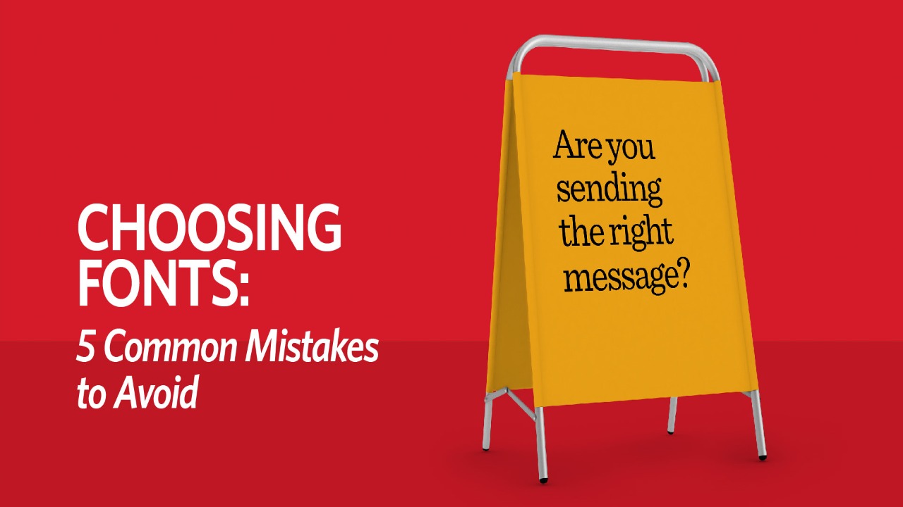
There are a few common mistakes that should be avoided. Firstly, ensuring that the font chosen is legible in a smaller size is important. Fonts with intricate details or thin stroke thickness may become difficult to read when scaled down. Secondly, you should carefully consider spacing between letters and words. Too much or too little spacing can affect readability and overall design.
Too many different fonts in one piece can create confusion and clutter. Sticking to a maximum of two or three fonts complementing each other well is best. Lastly, it is important to test the printed materials before finalizing them. Check for any blurry or distorted text, as this can occur when printing small fonts. By avoiding these common mistakes, you can ensure that your small font print materials are clear and visually appealing.
How Tiny Can A Font Be Before It Is Unreadable For Print?
There’s no definitive answer to how tiny a font can be before it is unreadable for print. It depends on various factors such as the typeface, the letterforms, the paper stock, and the printing process.
Some fonts are more readable at smaller sizes than others. For example, sans serif fonts like Arial or Helvetica tend to be more legible at smaller sizes than serif fonts like Times New Roman or Garamond.
- The letterforms also play a role in readability. Letters with high contrast (like black text on a White space background) are generally more legible than those with low contrast (like gray text on a white background).
- The paper stock can also affect readability. A thicker, higher-quality paper will show ink more clearly than a thinner, lower-quality paper.
- Finally, the printing process can impact readability. Offset printing generally produces sharper text than digital printing.
It depends on several factors. However, as a general rule of thumb, a font should be at least 10 points for body text and 12 points for headlines. Anything smaller than that may be difficult to read.
Conclusion
Determining the smallest font size for print is crucial for any print project. Choosing the right font size for print materials ensures readability and effectively conveys your message. It requires careful consideration of the font type, the paper quality, and the intended audience.
It is important to remember that the readability and legibility of the text should always be the top priority, as it directly affects the effectiveness of the message. By working closely with a professional designer and carefully selecting the appropriate font size, you can ensure that your print materials effectively convey your message to your target audience.
Frequently Asked Questions
What Is The Smallest Font Size That Can Be Used For Print Without Affecting Readability?
The smallest font size that can be used for print without affecting readability depends on various factors such as font type, paper quality, and reading distance. However, most legible fonts have a minimum size of 8-9 points for printed materials. Choosing a font size and type is recommended to ensure clear and comfortable reading for the target audience.
How Does The Type Of Paper And Ink Used Affect The Legibility Of Small Fonts?
The type of paper and ink used can greatly affect the legibility of small fonts. Thin or low-quality paper may cause text to bleed or appear fuzzy, while darker ink and high-quality paper can enhance clarity. It’s important to consider these factors when choosing printing materials to ensure optimal readability for your audience.
What Are Some Of The Factors That Impact The Legibility Of Small Fonts In Print?
Several factors can impact the legibility of small fonts in print, including font type, font size, line spacing, paper quality, ink colour and background colour. Other factors to consider include the lighting conditions and the visual acuity of the reader. Considering all of these factors, you can ensure optimal legibility for your printed materials.
Can Different Printing Techniques Affect The Smallest Readable Font Size?
Yes, different printing techniques can affect the smallest readable font size. For example, letterpress and engraving may require larger font sizes to produce clear text compared to digital printing techniques. It’s important to consider the printing method when selecting fonts and font sizes for optimal legibility.
Is It Necessary To Use A Larger Font Size For Headings And Subheadings When Using A Smaller Font Size For Body
Yes, using a larger font size for headings and subheadings is recommended when using a smaller font size for body text. This helps to create a visual hierarchy and makes the content easier to scan and navigate. Choosing a font that complements the body text and is easy to read in larger sizes is also important.


Leave a Comment