As digital marketers, we understand how important it is to create an effective call-to-action (CTA) for our website visitors. A CTA can drive conversions and sales, but it all begins with the right font for buttons.
The right font can maximize click-through rates and improve user experience. When selecting a font, we often default to using the same font for our website’s text. While this may seem logical, it’s not always the most effective. The font must be carefully considered to ensure it’s legible, eye-catching, and easy to read.
With so many font options, it can be overwhelming to determine which one to choose. We will explore the importance of selecting the right font and how to use it to increase click-through rates. We’ll also provide tips and tricks for choosing the perfect font for your website’s buttons.
How To Choose The Right Font For Buttons?
When choosing the right font for buttons, there are a few key factors to consider. First and foremost, readability is crucial. Your font should be clear and easily read, even in smaller sizes. Additionally, it’s important to consider your website or app’s overall style and aesthetic.
The font should align with your brand identity and complement the design of your buttons. Another factor to consider is the purpose of the buttons. A bold and eye-catching font may be more appropriate if they are meant to grab attention or convey urgency.
On the other hand, if the buttons are more subtle or minimalist in design, a clean and simple font may be a better choice. Ultimately, selecting the right font is all about finding a balance between readability, aesthetics, and functionality.
Examples Of Successful Button Designs With Fonts
Choosing the perfect font is crucial in maximizing click-through rates. Button successful designs pay close attention to font choice, considering factors like readability and legibility. Sans-serif fonts, such as those with a clean and modern appearance, are widely used for buttons as they convey professionalism.
It is equally important to opt for bold and easily readable fonts to ensure the text on buttons stands out. Notable examples of successful button designs include incorporating uppercase letters, which create emphasis, and using contrasting colors and appropriate font sizes. It is essential to consider the overall design aesthetic, including brand identity when selecting button fonts.
Best Practices For Pairing Fonts With Button Designs
When it comes to button designs, the pairing of fonts is key to creating an outstanding user experience. For optimal results, opting for sans-serif fonts that are clean and easy on the eyes is advisable. These modern fonts are a popular choice for buttons.
Emphasizing your buttons can be achieved using bold or heavy weights that captivate attention. Choosing the right font can make a big difference in your design’s overall look and effectiveness when it comes to designing buttons. Here are some best practices for pairing fonts with button designs:
- Keep it simple: Regarding buttons, readability is key. Choose a font that is clear and easy to read, especially at smaller sizes.
- Contrast is key: To make your buttons stand out, choose fonts that have good contrast with the background color of the button. This will help ensure that the text is easily visible and legible.
- Consider the tone: The font you choose should also align with the tone and style of your brand or website. For example, if your brand has a playful and fun vibe, you may want to choose a more whimsical or decorative font. On the other hand, if your brand is more professional and sleek, a clean and modern font may be more appropriate.
- Test different combinations: Don’t be afraid to experiment with different font pairings to find the perfect match for your button design. Sometimes, contrasting fonts can create an interesting visual effect, while other times, using similar fonts can create a cohesive and harmonious look.
By following these best practices, you can create buttons that are visually appealing, easy to read, and effectively convey their purpose to users.
Future Trends In Button Font Design
As technology advances, so does the design world, including button font design. The future holds exciting possibilities for button fonts, with trends that will surely catch the eye and enhance user experience. One trend expected to gain popularity is using bold and prominent font for buttons.
These fonts make it easier for users to navigate a website or application and can create a strong visual impact. Additionally, designers are experimenting with unique and unconventional fonts, such as handwritten or graffiti-inspired styles, to add personality and creativity to button designs.
Another emerging trend is using animated or dynamic fonts for buttons, which can capture attention and create more engaging user interaction. As designers continue pushing boundaries and exploring new possibilities, the future of button font design looks promising and innovative.
Conclusion
Choosing the right font for buttons is crucial for maximizing click-through rates and improving user experience. Your font should align with your brand identity and convey the desired message to users. Consider factors such as readability, legibility, and visual appeal when deciding.
Whether you opt for a bold and attention-grabbing font or a clean and minimalistic one, remember to test different options to see which performs best with your target audience. Experiment with different fonts and analyze the results to determine which works best for your goals.
With the right font choice, you can maximize your click-through rates and drive more conversions to your website.
Frequently Asked Questions
How Does The Choice Of Font Affect User Engagement With Buttons?
The font choice for buttons can greatly influence user engagement. Clear, visually appealing fonts that are easily read tend to have higher engagement. Using larger font sizes and appropriate letter spacing can make buttons more noticeable and clickable. Selecting a font that reflects your brand’s personality and effectively communicates your message.
Can The Color Of The Font Also Impact Click-Through Rates On Buttons?
Yes, the color of the font can affect click-through rates on buttons. Increasing visibility by having high contrast between the font color and button background, using complementary or contrasting colors to make the text stand out, and conducting A/B tests can help determine your audience’s most effective font color.
What Is The Best Font For CTA Buttons?
The ideal font for CTA buttons should be both legible and attention-grabbing. Popular choices are sans-serif fonts such as Arial, Helvetica, and Open Sans. Opt for a bold font larger to ensure it stands out. Experiment with different fonts to determine the best fit for your target audience.
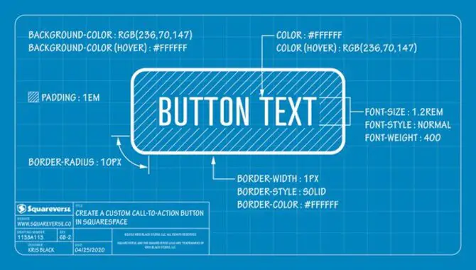
What Is The Font Type For Button In HTML?
The default font type for buttons in HTML is typically determined by the user’s browser or operating system. However, you can use CSS to specify a specific font type for buttons. Standard options include Arial, Helvetica, Verdana, and sans-serif. Choose a readable font that complements your website’s design.
Should Button Fonts Be Bold?
Button fonts should generally be bold to make them stand out and convey importance and urgency. However, it’s crucial to strike a balance so that the font remains legible and not overwhelming. Combining bold fonts with appropriate sizing and spacing can effectively increase click-through rates.


Leave a Comment