Typography plays a crucial role in shaping the perception and effectiveness of governmental messages. Whether they display on official documents, websites, or signage.
Selecting an appropriate font for government use is essential to ensure that the government uses readability, professionalism, and consistency across various platforms.
The need for clarity and accessibility guides the choice of font for government communications. Government agencies aim to convey important information to citizens and stakeholders, and legible typography enhances comprehension and engagement. Moreover, a consistent font across all government materials helps establish a recognizable and cohesive visual identity, promoting trust and credibility.
Given the importance of effective communication, it is feasible and highly recommended for governments to invest in selecting appropriate fonts that enhance the readability and impact of their messages. By carefully considering the typography used in government communications, authorities can enhance their ability to connect with citizens and effectively convey vital information. Here we will discuss what font does the government use.
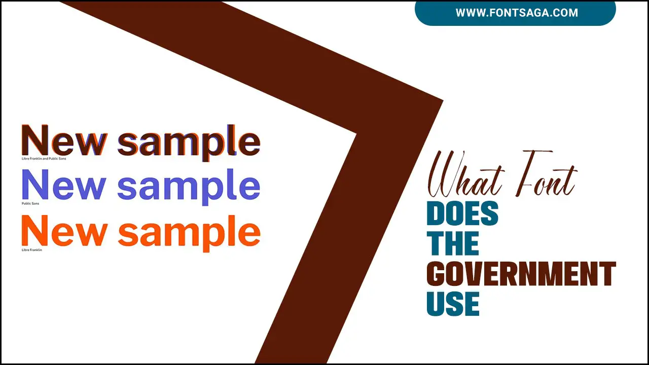
What Font Does The Government Use – A Closer Look

The government uses a variety of fonts depending on the specific department or agency. The importance of using appropriate fonts in government documents is to ensure readability, professionalism, and accessibility for all readers. Clear and legible fonts can also assist those with visual impairments in understanding the information presented. Here is some example of what font does the government use.
Serif Font
Serif fonts are often the preferred choice for government communication. This is because they easy read in printed materials and perceive as more formal and professional. Serif fonts have small lines or flourish at the ends of each letter. Which can help guide the reader’s eye and improve readability. Serif fonts convey a sense of stability and authority and are considered more traditional. Overall, serif fonts are a reliable option for government communication. That can help ensure clear and effective communication with the public.
Sans-Serif Fonts
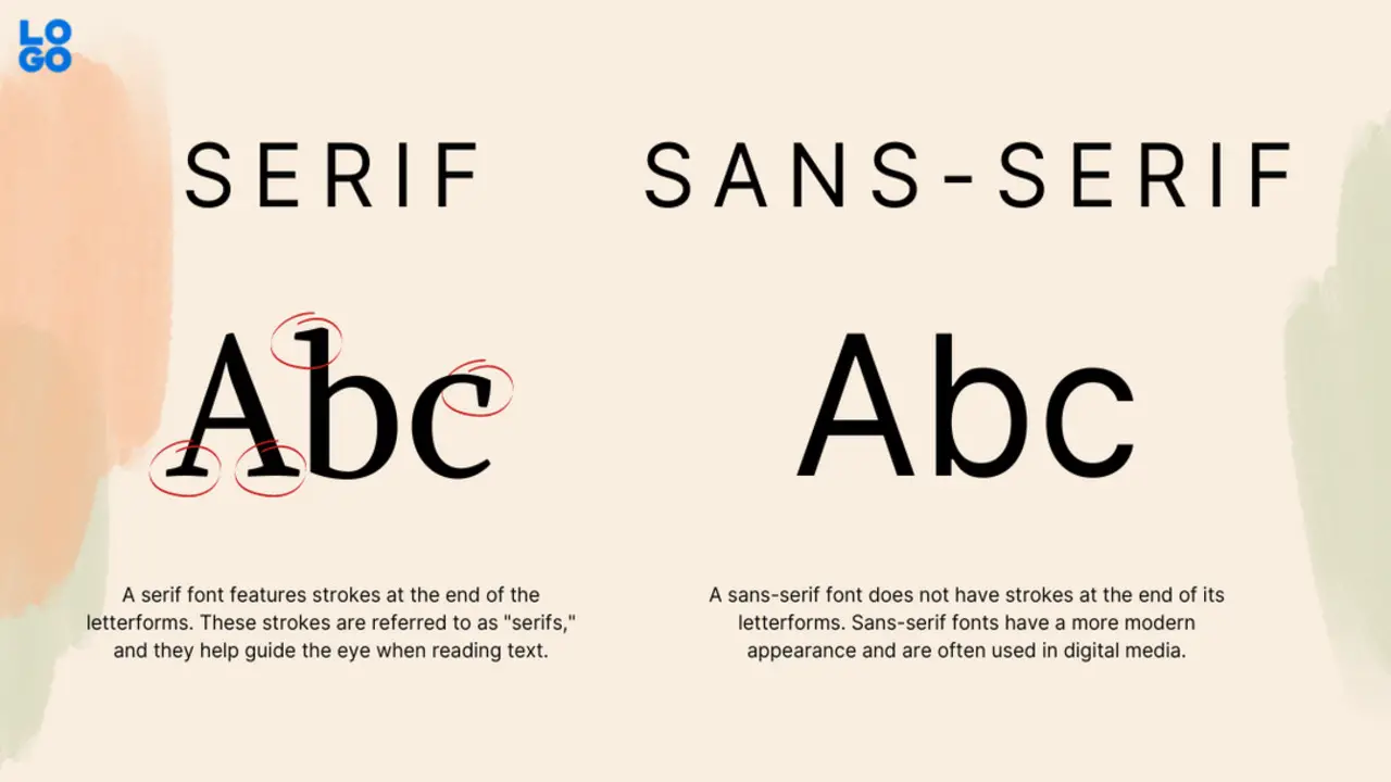
Sans-serif fonts play a crucial role in government typography. People widely use these fonts in digital and print materials for their legibility, simplicity, and modernity. They are particularly effective in conveying important information and instructions to the public, as they are easy to read even at smaller font sizes.
Moreover, sans-serif fonts are favoured by many government agencies for their neutrality and lack of decorative elements, which can distract readers from the main message. Overall, using sans-serif fonts in government typography helps ensure clear communication and accessibility for all.
Arial
Arial is a widely-used sans-serif font that has become a staple in government typography. Its simple, clean lines make it easy to read, even at small sizes, and its lack of serifs gives it a no-nonsense, modern feel. This makes it an ideal choice for government documents, which need to be informative and easy to understand. Additionally, Arial is available on most computers and is compatible with a wide range of software, making it a practical choice for government agencies with varying technology needs.
Times New Roman
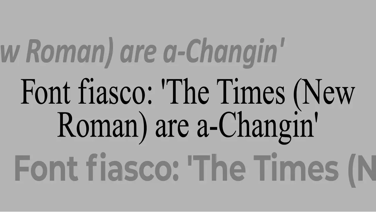
People widely recognize Times New Roman as a typeface that has played a significant role in government typography. The Times newspaper originally designed it as a serif font in the 1930s. Its popularity grew, becoming a standard font for many print publications, including those produced by the government. Times New Roman is popular for its legibility and professionalism, making it an ideal choice for official government documents and reports.
Public Sans
The designers created Public Sans specifically for government communication use. Its purpose is to provide a clean, modern, and easy-to-read font that can use across a wide range of applications, from signage to digital media. The font is available for free use by government agencies and has adopted by a number of organizations, including the United States Web Design System.
Conclusion
The font choice for government communications is a crucial element that contributes to the overall success and impact of official messages. By carefully considering what font the government use, authorities can ensure clarity, accessibility, and professionalism in their communication with citizens and stakeholders.
The specific font used may vary among different government agencies, but the importance lies in selecting typefaces that enhance readability, adhere to accessibility guidelines, and maintain consistency across platforms. A well-chosen font supports effective information dissemination, establishes a recognizable visual identity, and fosters trust and credibility.
When citizens can easily understand and engage with government materials, the desired results of increased comprehension, public participation, and successful communication can achieve. We hope now you know what font does the government use.
FAQ’s:
1.Is There A Standard Font Size Used In Government Documents?
Ans: Government documents do not have a universally prescribed font size. However, a commonly used font size range for official documents is between 10 and 12 points. This ensures readability while accommodating varying document lengths and formatting requirements.
2.Are Government Websites Required To Use Specific Fonts?
Ans: Answer: There are usually no specific font requirements for government websites. However, government web design guidelines often emphasize readability, accessibility, and compatibility across different devices. Popular choices include sans-serif fonts like Arial or Verdana, which offer clarity and legibility on screens.
3.What Font Is Typically Used In Government Signage?
Ans: Answer: Government signage often utilizes fonts that prioritize legibility and visibility. Clear and bold sans-serif fonts, such as Helvetica, Frutiger, or Univers, are commonly chosen for their readability from a distance and their ability to convey information effectively.
4.Can I Use The Same Font As The Government For My Own Documents?
Ans: Yes, you can use the same fonts as the government for your personal or business documents. The commonly used fonts mentioned earlier, such as Arial, Times New Roman, Calibri, and Helvetica, are widely available in most word processing and design software.
5.Can I Use Government Fonts For Commercial Purposes?
Ans: Fonts used by the government may be subject to copyright or licensing restrictions. While some fonts are freely available, others may require permission or licensing for commercial use. We recommend checking the specific font’s licensing terms to ensure compliance with copyright laws.

David Egee, the visionary Founder of FontSaga, is renowned for his font expertise and mentorship in online communities. With over 12 years of formal font review experience and study of 400+ fonts, David blends reviews with educational content and scripting skills. Armed with a Bachelor’s Degree in Graphic Design and a Master’s in Typography and Type Design from California State University, David’s journey from freelance lettering artist to font Specialist and then the FontSaga’s inception reflects his commitment to typography excellence.
In the context of font reviews, David specializes in creative typography for logo design and lettering. He aims to provide a diverse range of content and resources to cater to a broad audience. His passion for typography shines through in every aspect of FontSaga, inspiring creativity and fostering a deeper appreciation for the art of lettering and calligraphy.
