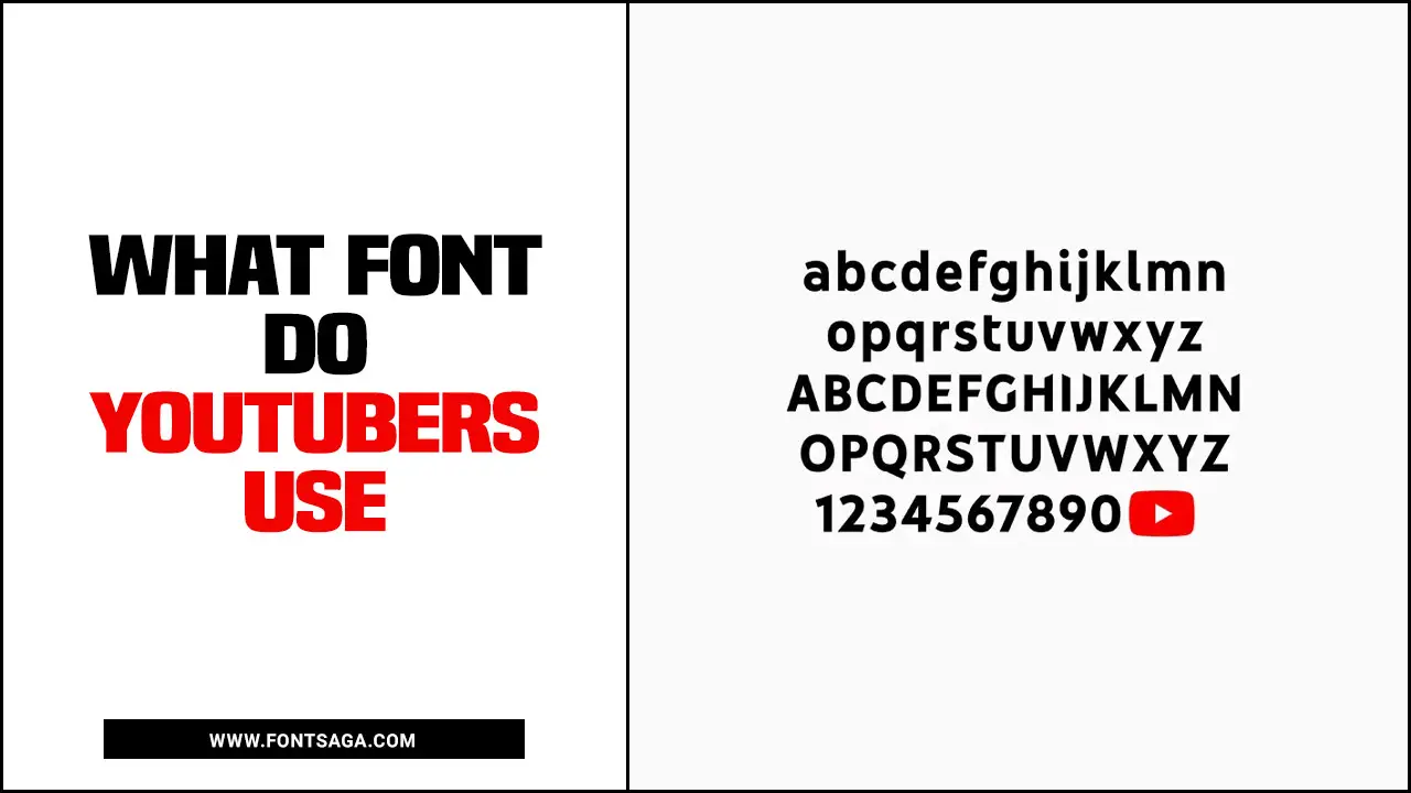
In online content creation, typography plays a crucial role in conveying the intended message and tone of the content. As the most popular video-sharing platform, YouTube attracts many content creators from different backgrounds and niches.
As we all know, the visual appeal of any content, including videos, is paramount to capturing the viewer’s attention and keeping them engaged. Given this, it’s no surprise that YouTubers pay close attention to the fonts they use in their videos. In fact, the font choice can significantly impact the viewer’s perception of the content and the creator’s brand.
So, what font do YouTubers use? This question has piqued the interest of many aspiring content creators looking to up their typography game. Here, we’ll explore the world of YouTube fonts and the most popular choices among top YouTubers.

Discussion On – What Font Do Youtubers Use?

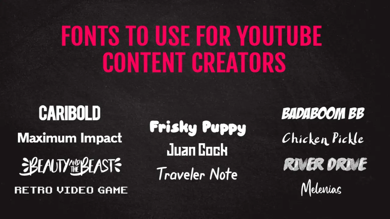
YouTubers often use a variety of fonts in their videos, thumbnails, and channel branding to create a unique and visually appealing aesthetic. What font do youtubers use? Several popular fonts are commonly seen in YouTube content. Here are some fonts that YouTubers frequently use:
- Bebas Neue: People often use this font in titles and headings to grab attention and create a strong impact because of its bold and modern appearance.
- Montserrat: Montserrat is a versatile font with a clean and professional look. It’s popular for its readability, making it suitable for titles and body text.
- Roboto: Many people use Roboto font due to its simplicity and readability. It has a modern and friendly appearance, making it suitable for various types of content.
- Raleway: Raleway is an elegant and stylish font that is often used for headings and logos. It has a sophisticated look and can add a touch of class to visual elements.
- Poppins: Poppins is a versatile font with a geometric design. It has a contemporary feel and is often used in minimalist and modern-themed videos.
- Impact: Impact is a bold and attention-grabbing font frequently used in meme videos or to create a strong visual impact in titles and thumbnails.
- Helvetica: Helvetica is a classic font that is widely recognized for its clean and timeless design. It’s often used in professional and corporate-style videos.
Tips For Using Fonts Effectively In Video Thumbnails

When creating a visually appealing video thumbnail, the font you choose can make a significant impact. Here are a few tips to help you use fonts effectively in your video thumbnails.
- choose a font that matches your video’s tone and message. For example, if creating a fun and lighthearted video, consider using a playful and whimsical font. Alternatively, a more traditional font may be more appropriate if your video is more serious or informative.
- be mindful of font size and legibility. Your thumbnail will likely be viewed on a small screen, so it’s important to use a font size that is easy to read. Consider using a bold font or adding a drop shadow to make your text stand out.
- don’t be afraid to experiment with different font pairings. Combining two complementary fonts can add a unique and eye-catching element to your thumbnail. However, choose fonts that work well together and don’t clash.
Fonts For Subtitles And Captions In Videos
Choosing the right font for subtitles and captions in videos is an important consideration for any content creator. The font must be legible, easy to read, and complement the overall visual style of the video. Many fonts range from basic sans-serif options to more decorative and stylized choices. Some popular options include Arial, Helvetica, and Times New Roman, all simple fonts that are easy to read.
Others may prefer more decorative options, such as script fonts or bold and chunky typefaces, which can add a unique flair to the captions. It is important to consider the context of the video and the intended audience when choosing a font. For example, a more playful and colorful font may be appropriate if the video targets a younger demographic. On the other hand, if the video is more professional and serious in tone, a more traditional and understated font would be more appropriate.
Conclusion
What font do YouTubers use? Choosing the right font for your YouTube channel is an important aspect of branding yourself as a professional content creator. While there are no hard and fast rules about using a specific font, it’s important to consider your chosen font’s readability, legibility, and aesthetics.
It’s also important to remember that your font choice should be consistent across all your branding efforts, including your website, social media, and other marketing materials. By choosing the right font for your YouTube channel, you can create a professional and cohesive brand that will help you stand out in a crowded online space.
FAQ
1.What Are Some Popular Fonts Youtubers Use For Their Video Titles?
Ans: Some popular fonts YouTubers use for their video titles include Bebas Neue, Montserrat, Roboto, Oswald, Lato, and Raleway.
2.How Do Youtubers Choose The Font For Their Channel Logo?
Ans: YouTubers choose the font for their channel logo by considering their channel’s style, tone, and audience. They may experiment with different fonts and typography to find one that best represents their brand and personality.
3.Are There Any Specific Fonts That Are More Effective For Video Thumbnails On Youtube?
Ans: Yes, there are specific fonts that are more effective for video thumbnails on YouTube. Sans-serif fonts like Arial, Helvetica, and Open Sans are popular because they are clean, modern, and easy to read.
4.How Do Youtubers Ensure Their Font Is Readable On Different Devices And Screen Sizes?
Ans: Yes, some fonts are more effective for video thumbnails on YouTube. Sans-serif fonts with bold lettering and high contrast are generally preferred as they are easy to read and stand out in a crowded feed.
5.Are There Any Font Trends Among Youtubers That Have Emerged Recently?
Ans: It is common for YouTubers to use bold, sans-serif fonts in their video thumbnails and titles to make them stand out and grab viewers’ attention. Some YouTubers may also use custom or handwritten fonts to create a unique and personalized brand identity.

David Egee, the visionary Founder of FontSaga, is renowned for his font expertise and mentorship in online communities. With over 12 years of formal font review experience and study of 400+ fonts, David blends reviews with educational content and scripting skills. Armed with a Bachelor’s Degree in Graphic Design and a Master’s in Typography and Type Design from California State University, David’s journey from freelance lettering artist to font Specialist and then the FontSaga’s inception reflects his commitment to typography excellence.
In the context of font reviews, David specializes in creative typography for logo design and lettering. He aims to provide a diverse range of content and resources to cater to a broad audience. His passion for typography shines through in every aspect of FontSaga, inspiring creativity and fostering a deeper appreciation for the art of lettering and calligraphy.

