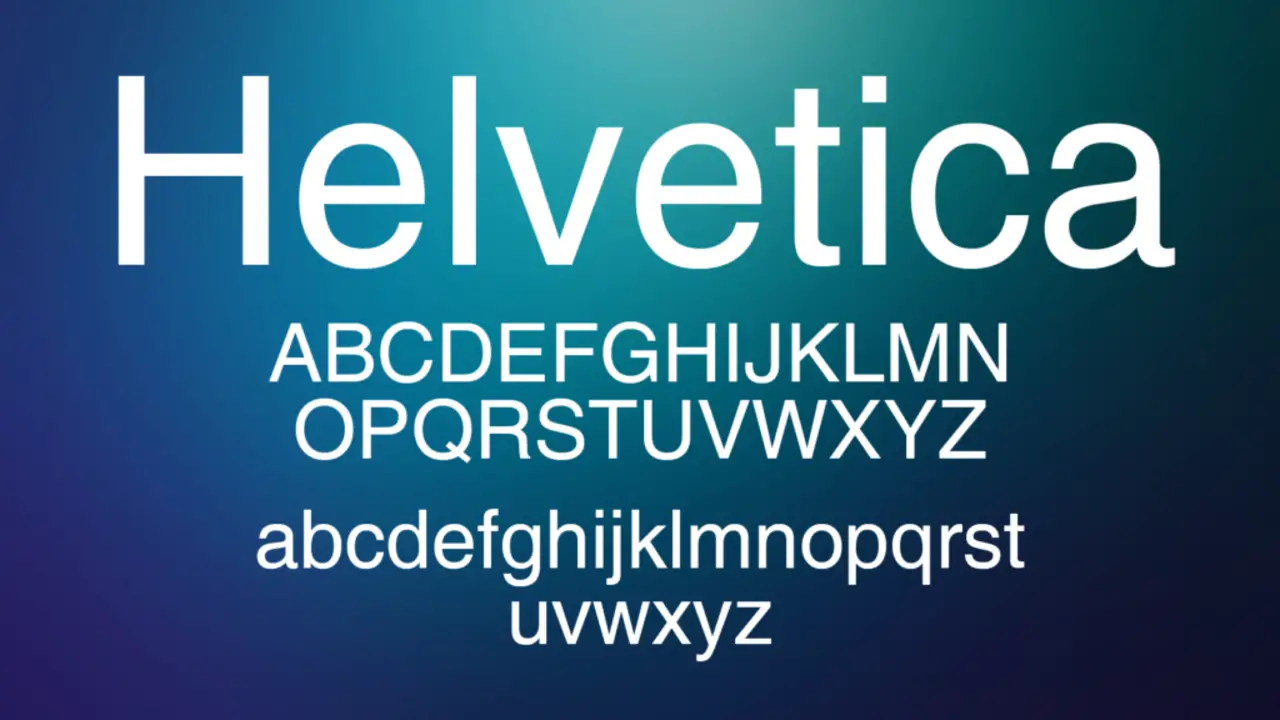
Regarding typography, font choice can significantly affect any written content’s overall impression and legibility. Among the plethora of fonts available, Helvetica has been a popular choice for designers and writers for over 60 years.
Swiss designer Max Miedinger created this sans-serif typeface in 1957, and it has since become a timeless classic in the design world. Here, we will explore the advantages of the Helvetica font and why it continues to be a professional favourite.
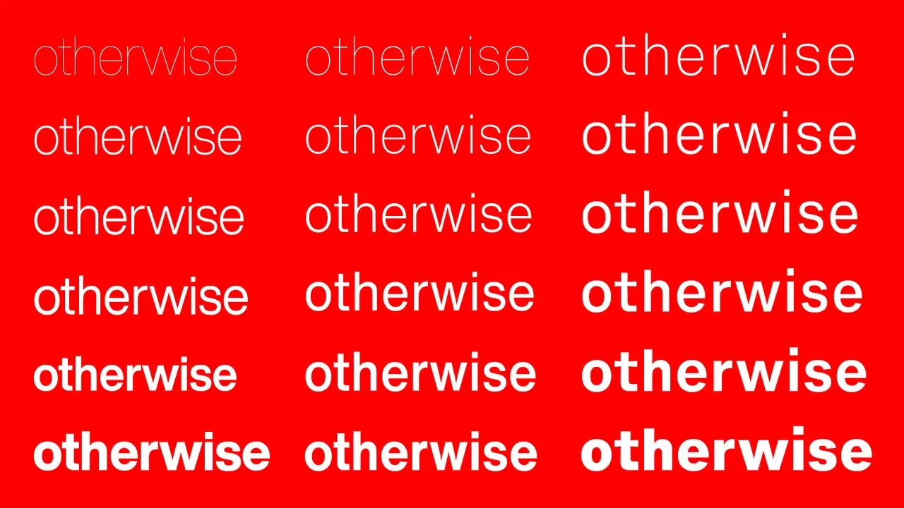
One of the biggest advantages of Helvetica font is its simplistic yet elegant design. Its clean lines and uniformity make it easy to read at any size. Whether on a billboard or in a small paragraph of text. Helvetica has a neutral personality, which allows it to blend seamlessly into any design without overpowering the content. This versatility has made it popular for various applications, from branding and advertising to web and print design.
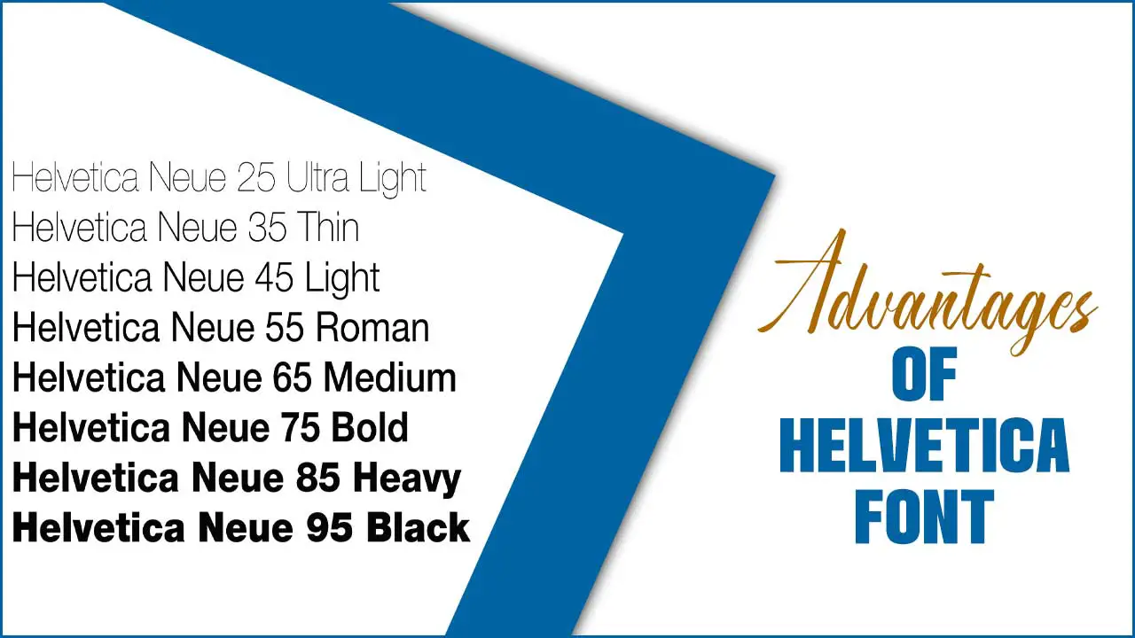
Exploring The Advantages Of Helvetica Font
Helvetica, a widely recognized and popular typeface, offers several advantages. Here are some of the key advantages of Helvetica font:
- Simplicity and Clarity: People recognize Helvetica for its clean and straightforward design. Its balanced and uniform appearance makes it easy to read and understand. The simplicity of the font allows it to be handy effectively in various contexts, from print to digital media.
- Versatility: Helvetica is a highly versatile typeface that can used for various applications. It is suitable for headings and body text. We are making it a popular choice for signage, logos, posters, websites, and other forms of visual communication.
- Timelessness: Helvetica has maintained its popularity and relevance over many decades. Max Miedinger and Eduard Hoffmann designed it in 1957, and it has since become one of the most widely used typefaces globally.
- Legibility: The clarity and legibility of Helvetica make it an excellent choice for conveying information effectively. Its clean lines, consistent stroke widths, and open letterforms contribute to its high print and digital screen legibility.
- International Appeal: Helvetica’s design is highly accessible and internationally recognized. Its neutral character allows it to be handy across different languages and cultures without losing clarity and legibility.
- Brand Association: Numerous reputable brands and organizations have used Helvetica. Which has helped establish its association with professionalism, reliability, and modernity. Its use in branding has given it a sense of familiarity and trustworthiness,
- Readability at Small Sizes: Designers designed Helvetica to maintain its legibility even at small sizes. Its letterforms are well-proportion and easily distinguishable. They are allowing it to be handy effectively when text needs to scale down, such as on packaging, labels, or user interfaces.
What Is Helvetica Best Used For?
Helvetica is a widely recognized font that has been in use for over 60 years. It is best used for creating clear, concise, and easily readable designs. Its simple, clean lines make it an ideal choice for a wide range of applications, from headlines and body text to logos and branding. Additionally, Helvetica’s versatility allows it to be handy across a broad range of mediums, such as print, web, and mobile devices.
Its popularity has led to its adoption as a standard font for many industries, including advertising, publishing, and graphic design. Overall, Helvetica is a reliable and effective choice for any project that requires a clear and professional visual aesthetic.
What’s So Special About Helvetica?
Helvetica is a typeface that has been lauded for its simplicity and readability and was developed in the 1950s by Swiss designers Max Miedinger and Eduard Hoffmann. Helvetica quickly became a favourite among graphic designers and typographers. Its clean lines and uncomplicated design make it highly versatile and easy to read, making it a popular choice for everything from logos to street signs.
In addition to its aesthetic appeal, Helvetica has also become a symbol of modernity and sophistication. Its widespread use in advertising, branding, and design has made it a recognizable and iconic typeface, and its enduring popularity shows no signs of waning.
Conclusion
Helvetica is a typeface that has stood the test of time and was developed in 1957 by Swiss designer Max Miedinger. It quickly became a favourite among graphic designers due to its legibility, versatility, and clean lines. Originally intended for use in the printing industry, Helvetica’s popularity grew.
It soon found its way into other forms of media, including signage, advertising, and digital design. One of the key advantages of Helvetica is its simplicity. The font’s clean lines and lack of ornamentation make it easy to read in a variety of contexts, from small print to large billboards. We hope now you know the advantages of Helvetica font.
FAQ
1.What Are Some Factors To Consider When Choosing A Chinese Font For A Design Project?
Ans: When choosing a Chinese font for a design project. There are a variety of factors that must be taken into account. One of the most important elements to consider is legibility. The font you select must be clear and easy to read. This will ensure that your target audience easily understands your message.
2.How Can I Ensure The Chinese Font I Choose Is Legible And Easy To Read?
Ans: In order to enhance the readability and recognizability of written content, it is crucial to choose a font with consistent stroke width. This means that the lines used to form the characters should have an even thickness throughout rather than varying in width. By selecting a font with consistent stroke width, readers will be able to quickly and easily recognize each character, as the visual appearance of the font will remain uniform.
3.Are There Any Particular Chinese Fonts That Are Considered The “Best” For Certain Types Of Projects Or Applications?
Ans: Chinese fonts, choosing the right one can make a significant impact on the overall look and feel of a project or application. While there are several Chinese fonts available, certain fonts are considered the “best”, depending on the purpose of the project. One such font is “SimSun,” which is widely handy for official documents and business communications in China.
4.What Are Some Common Mistakes To Avoid When Using Chinese Fonts In Design Work?
Ans: Choosing the right font is crucial to the success of the project. The font you choose can affect the overall appearance, readability, and messaging of your design. Therefore, it is important to consider carefully—the context and purpose of your design in order to choose—the appropriate font.
5.Are There Any Resources Or Tools Available To Help Me Choose And Use Chinese Fonts Effectively?
Ans: A subscription-based font library is a platform that provides users with access to a variety of fonts through a monthly or yearly fee. One such platform is a Chinese font library, which offers a range of fonts to meet the needs of designers, developers, and other professionals who require Chinese typography. This library includes a vast collection of traditional and modern Chinese fonts that can be handy for various applications such as branding, advertising, publishing, and web design.

David Egee, the visionary Founder of FontSaga, is renowned for his font expertise and mentorship in online communities. With over 12 years of formal font review experience and study of 400+ fonts, David blends reviews with educational content and scripting skills. Armed with a Bachelor’s Degree in Graphic Design and a Master’s in Typography and Type Design from California State University, David’s journey from freelance lettering artist to font Specialist and then the FontSaga’s inception reflects his commitment to typography excellence.
In the context of font reviews, David specializes in creative typography for logo design and lettering. He aims to provide a diverse range of content and resources to cater to a broad audience. His passion for typography shines through in every aspect of FontSaga, inspiring creativity and fostering a deeper appreciation for the art of lettering and calligraphy.
