The typical default font size in CSS is 16px, but it can differ based on a user’s device or browser settings. Setting a font size for your website/application is essential to maintain consistent typography.
You can easily modify the font size using CSS properties like “font-size” and “rem”. As a web developer, you know how important it is to make your website responsive to different devices. One of the critical aspects of responsive design is ensuring that your font size scales up or down depending on screen size.
Here we will g uide you through how to change font size in CSS, from understanding default font sizes to utilizing absolute and relative size keywords. We will also explore various length values, percentage values, and responsive text techniques that you can use to make your fonts look great on any device.
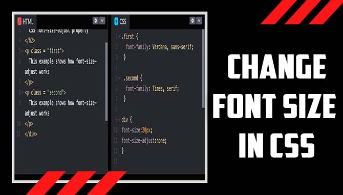
How To Change Font Size In CSS
When styling text in CSS, adjusting the font size is critical. To change font size in CSS, you should use the “font-size” property and relative units such as “em” or “rem” instead of fixed units like “px.” It is essential to consider your website’s overall design and readability while selecting font sizes.
Additionally, you can use media queries to adjust text size for different screen sizes. Using these techniques, you can effectively scale up or down the size of your fonts without compromising accessibility or visual hierarchy. Here are some methods to change font size in CSS.
Understanding Absolute-Size Keywords
To maintain consistency in web design, understanding absolute-size keywords is crucial when changing font size in CSS. These keywords enable you to specify a particular font size based on a standard scale like ‘xx-small’, ‘x-small’, ‘medium’, and others.
Remember that the font size may differ based on the device or screen resolution. Therefore, experimentation and testing are necessary to find an optimal font size for your project. Inclusive design should be kept in mind while selecting the perfect typeface and visual hierarchy and relative units such as ems, rems, and pixels while styling your text.
Utilizing Relative-Size Keywords
There are several ways to change font size in CSS without using fixed units like pixels. One good option is to use relative-size keywords like “smaller” and “larger”. By doing this, you can adjust the font size of an element based on the parent element’s font size. This technique maintains visual hierarchy and ensures smooth readability.
Another way to change font sizes in CSS is by using percentages (which are relative to the viewport width), ems (which are based on a parent element’s font size), or rems (which are based on the root element’s font size).
These techniques can help make your fonts more responsive and optimize accessibility for users with different screen sizes. Remember the importance of good design and readability while ensuring inclusive design practices when selecting a font size for your website or application.
Specifying Length Values
When styling your web page, you can specify the font size using either pixel or em units in CSS. Pixels are an absolute unit of measurement that always produce a consistent display size irrespective of the device used. On the other hand, ems are relative to their parent element’s font size, making them more accessible across devices with varying screen sizes.
When using ems, it’s essential to consider both readability and accessibility while choosing the right font-size property for your website. By making good choices with the sizing of your fonts concerning CSS styles, you can create a visual hierarchy that ensures inclusive design across all users.
Applying Percentage Values
You can create responsive fonts by using percentage values when adjusting font sizes in CSS. This approach allows you to adjust the size of your text relative to the parent element, making it a good choice for inclusive design.
For example, setting a font size of 150% would make the text 1.5 times larger than its parent element’s font size. This technique, along with media queries and viewport width, ensures your web page looks great on any device or browser window.
Implementing Responsive Text

To create responsive fonts in CSS without sacrificing accessibility and readability. It’s important to use CSS media queries and relative units such as em and rem. By testing your font sizes on different devices and screens, you can ensure that all users can easily read your content.
Avoid using absolute units like pixels or default font size in CSS syntax, which may not work well with various device types and browser windows. Instead, consider inclusive design techniques which will help all users regardless of their context or typeface preferences.
Exploring Keywords
Changing font size in CSS requires using different methods, such as absolute-size and relative-size keywords, length and percentage values, and pixel values. Responsive fonts are an excellent choice for adjusting font size based on the user’s device or screen size.
You can easily change the text size using CSS keywords like ‘medium’, ‘small’, ‘large’, and ‘x-large’. Additionally, using em and rem units instead of pixels helps ensure your text maintains its visual hierarchy across devices.
Examining Pixel Values
To scale up your web page by changing the font size in CSS without compromising accessibility. You have various options. You could use the various units available such as ems or percentages. Adjust text size relative to the parent element’s font size or container width.
Alternatively, you could use keywords like ‘large’ or ‘small’. It is, however, important to keep accessibility in mind when using pixels because they do not scale well on different devices.
Analyzing Em Values
When examining font sizing with em values in CSS styling. It is essential to consider that one em value equates to the parent element’s font size. As a relative unit of measurement, em values enable you to maintain consistent typography throughout your web page.
Nevertheless, adjusting the font size with em values affects other properties like line height and spacing. Therefore, use this styling technique cautiously while assessing related keywords like typography, properties, and CSS.
Examining Rem Values
To adjust the text’s size in CSS, various units of measurement are available. One such unit is rem values based on the root element’s font size. Implementing rem values on your website can ensure consistency in your typography while changing font sizes.
Remembering that these values are relative to the root font size and not the parent element’s font-size property is crucial. Employing this relative unit is a good choice for inclusive design and responsive web pages.
Creating Responsive Fonts
Using relative units like em or rem to change the element’s font size in CSS helps create responsive fonts that adjust to different screen sizes. One em value equals the parent element’s font size, making maintaining consistency across your website’s typography easier.
To control the font size of your text visible on a browser window, you can use viewport width (vw). When selecting a good typeface for your web page, consider inclusive design principles and accessibility guidelines. Testing your font sizes on various devices can help you find the perfect size that suits your website’s needs.
How To Use Rem Units For Responsive Text
When creating responsive text in CSS, start by setting up a media query that adjusts font sizes based on the user’s screen size and device. Consider utilizing a modular scale for consistent and harmonious typography across your website.
Finally, ensure optimal readability by testing font sizes on various instruments and screen sizes. Remember that REM units are relative to the root element’s font size and are an ideal responsive choice.
Conclusion
CSS offers a variety of options to change the font size, and it’s essential to choose the right one for your needs. Absolute-size keywords, relative-size keywords, length values, percentage values, and responsive text are some of the most common techniques to change font size in CSS. But the real game-changer is using rem units for responsive text.
It allows you to scale up or down your font sizes while ensuring they remain consistent across different devices and screen sizes.
Whether you want to make your text more readable on mobile devices or simply experiment with different font sizes for aesthetic purposes, CSS gives you the flexibility and control to achieve your desired results. So what are you waiting for? Start exploring the possibilities of font size adjustment in CSS today.
Frequently Asked Questions:
1.How Do I Change Font Size In CSS?
Ans: To adjust the font size in CSS, utilize the “font-size” property and assign a value such as “16px”. Scalability can be achieved using relative values like “em” or “rem”. Apply font size to specific elements via class or ID selectors. Consistency in font size enhances readability and accessibility.
2.How To Change The Font In CSS?
Ans: Customize your website’s font in CSS by using the “font-family” property to choose the desired font, “font-size” to adjust its size, and “font-weight” and “font-style” for further customization. Don’t forget to test on various devices and browsers to ensure readability.
3.What Is The CSS For Font Size?
Ans: To define the font size in CSS, use the syntax “font-size: [value];” replacing “[value]” with the desired size in pixels, rems, ems or percentages. Consider readability and accessibility when selecting a font size for your website.
4.How To Style Font Size CSS HTML?
Ans: When styling font size in CSS for HTML, utilize the “font-size” property and choose units like pixels, ems, or percentages. Target specific HTML elements with CSS selectors to adjust their font size. Consistency in font sizes is critical for a seamless user experience on your website.
5.How To Change Font Size For List Elements?
Ans: If you want to adjust the font size for list elements, you can target the <li> element in CSS and use the “font-size” property. Consider using percentage or em values to adjust relative to the parent element. Ensure legibility and consistency with your design.

David Egee, the visionary Founder of FontSaga, is renowned for his font expertise and mentorship in online communities. With over 12 years of formal font review experience and study of 400+ fonts, David blends reviews with educational content and scripting skills. Armed with a Bachelor’s Degree in Graphic Design and a Master’s in Typography and Type Design from California State University, David’s journey from freelance lettering artist to font Specialist and then the FontSaga’s inception reflects his commitment to typography excellence.
In the context of font reviews, David specializes in creative typography for logo design and lettering. He aims to provide a diverse range of content and resources to cater to a broad audience. His passion for typography shines through in every aspect of FontSaga, inspiring creativity and fostering a deeper appreciation for the art of lettering and calligraphy.
