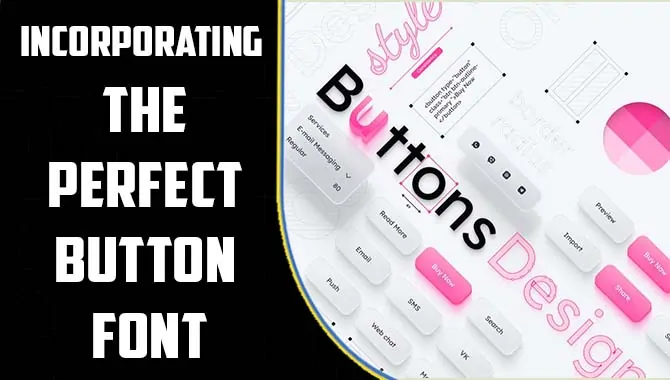
Incororating the perfect button font in any project can be a challenging task. First and foremost, it is important to choose a font that is easy to read and legible, even in smaller sizes.
Sans-serif fonts are generally a good choice for buttons as they are clean and modern. However, serif fonts can also be effective if used appropriately. The font should complement the overall design and tone of the site.
Another important factor to consider is the button’s functionality. Buttons that are used for calls to action or important actions should stand out and be easily identifiable. This can be achieved through the use of color, size, and placement, as well as a font choice. Finding the perfect button font requires a balance of functionality and aesthetics. Lets dive in deep on how you can use Button font for maximum impact in desings.
Understanding The Basics Of Button Fonts
When designing buttons for a website or mobile app, it’s important to understand the basics of button fonts. The font choice can affect the overall look and feel of the button, as well as its readability and usability. One of the most important factors to consider is legibility – the font should be easily read at a glance, even in smaller sizes.
However, serif fonts can also work well, particularly for more formal or traditional websites. Another consideration is the weight or thickness of the font – a heavier font can make the button stand out more, while a lighter font can give a more subtle, elegant effect. It’s also important to consider the contrast between the font and the button background. High contrast can make the text more readable, but it’s important to ensure that the colors chosen are accessible for users with visual impairments.
Types Of Button Fonts In Design
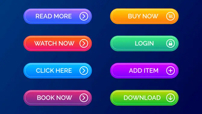
When designing buttons, selecting the right font can make all the difference. There are various types of button fonts that designers can choose from depending on the purpose of the button and the overall design aesthetic. One popular option is sans-serif fonts, which are clean and simple, making them ideal for buttons with a minimalist design.
Another type of button font is script fonts, which are elegant and flowing and can be used to create buttons with a more decorative or ornamental feel. For buttons that require a more playful or whimsical touch, designers can opt for display fonts, which are bold and attention-grabbing. Ultimately, the choice of button font will depend on the website or application’s overall design and the message that the button is meant to convey.
How To Use Button Font For Maximum Impact In Desigsn
Button font are an essential element of any design that requires user interaction. They can make or break the user experience, depending on how they are used. It’s important to consider a few key factors to get the most out of button fonts. First, the font should be readable and easily distinguishable from other text on the page. This means choosing a legible font in different sizes that contrasts well with the background color.
Second, the font should be consistent with the page’s overall design. This means using a font that matches the tone and personality of the brand or product. Third, the font should be appropriately sized to make the call to action clear and compelling. Following these guidelines, designers can use button fonts to create an engaging and user-friendly experience.
Planning Button Fonts For Your Design
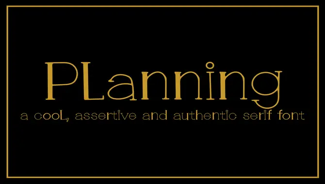
When it comes to designing, one of the most crucial elements is choosing the right fonts. The font you select can make or break your design’s overall look and feel. Therefore, it’s vital to plan your font choices carefully. The first step in planning your fonts is to consider the purpose of your design. It’s also essential to consider your target audience. Are we designing for children or adults?
Different age groups may have different preferences when it comes to font styles. Additionally, it’s important to pay attention to the readability of your fonts. You don’t want your message lost because your font is too difficult to read. Finally, don’t forget to pay attention to the small details, such as the spacing between letters, line height, and kerning.
Choosing The Right Button Font
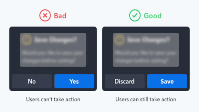
Choosing the right button font is essential for a great user experience. The font you choose for your buttons can significantly impact how users interact with your website or application. When selecting a button font, it’s important to consider factors such as readability, legibility, and aesthetic appeal. On the other hand, fonts that are too large or bold can overpower the overall design of your page and make it difficult for users to focus on other elements.
When choosing a button font, it’s also important to consider the message that you want to convey. For example, if we want to create a sense of urgency, we may choose a bold and attention-grabbing font. Similarly, if we want to create a sense of elegance and sophistication, we may choose a more refined and delicate font.
Consider Font Align Your Button Font In Desing

When it comes to designing a website or application, the button font plays a crucial role in creating a visually appealing and user-friendly experience. Implementing your button font in design is a process that requires attention to detail and a good understanding of typography. The first step is to choose a font that aligns with your brand identity and the overall design aesthetic.
Once we have selected the font, we must ensure it is legible and easy to read, especially in smaller sizes. We must consider factors such as the button color, size, and placement to implement your button font in design. We want to make sure that the font complements these elements and adds to the overall visual appeal.
Designing Your Button With Typography

Designing a button with typography can be a powerful way to make it stand out and grab your audience’s attention. The right font and placement can make all the difference in your button’s effectiveness at prompting action. When choosing a font, it’s important to consider both legibility and style. Sans-serif fonts are often a good choice for buttons because they are clean and easily read in small sizes.
However, serif fonts can also create a more elegant or formal look. We have chosen our font. We can start experimenting with placement and size. Think about where the button will be placed on your website or app and how it will fit in with the rest of the design. Finally, consider adding some visual interest to your button with color or other design elements.
Conclusion
Selecting the right button font can make a significant difference in the user experience. By following the tips discussed in this article, designers can ensure that their button fonts are clear, legible, and easy to understand. Remember to consider the context of the button, the brand identity, and the overall design of the interface when choosing a font.
Ultimately, the goal is to create a seamless and intuitive user experience that encourages engagement and interaction. With these tips in mind, designers can create buttons that are aesthetically pleasing, functional, and easy to use, resulting in a more engaging and successful design.
FAQ
What Are Some Key Considerations When Choosing A Font For Buttons On A Digital Interface?
When choosing a font for buttons on a digital interface, some key considerations include the legibility and readability of the font, the font’s style and weight, the size of the font, and the contrast between the font and the background.
How Can Designers Balance Readability With Aesthetics When Selecting A Button Font?
Designers can balance readability with aesthetics when selecting a button font by choosing a font that is clear and legible while also considering the stylistic elements of the font that contribute to its aesthetic appeal.
Are Certain Font Styles Or Characteristics That Work Better For Specific Buttons?
Certain font styles and characteristics can work better for specific buttons. For call-to-action buttons, it is recommended to use bold and attention-grabbing fonts that convey urgency and encourage action.
How Can Designers Avoid Common Mistakes When Choosing Button Fonts?
Choose a font that is easy to read: The font should be legible and clear, even in smaller sizes. Consider the context of the button: The font should match the tone and purpose of the button.
How Can Designers Test And Iterate On Different Button Font Options To Find The Best Fit For Their Interface?
Create various font options: Designers can use different fonts, font sizes, and font weights to create a range of options for testing. Conduct user testing: Designers can test to get feedback on different font options.

Leave a Comment