Technical documents are often jam-packed with information, and a wrong font choice can make it difficult for the reader to understand and follow along.
The right font selection can not only enhance the aesthetic appeal of the documents but can also improve their overall readability. But with so many different font types available, it can be overwhelming to choose the right one. We will take you through the different types of fonts, popular fonts for technical documents, and the benefits of font selection.
However, we will help you to choose the best font for technical documents. We also provide seven simple tips to choose the perfect font for your technical documents that will help enhance usability, readability, and professionalism. So, whether you’re putting together a user manual or scientific report, read on for everything you need to know about selecting the right font type.
What Are The Different Types Of Fonts?
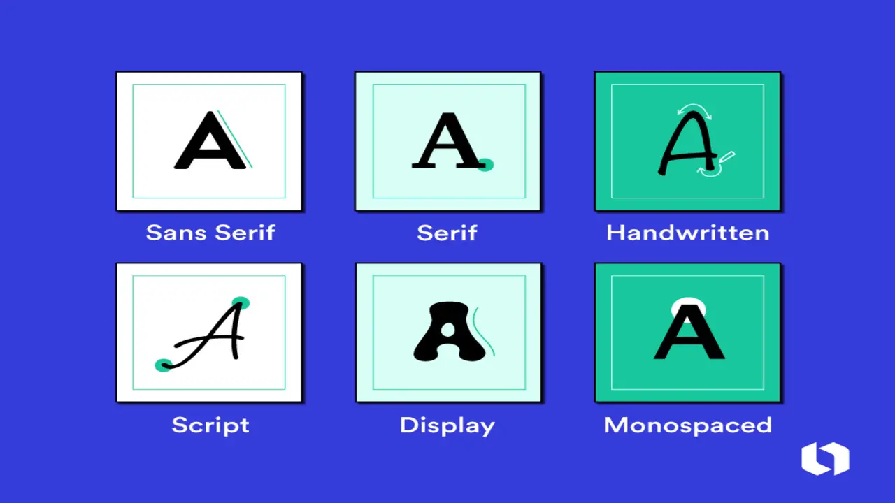
There are several fonts, each with a unique thermal design and purpose. Serif fonts have little lines on the ends of the letters, while sans-serif fonts are simpler. Script fonts are used for headlines, cursive fonts for a handwritten look, and decorative fonts add visual interest. Monospaced fonts are ideal for code and programming. Depending on the situation, these fonts can be used in various ways to create elegant typography or professional-looking documents.
6 Tips For Choosing The Right Best Font For Technical Documents
There are so many fonts, but choosing the best font for technical documents can be daunting. It is important to pick a font that conveys the right message and tone for the document. Generally, sans serif fonts are best for technical documents as they are easier to read, particularly on screens.
Popular sans serif fonts include Arial, Calibri, and Verdana. However, it is important to assess each document individually to ensure that the font matches the content, tone, and audience. Here are some tips to help you choose the right font for your next project.
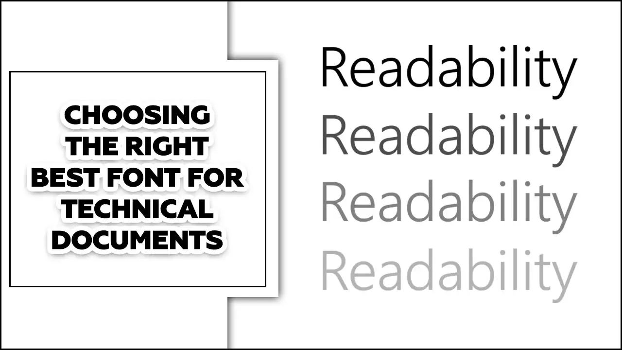
1.Consider Readability

Choose a font that is easy to read, especially for long technical documents. The first factor to consider when selecting a font is legibility. This refers to how easily the letters can be distinguished from one another. A font that is too complex or decorative may be visually appealing. Still, it can make it difficult for readers to decipher the text, leading to a loss of interest and comprehension.
2.Stick To A Professional Look
Opt for fonts that have a clean and streamlined appearance to maintain a professional look. It can also reflect the professionalism and attention to detail of the person or organization behind the document or website. In today’s fast-paced and competitive world, making a good first impression is crucial; font selection is a significant part of that.
3.Avoid Decorative Fonts
Steer clear of fonts with excessive embellishments or decorative elements that can distract from the content. These elaborate fonts tend to have intricate details and flourishes that can interfere with the legibility of the letters. In some cases, the embellishments can merge with the letterforms, making it challenging for readers to distinguish between different characters. This can cause frustration and, in turn, decrease the overall effectiveness of the written content.
4.Select A Font With Different Weights
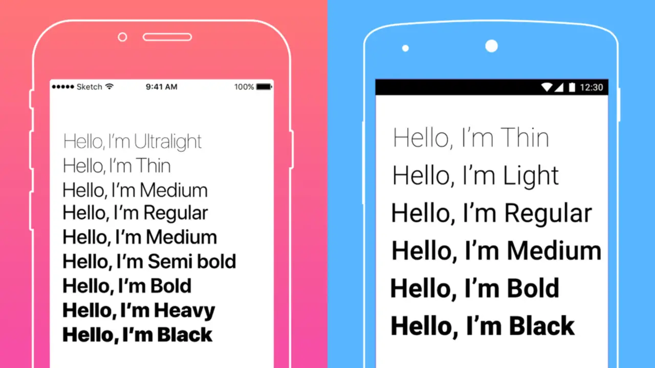
Look for fonts that offer different weights (such as regular, bold, and italic) to add emphasis and hierarchy to your technical documents. Combining font weights can help you create a visual hierarchy in your technical documents.
On the other hand, using a regular font for body text can make it easier to read and keep the document looking clean and organized. Additionally, incorporating italicized text can be useful for emphasizing specific words or phrases within a sentence.
5.Ensure Compatibility
Ensure the chosen font is compatible across different platforms, devices, and software to prevent formatting issues. Selecting a font supported by all major operating systems, such as Windows, Mac, and Linux, is crucial. This ensures that no matter what device your audience uses, they can view your content without any issues. Additionally, it’s important to consider the compatibility of your font across different web browsers, as each one may render fonts differently.
6.Test Before Finalizing
Before settling on a font, test it in a sample document or paragraph to evaluate its legibility and overall suitability for your technical content. One of the best ways to test a font is by using it in a sample document or paragraph. This will allow you to see how the font looks and feels in a real-life scenario. As you type out your sample text, consider the font’s legibility.
Benefits Of Font Selection
The typeface of a document is crucial for technical writing. It affects readability and accessibility, aiding readers with different abilities. Font selection creates logical emphasis, with sans-serif fonts being popular for their clean, modern look. However, serif fonts can suit certain contexts. Choosing the right font benefits both the writer and the reader, enhancing the communication of technical information.
- Enhances readability and legibility of text
- It helps create a visually appealing and engaging design
- Conveys the tone and message of the text
- Improves brand recognition and consistency
- Increases accessibility for different audiences
Popular Fonts For Technical Documents

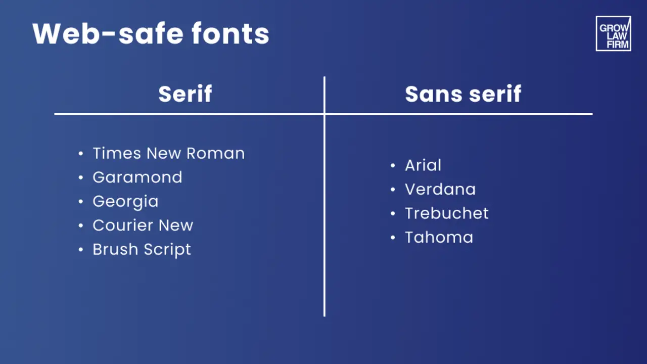
When choosing fonts for technical documents, prioritize readability and professionalism. Popular choices include sans serif fonts like Calibri, Times New Roman, and Cambria, while Garamond may be suitable for formal or academic papers.
In technical fields, monospace fonts like Courier or Consolas can help differentiate technical information. However, avoid fonts like Comic Sans MS, which lack the necessary level of technicality. Opt for fonts that are easy to read and avoid overly decorative or cursive styles. Choose a professional-looking font that ensures a clear and effortless understanding of the text.
How To Use Scientific Fonts For Technical Documents?
Choosing the right font for technical documents is crucial for readability and comprehension. Regarding scientific fonts, opting for a professional and easy-to-read font is vital. While serif fonts are commonly used in printed materials, such as books and journals, sans-serif fonts are more suitable for online content and graphic design.
However, the choice of font ultimately depends on the document’s content. It is advisable to avoid Comic Sans MS for highly technical documents, as it can be distracting and unprofessional. Due to their readability and professional appearance, Calibri, Times New Roman, Cambria, Georgia, Garamond, and Didot are recommended for official documents. Remember, the objective is to enhance readability and comprehension, so choose your font wisely.
What To Consider When Choosing A Font For Technical Documents?
When choosing a font for technical documents, consider readability and professionalism. Opt for an easy-to-read font to ensure clarity. Font size and type are important, especially for manuals and instructions. Choosing a Google Font that aligns with your brand can improve coherence.
Clear fonts make documents engaging and user-friendly. Thoroughly research before selecting a font for a visually appealing, easy-to-read, and professional technical document design. An effective font size is crucial regarding technical documents. Color palettes play a crucial role in enhancing the aesthetics and readability of technical documents.
How To Choose The Right Font Type For A Technical Document?
Choosing the right font is crucial for technical documents. Using approved fonts and larger sizes, especially for legal documents, ensures readability and professionalism. Headlines should be non-serif fonts, while body text should come from serif fonts for better legibility.
Experts suggest using only a few typefaces to avoid confusion. Recommended fonts for official documents include Calibri, Times New Roman, Cambria, Georgia, Garamond, and Didot. Century, Arial, Helvetica, and Century Schoolbook are suitable for legal documents. Consistency in font choice and heading size creates a uniform appearance, allowing readers to focus on the content. Follow these guidelines to communicate information in your technical document effectively and professionally.
What Are The Best Font Types For Technical Documents?

Choosing the right font for technical documents is crucial for readability and comprehension. Simple sans-serif serifed typefaces like Calibri and Times New Roman are commonly used for their easy readability and professional appearance.
It is advised to avoid fonts like Comic Sans MS for technical material. Another great option is the Economica font, a free alternative to commercial fonts. Consider the complexity of the document, font size, and spacing when selecting a typeface. The right font choice enhances readability and minimizes misinterpretation. Different types of documents require different fonts to ensure readability and professionalism.
Conclusion
It is very important to know the best font for technical documents. The readability of a technical document can make or break its effectiveness. Ultimately, choosing the right font for your technical document will depend on various factors, such as the type of document you’re creating, your target audience, your brand, and your Italian style guide. Remember that your chosen font must be legible, easy to read, and professional-looking.
We have explored some of the best fonts for use in technical documents. Using these fonts ensures that your documents are easily read and visually appealing. Whether writing documentation for a software application or preparing a document for a technical meeting, using the right font can make your work easier and more efficient.
Frequently Asked Questions
What’s The Best Legal Document Font Size And Style?
For legal documents, it is recommended to use a professional and easy-to-read font, such as Arial, Helvetica, or Century Schoolbook. Sticking to approved font styles and sizes is important to ensure the documents are clear and legible.
While Times New Roman is a default font among legal practitioners, it is not the best choice. Instead, opt for a professional, authoritative font. To accommodate readers with visual impairments, use a font size of 14 or no smaller than 12. The American Supreme Court favors the Century family of fonts; a 12-point type is almost mandatory.
Is There Anything Else You Need To Consider When Selecting The Right Font?
When selecting a font, it is important to choose one that is readable and fits your brand. Sans-serif fonts are generally more natural and better for computer reading, while serif fonts are traditional and better for body text.
It’s best to use non-serif fonts for headlines and serif fonts for body text and avoid using too many fonts in one document. Famous system fonts like Arial, Times Roman, and Courier are popular and generally safe choices. However, misleading fonts can result in incorrect information, so choose your font wisely.
What Are The Benefits Of Using Helvetica Neue For Technical Documents?
Using Helvetica Neue for technical documents can provide several benefits. This clean, easy-to-read font has a modern, professional aesthetic perfect for technical writing. Using a consistent font like Helvetica Neue can improve the overall look and readability of the document, making it easier for readers to follow along.
Also, Helvetica Neue is a widely recognized and respected font, making it a safe choice for technical documents that convey professionalism and reliability.
How Can I Make My Custom Fonts From Scratch?
To create your custom font from scratch, you will need a strong background in typography and design software such as Adobe Illustrator or Glyphs. However, if you’re looking for a simpler approach to font selection, consider choosing a font that fits your brand and is easily readable.
Google Fonts offers a diverse range of free fonts with easy website integration. Montserrat is a popular, versatile sans-serif font with 18 different styles. Morison is a versatile serif font that can add personality to corporate documents without sacrificing legibility.
What Fonts Should I Avoid When Creating Technical Documents?
When creating technical documents, avoiding fonts that overuse typographical effects is best. Your font choice should fit your brand and be readable for your website. We recommend using non-serif fonts for headlines and serif fonts for body text.
Monospace fonts are also suitable for technical documents and coding. Ultimately, consider readability and appropriateness for the tone and style of the document when selecting a font.

David Egee, the visionary Founder of FontSaga, is renowned for his font expertise and mentorship in online communities. With over 12 years of formal font review experience and study of 400+ fonts, David blends reviews with educational content and scripting skills. Armed with a Bachelor’s Degree in Graphic Design and a Master’s in Typography and Type Design from California State University, David’s journey from freelance lettering artist to font Specialist and then the FontSaga’s inception reflects his commitment to typography excellence.
In the context of font reviews, David specializes in creative typography for logo design and lettering. He aims to provide a diverse range of content and resources to cater to a broad audience. His passion for typography shines through in every aspect of FontSaga, inspiring creativity and fostering a deeper appreciation for the art of lettering and calligraphy.
