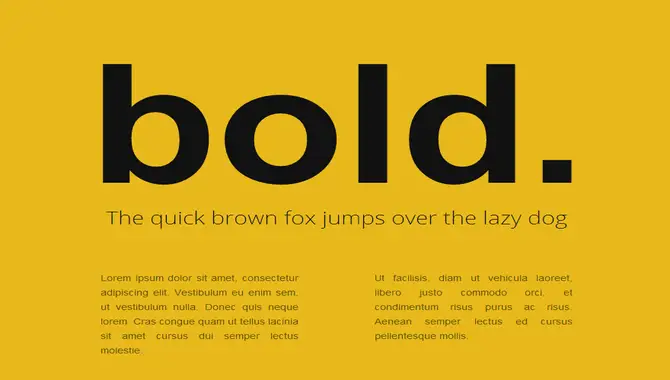
When it comes to designing a website, choosing the right font can significantly impact the overall look and feel of your page. One way to make text stand out is by using the bold font in CSS.
Bold font can help emphasize important information and make it easier for readers to scan through the content quickly. Bold fonts make a statement and draw attention to the vital text on your website. They are an essential tool in any CSS developer’s toolkit.
We will cover everything you need to know about mastering bold fonts in CSS. From understanding bold fonts and why they are essential to applying and styling them, we have got you covered. We will also discuss potential issues while using bold fonts and how to troubleshoot them effectively.

What Are Bold Fonts?
Bold fonts are a typeface with a thicker, more emphasized weight than the regular or “normal” version. They are designed to make specific text stand out and highlight important information. Bold fonts can be used for headlines, subheadings calls to action, or any other text that needs to be highlighted on your website. Using bold fonts in CSS ensures your website’s content is communicated effectively and efficiently to your audience.
Why Use Bold Font In CSS?
Using bold fonts in CSS is a great way to create contrast and hierarchy on your web page. Bold fonts can grab your readers’ attention, guide them through your content, and highlight important information. They also make your website’s text easier to read by adding visual weight to the words and phrases that matter most.
With CSS, you can customize the weight and style of your fonts to fit your website’s unique needs. So, if you want your content to impact and stand out, using bold fonts in CSS is worth considering.
Understanding HTML And CSS For Bold Fonts
To master bold fonts in CSS, it’s vital to understand the following: syntax for bold text, using HTML and CSS elements for bold text, accessibility concerns, and experimenting with different CSS properties like italics and underlining. Test your website on different devices and browsers to ensure browser compatibility.
Use appropriate HTML tags such as <strong>, or modify the font properties using CSS’s font-weight and font-style properties to change the default weight of body text or headings. Always use web-safe fonts such as Arial or Helvetica unless you have specified terms of use for a custom typeface from Google Fonts. Incorporating these best practices will help you create visually appealing content that improves readability while maintaining accessibility.
The Syntax For Bold Text In CSS
To create bold text in CSS, use the font-weight Property. You can use a numeric value between 600-900 or the keyword “bold”. To apply this Property, you can target either specific HTML elements or utilize universal selectors to apply it across your whole document. When specifying multiple fonts in your font-family Property, ensure you have a fallback option if the user’s device doesn’t support your preferred font. Testing your bolded text across different browsers and devices ensures consistency.
Inline Vs Block Elements For Bold Text
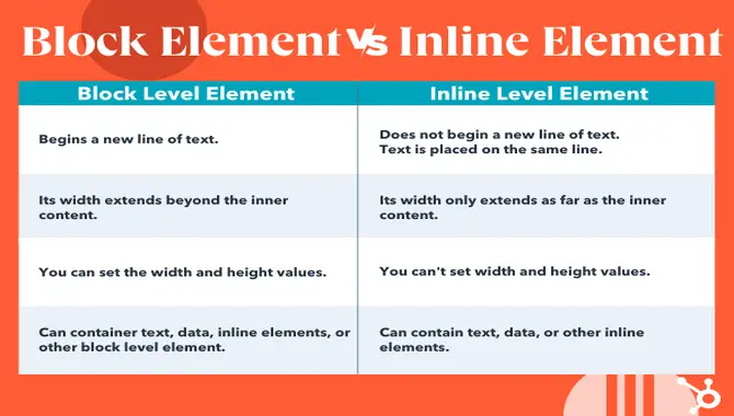
To create bold fonts in CSS, you must differentiate between inline and block elements. The former is employed for styling individual words or small text sections, whereas the latter is used for entire paragraphs or more extensive text sections. You may make your text bold by manipulating the font-weight Property within your CSS code. For emphasis and legibility purposes, apply bold fonts wisely.
Accessibility Considerations For Bold Text

When considering the accessibility of bold fonts in CSS, ensuring sufficient contrast between the bold text and the background colour is crucial for optimal readability. Semantic HTML tags like <strong> and <em> should be utilized rather than increasing font weight. Furthermore, one should avoid using all caps or underlining as they may confuse screen readers. Testing your website with accessibility tools also helps ensure universal usability.
Applying Bold Fonts In CSS
Experiment with different font families when using CSS’s “font-weight” property to apply boldness to text. A combination of font weights, such as regular and semi-bold, can achieve the perfect level of boldness. Try different font sizes, styles like italic or underline, or colours for added visual interest for bold and regular text. Consider best practices, including browser support and accessibility guidelines, when applying bold fonts on your website.
Using The Font-Weight Property
The “font-weight” property in CSS allows you to make text bold. It is important to remember that this Property affects the entire element, whether inline or block. To achieve the desired effect, you can experiment with different font weights, such as bold, semi-bold and regular.
However, it is crucial to consider accessibility guidelines, including contrast and semantic HTML tags, when using bold fonts in CSS. By following best practices, you can make your text stand out while ensuring optimal usability for all users.
Using The Font-Family Property For Bold Text
To use different levels of boldness in CSS while using the font-family Property for bold text requires specifying the font family for an element’s text. Adding the font-weight Property allows adjusting between different levels of weight, such as ‘bold’ and ‘700.’
To ensure a perfect balance between readability and legibility while choosing a suitable font from Google Fonts or through CSS code selection like Arial or Helvetica is crucial. Moreover, effectively utilizing typography principles like adjusting letter spacing within HTML and parent elements can help create visually appealing web development designs.
Using Variable Fonts For Bold Text

Variable fonts are a modern type of font that allows for more flexibility in adjusting font-weight. With variable fonts, you can adjust the weight of the text within a range, providing even more control over how the text appears on your website.
This technology is still emerging but offers exciting possibilities for designers who want to create unique and impactful website typography. However, it’s essential to consider browser support and loading times when using variable fonts. So, before using them, test compatibility with different devices and browsers to ensure optimal user experience.
Styling Bold Text In CSS
Regarding web development, styling bold text in CSS is an essential skill that requires knowledge of HTML, CSS, and fonts. To make text appear bolder than the default, you can use the font-weight Property with different keyword values like “bold” or numeric values ranging from 100 to 900.
It’s essential to consider the font family of the parent element so that you choose a font with a bolder variant. In HTML, you can use the solid tag to apply bold styling to specific words or phrases within a paragraph. By following best practices and experimenting with CSS properties like text-transform and letter-spacing, you can create unique effects without compromising accessibility.
Adding Italic And Underline To Bold Text
To effectively style bold fonts in CSS, it’s essential to understand how to add italics and underlines to your text. One way to achieve this is by using the font-style Property to make the text slanted and the text-decoration Property to add a line underneath it.
Combining these properties with font weight allows you to create unique styling for your bold text. To ensure accessibility and browser support, choose fonts that are easily read, even when styled in bold. Remember to follow best practices when adding boldness to your paragraph or heading without compromising readability.
Using Different Colors For Bold And Regular Text
To create an eye-catching webpage, use different colours for bold and regular text. This can be achieved by combining the “color” property and the “font-weight” property in CSS. Experiment with various colour combinations to find the perfect match. It’s essential to choose easily readable fonts regardless of their boldness level. Keep this tip in mind while designing your website.
Troubleshooting Bold Fonts In CSS
Check the font-weight Property in your CSS code to troubleshoot bold fonts in CSS. Make sure the font you’re using has a bold variant available, and consider using a value of 700 for a bolder look. If problems persist, use browser developer tools to inspect and troubleshoot any issues with your CSS code. Remember to choose fonts carefully and stick to best practices like ensuring font accessibility and readability.
Browser Compatibility For Bold Text
To ensure browser compatibility with bold text in CSS, using the correct syntax for HTML and CSS is crucial. Since different browsers may render boldness differently, it’s best to use web-safe fonts or specify a numeric value for font-weight instead of relying solely on the “bold” keyword.
Testing your website on various platforms can help detect and resolve issues with bold text accessibility. Following these best practices allows you to apply bold fonts effectively without compatibility issues.
Common Issues And Solutions For Bold Text Styling
In terms of using bold fonts in CSS, there are some common issues that one might run into. For instance, the bold text can sometimes appear blurry or pixelated on specific devices. To prevent this, a font weight of 700 or higher is recommended to ensure that the selected font is designed explicitly for boldness.
Additionally, you might encounter an issue where the bold text isn’t showing up. This problem could stem from conflicting CSS code styles or a font family that doesn’t support a bold weight. Be sure to carefully examine your CSS code and experiment with different fonts until you find one that correctly implements the CSS font-weight property.
Conclusion
Bold fonts are a great way to add emphasis and hierarchy to your text in CSS. Using bold font in css can be a simple yet effective way to make important text stand out on a webpage. By adjusting the weight of the text, you can create emphasis and draw attention to specific information, such as headings or critical points.
It is essential to consider readability and not overuse it when using bold font, as too much bold text can be overwhelming and challenging. However, Understanding the syntax and properties of applying bold fonts is crucial for any beginner looking to master CSS. Keep in mind accessibility considerations and browser compatibility while styling your bold text. This guide allows you to apply and style bold fonts in your web designs confidently.
Frequently Asked Questions
How Do I Make The Font Even Bolder In CSS?
To make fonts bolder in CSS, adjust the font-weight Property from regular to bold or use the text-shadow Property to create a shadow effect. Be mindful not to overdo it, as excessively bold fonts can hinder readability.
What Is The Best Way To Use Bold Font In CSS?
To format bold font in CSS, use the “font-weight” property with values ranging from 100 to 900. Another option is to apply the “strong” HTML tag or “bold” CSS class. However, excessive use of bold can harm readability and should be avoided.
What Are Some Common Uses For Bold Fonts In CSS?
CSS bold fonts are used to highlight headings and subheadings, as well as essential words or phrases within the body text. They also add contrast and hierarchy to designs, especially when paired with other font weights for cohesive typography.
How Can I Add Bold Fonts To My Website Using CSS?
To add bold fonts to your website, use CSS’s font-weight Property, which accepts values ranging from 100-900. The keyword “bold” can be used instead of a numerical value. For instance, “h1 { font-weight: bold; }”.
Are There Any Best Practices For Using Bold Fonts In Web Design?
When using bold fonts in web design, using them strategically and sparingly to highlight essential elements is essential. Keep readability in mind and choose a font-weight that matches your website’s style. Test your bold font choices on various devices to ensure consistency.

David Egee, the visionary Founder of FontSaga, is renowned for his font expertise and mentorship in online communities. With over 12 years of formal font review experience and study of 400+ fonts, David blends reviews with educational content and scripting skills. Armed with a Bachelor’s Degree in Graphic Design and a Master’s in Typography and Type Design from California State University, David’s journey from freelance lettering artist to font Specialist and then the FontSaga’s inception reflects his commitment to typography excellence.
In the context of font reviews, David specializes in creative typography for logo design and lettering. He aims to provide a diverse range of content and resources to cater to a broad audience. His passion for typography shines through in every aspect of FontSaga, inspiring creativity and fostering a deeper appreciation for the art of lettering and calligraphy.
