In the world of marketing and branding, every detail matters. From colour schemes to messaging, each element contributes to the overall perception of a brand.
However, one critical aspect that is often overlooked is typography. The font family used by a brand can significantly impact how its target audience perceives it in today’s era, where digital communication is primary, and selecting the right typeface is more crucial than ever. One such typeface that many brands have used over the years is Garamond.
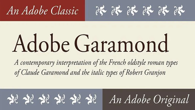
Garamond is a classic typeface that has been in use since the 16th century. Its timeless and elegant design has made it a popular choice for brands across various industries. We will explore the power of the Garamond font family and how it can impact your brand identity.
Mastering The Art Of Typography With Garamond Font Family
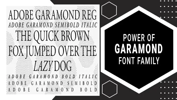
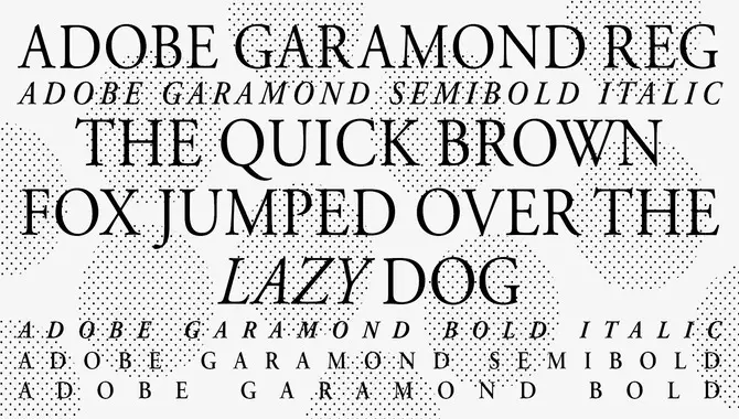
The Garamond font family is a classic and elegant font that has stood the test of time. It is known for its timeless appeal and versatility. Making it a popular choice for designers and typographers alike. Mastering the art of typography with the Garamond font family involves understanding its unique characteristics and knowing how to use them effectively. One of the key features of Garamond is its high legibility, making it ideal for use in body copy.
Its refined look can be used in formal and informal settings because of its delicate serifs and subtle variations in stroke thickness. Whether designing a book cover or creating a website, mastering the use of the Garamond font family can add an extra touch of sophistication to your typography.
Garamond’s Life And His Influence On The Font
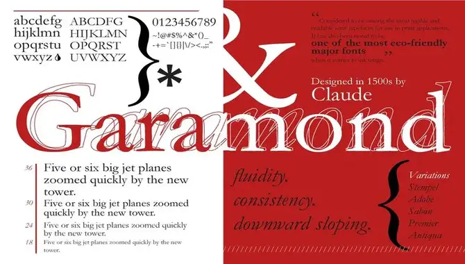
The Garamond font family has become one of the world’s most popular and recognizable fonts. But few people know that Claude Garamond, a man who lived in 16th-century France, gave it its name.
Garamond was a skilled punch cutter and type designer. People highly regarded his work during his lifetime. Many of his designs are still in use today, including the famous Garamond font. Garamond’s influence on typography extends far beyond just his namesake font. He characterized his designs by their elegance and balance.
Which made them popular with publishers and printers of the time. His attention to detail and precision were also known. Which still follows today’s typography standard. Overall, Garamond’s life and work have had a lasting impact on the world of typography. Countless fonts that are used every day show his legacy.
Robert Granjon’s Contribution To Garamond Font
Robert Granjon is known for his significant contribution to the Garamond font family. Granjon was a French-type designer and punchcutter who lived during the 16th century. People highly regarded his skill in creating delicate, refined letterforms. People widely used them throughout Europe during the Renaissance period.
Granjon’s work on Garamond was particularly noteworthy, as he refined and improved upon the original design of the font. He made subtle adjustments to the curves, serifs, and proportions of the letters, resulting in a more elegant and harmonious typeface. Today, Garamond remains one of the most popular serif fonts in use, thanks in large part to Robert Granjon’s contributions.
Revival Era Of The Garamond Font Family
The Garamond font family has a rich history that spans several centuries. It was first created in the 16th century by the French type designer Claude Garamond. However, it wasn’t until the revival era of the 20th century that Garamond’s work gained widespread recognition and appreciation.
During this time, graphic designers and typographers began to rediscover Garamond’s beautiful and elegant typefaces and incorporate them into their designs. Today, both print and digital media widely use Garamond due to its timeless appeal and versatility. Whether you’re designing a book cover or a website, the Garamond font family will surely add sophistication and refinement to your work.
How Renaissance Impacted The Garamond Font Family
The Garamond font family is a classic and timeless typeface that has been around for centuries. It was first created by the French engraver Claude Garamond in the 16th century during the Renaissance period. During this time, there was a renewed interest in classical art and literature, which led to a revival of ancient Roman letterforms. These classical designs heavily influenced Garamond’s font, and it quickly became popular among printers and publishers.
Over the years, the Garamond font family has undergone many changes and variations, but its core design elements have remained the same. Its elegant and sophisticated style makes it a popular choice for book typography, as well as high-end branding and advertising. While many other fonts have come and gone over the centuries, Garamond has stood the test of time and remains one of the most beloved fonts in use today.
The Early Modern Period Of The Garamond Font Family
The Garamond font family has a rich history that dates back to the early modern period of typography. Claude Garamond created the original Garamond typeface in the 16th century. Its elegant, timeless design was known. Many famous printers quickly used it, and it became popular throughout Europe.
Including Christophe Plantin and Robert Estienne. Over the years, the Garamond font family has evolved and expanded to include various styles and variations, each with unique characteristics. It remains a popular choice for designers and typographers, thanks to its classic appeal and versatility in print and digital media. Whether you’re designing a book cover or a website layout, the Garamond font family will surely add a touch of sophistication to your project.
Contemporary Versions Of The Garamond Font Family
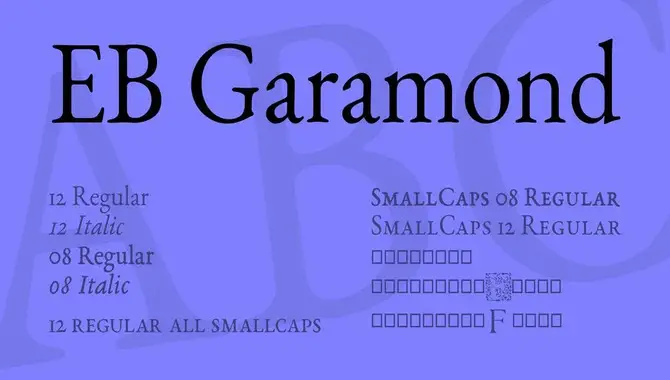
Garamond is a classic font family that has been used for centuries. However, designers have developed contemporary versions of Garamond to meet modern design needs. One example is Adobe Garamond Pro, which features a wider range of weights and styles than the original Garamond font. EB Garamond, a free and open-source font optimized for digital use, is another contemporary version.
These modern versions of Garamond retain the original font’s elegance and legibility while offering new features and capabilities for designers to experiment with. Whether designing a website or creating print materials. Contemporary versions of Garamond can be a great choice for your typography needs.
How To Use The Garamond Font Family For Branding Purposes
Garamond is a timeless and classic font family that can be an excellent choice for branding purposes. Garamond is a typical font family that can be used to add elegance and sophistication to your branding. Here are some tips for using Garamond for branding purposes:
- Use it sparingly. While Garamond is a beautiful font, it can be overwhelming if used too frequently or in large blocks of text. Instead, use it selectively for titles, headings, and other important elements.
- Pair it with complementary fonts. Garamond pairs well with sans-serif fonts like Helvetica or Arial and other serif fonts like Times New Roman or Baskerville.
- Experiment with different weights and sizes. Garamond comes in a variety of weights and sizes, so try experimenting with different combinations to find the right balance for your brand.
- Customize it to fit your brand. While Garamond is a classic font, you can still customize it by adjusting the spacing or adding subtle design elements to make it unique to your brand.
By following these tips, you can use Garamond to create a timeless and sophisticated look for your branding materials.
How The Garamond Font Family Can Impact Your Brand Identity
Choosing the right font can significantly impact your brand identity, and Garamond is no exception. This classic serif font family exudes elegance and sophistication, making it a popular choice for high-end brands in industries like fashion, beauty, and luxury goods. Its timeless appeal also makes it a great option for businesses looking to establish a sense of tradition or heritage.
However, while Garamond can add a touch of class to your brand identity, it may not be the best choice for every business. When selecting a font, one should consider factors like readability and audience perception. When used appropriately, Garamond can be a powerful tool in creating a distinct and memorable brand identity.
Conclusion
Typography plays a significant role in branding and creating an identity for your business. With its rich history and elegant design, the Garamond font family can be an excellent choice to convey sophistication, classicism, and professionalism. It’s important to remember that every font has advantages and disadvantages.
It is a timeless and elegant typeface that can bring a touch of sophistication and class to any design. When used correctly, Garamond can help a brand stand out, communicate its message effectively, and create a lasting impression on its audience. As a designer, it’s important to understand the power of typography and how it can impact a brand’s image. So, consider giving Garamond a try in your next design project and see for yourself how it can elevate your brand’s identity.
Frequently Asked Questions
1.What Font Family Is Garamond In?
Ans: Claude Garamond designed the classic serif font family. Garamond, in the 16th century and is known for its elegant appearance. It’s a popular choice for book design and branding. Some other commonly used serif fonts are Times New Roman, Georgia, and Baskerville.
2.Is Garamond Font Free?
Ans: Garamond is not entirely free, but some versions can be obtained for free. However, the availability of the font varies based on the typeface and licensing agreement. Though some websites offer free downloads, checking the licensing agreement before commercial use is crucial.
3.Is Garamond An Old-Style Typeface?
Ans: Indeed, Garamond falls under Old-Style typefaces, distinguished by their natural and flowing strokes and diagonal stress in their letters. Garamond has been around for centuries since its creation in the 16th century, and it remains a top choice for branding and editorial design due to its timeless elegance and readability.
4.Is Garamond An Acceptable Font?
Ans: Garamond is a reputable and versatile font that exudes elegance and timelessness, making it suitable for various applications. It’s commonly used in print media like books and magazines. Selecting the appropriate font is crucial in establishing a powerful brand identity.
5.What Makes The Garamond Font Family A Good Choice For Brand Identity?
Ans: The Garamond font family is an excellent choice for brand identity due to its timeless and refined appearance that exudes sophistication. It remains legible even in small sizes, making it practical for various applications. Its association with tradition lends credibility, while the range of weights and styles allows design versatility.

David Egee, the visionary Founder of FontSaga, is renowned for his font expertise and mentorship in online communities. With over 12 years of formal font review experience and study of 400+ fonts, David blends reviews with educational content and scripting skills. Armed with a Bachelor’s Degree in Graphic Design and a Master’s in Typography and Type Design from California State University, David’s journey from freelance lettering artist to font Specialist and then the FontSaga’s inception reflects his commitment to typography excellence.
In the context of font reviews, David specializes in creative typography for logo design and lettering. He aims to provide a diverse range of content and resources to cater to a broad audience. His passion for typography shines through in every aspect of FontSaga, inspiring creativity and fostering a deeper appreciation for the art of lettering and calligraphy.
