Title font size refers to the size of the font used for a title or headline in printed or digital media. It is an important aspect of design, as it can affect the readability and impact of the title.
Title font sizes can vary depending on the medium and purpose of the title. Selecting the perfect title font size is a critical aspect of creating any design. However, moving beyond the basics and mastering advanced techniques can take your designs to the next level. One of the best ways to ensure that your title stands out is to play around with font size. Experimenting with different sizes can help you find the perfect balance between readability and aesthetics.
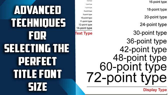
How To Select The Perfect Title Font Size

When creating a visually appealing and effective title for any project, selecting the perfect title font size is crucial. The font size should be large enough to be easily read by the audience but not so large that it becomes overwhelming or difficult to follow. One approach is to consider the context and purpose of the project. For instance, a title for a promotional poster may require a larger font size than a title for a research paper.
Additionally, it’s important to consider the visual hierarchy of the entire project. The title should be proportional to other design elements and not overpower other important information. It’s also important to consider the audience and their reading ability. For example, if the target audience is elderly, a larger font size may be necessary. Lastly, testing the design with different font sizes can be helpful in finding the perfect fit for the title.
You can try using a larger font size for the title and a smaller one for the subtitle. Another technique is to use contrasting font sizes to highlight important information. Additionally, you can create a hierarchy of information by using different font sizes for different levels of information. This technique can help the reader navigate through the design easily. It’s important to consider the context of the design when selecting font size.
Choosing A Font For Digital Platforms
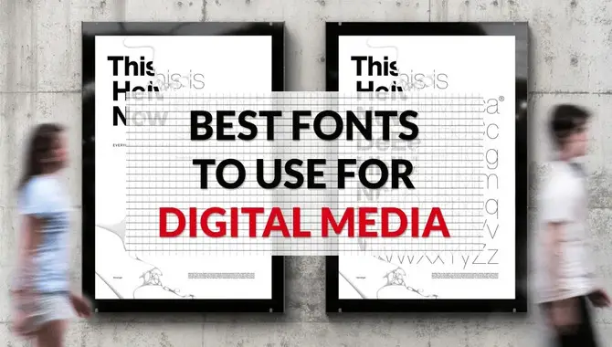
Choosing the right font for digital platforms can make all the difference in the success of our content. With the vast array of options available, deciding which one to use can be overwhelming. First and foremost, it’s important to consider readability.
The font we choose should be easy to read and not cause eye strain, especially considering how much time people spend staring at screens. Additionally, the font should complement the overall design aesthetic of our website or social media page. Serif fonts can give a more elegant and traditional feel, while sans-serif fonts are often associated with modernity and simplicity.
It’s also important to consider the intended audience and purpose of your content. For example, a more playful font might be appropriate for a children’s website, while a serious and professional font might be better for a business website. Finally, be consistent in your font usage throughout your digital platforms. This will help establish a recognizable brand identity and ensure uniformity across all channels.
Accounting For Line Length
When it comes to choosing the right font size for your title, it’s important to take into account the line length of your text. If your title is too long, using a larger font size can help to make it more readable and eye-catching. However, if your title is short and the line length is already small, using a larger font size may not be necessary and could actually make the text look awkward or unbalanced.
It’s always a good idea to experiment with different font sizes and see how they look in relation to the overall design of your project. Ultimately, the goal should be to choose a font size that enhances the readability and impact of your title while also maintaining visual balance within the layout.
Selecting The Appropriate Font Weight
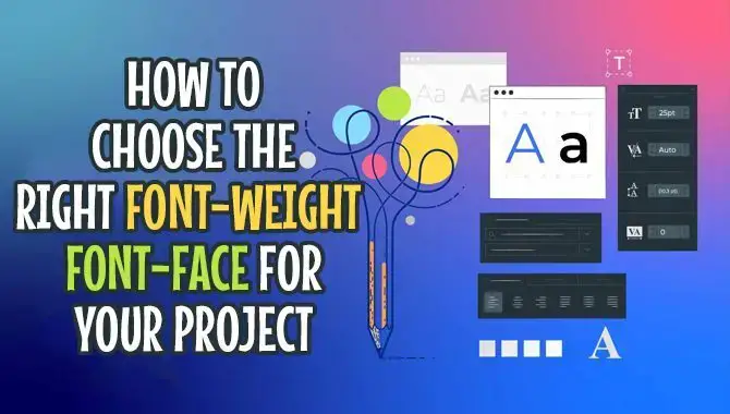
Selecting the appropriate font weight is an essential step in creating effective typography. The weight of a font refers to the thickness of the lines that make up each character. Choosing the right weight can help you convey the intended tone and message of our content.
For example, if you’re designing a logo for a luxury brand, you may want to use a bold and elegant typeface with a heavy weight to communicate sophistication. On the other hand, if you’re creating a website for a tech startup, you may opt for a lighter-weight font to convey a modern and minimalist feel.
When selecting the appropriate font-weight, it’s important to consider the context in which your content will be viewed. For printed materials, we may need to choose a heavier-weight font to ensure readability at a smaller size. For digital content, we may need to consider the screen resolution and adjust the weight accordingly.
Testing Various Fonts
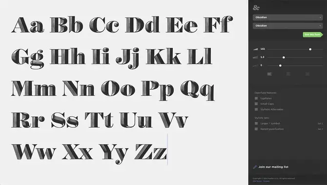
Testing various fonts is an essential part of creating any design project. The right font can convey the right message and help to engage your audience. It’s important to test different fonts to find the one that best fits your brand and the message you want to convey. A font can make or break a design, and it’s crucial to choose the right one. In order to test various fonts, you can use design software such as Adobe Illustrator or Photoshop.
These programs allow you to preview fonts and apply them to your project to see how they look. Another way to test fonts is to print out samples and compare them side by side. This can help you to see how the font looks in different sizes and in various contexts. Additionally, you may want to test the readability of different fonts by having someone else read your text. This can help us to determine which fonts are the easiest to read and understand.
Ensuring Title Font Legibility Across Platforms
In today’s digital age, ensuring the legibility of title fonts across multiple platforms has become more important than ever. With the rise of mobile devices and the increasing popularity of responsive design, web designers must be careful to choose fonts that are easy to read on screens of all sizes. This means selecting fonts that are not only visually appealing but also easy to read in a variety of sizes.
One of the first steps in ensuring title font legibility is to choose a font that is designed with legibility in mind. Sans-serif fonts, such as Arial or Helvetica, are often considered the easiest to read on screens. It’s also important to consider the size and weight of the font, as well as its colour and contrast with the background.
Another key factor in ensuring legibility across platforms is to test the font on a variety of devices and screen sizes. This can be done by using responsive design techniques to adjust the font size and spacing based on the screen size or by using web fonts.
Conclusion
Selecting the perfect title font size is an art and a science. By understanding the key principles of typography and experimenting with different font sizes, designers can create visually appealing and effective title designs that capture the reader’s attention and convey the right tone and message. Remember, it’s not just about choosing the biggest or smallest font size but rather finding a balance between legibility, hierarchy, and aesthetics.
Remember that typography is a powerful tool that can make or break our design, so invest the time and effort to master these advanced techniques and create title designs that stand out. With these advanced techniques, designers can take their title designs to the next level and elevate the overall impact of their visual communication.
FAQ
What Are Some Advanced Techniques For Selecting The Perfect Title Font Size?
Adjusting the font-weight: Depending on the font you choose, you may need to adjust the weight of the font to get the right look. For example, a heavy, bold font may require a smaller size than a lighter, thinner font.
How Can Designers Determine The Appropriate Font Size For A Title Based On Factors Such As The Content?
Designers can determine the appropriate font size for a title based on factors such as the content by considering the hierarchy of information on the page.
What Are Some Common Mistakes That Designers Make When Selecting Font Sizes For Titles?
Some common mistakes that designers make when selecting font sizes for titles include using font sizes that are too small or too large and not considering the hierarchy and importance of the title in relation to other text on the page.
How Can Designers Use Typography To Create A Visual Hierarchy Within A Design?
Designers can use typography to create a visual hierarchy within a design by varying the font size, weight, style, and colour of different text elements. The most important information can be emphasized with larger font size, bold or italicized style, and contrasting colours.
Are There Any Emerging Trends Or Best Practices In The World Of Title Font Size Selection That Designers?
Use a contrasting font size for titles and headings to make them stand out from the body text. Using responsive font sizes that adjust based on the screen size and device being used.

David Egee, the visionary Founder of FontSaga, is renowned for his font expertise and mentorship in online communities. With over 12 years of formal font review experience and study of 400+ fonts, David blends reviews with educational content and scripting skills. Armed with a Bachelor’s Degree in Graphic Design and a Master’s in Typography and Type Design from California State University, David’s journey from freelance lettering artist to font Specialist and then the FontSaga’s inception reflects his commitment to typography excellence.
In the context of font reviews, David specializes in creative typography for logo design and lettering. He aims to provide a diverse range of content and resources to cater to a broad audience. His passion for typography shines through in every aspect of FontSaga, inspiring creativity and fostering a deeper appreciation for the art of lettering and calligraphy.
