Font size percentage is a method of adjusting text size relative to the document’s base font size. For instance, 150% would make it 1.5 times bigger. This technique is often utilized in responsive web design to ensure readability across screen sizes while maintaining consistency.
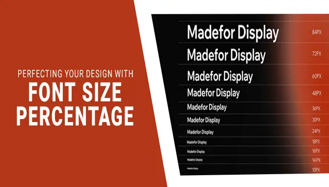
Have you ever wondered how to make your website design look consistent and professional? One of the most important factors in web design is font size. It can make or break the user experience and affect your website’s overall aesthetic. That’s where font size percentage comes into play.
We will dive into font size percentage and how to use it in web designing. We’ll also discuss why it’s important and what benefits come with using it. Whether you’re a beginner or an experienced designer, this post will provide all the information you need to perfect your design using font size percentage.
How To Use Font Size Percentage In Web Designing?

To use font size percentage in web designing, you need to determine the base font size of your document or website. Once you have the base font size, you can adjust the text size using a certain percentage value.
This can be done through CSS styling or inline styles. It’s important to remember that font size percentage should be used in moderation to avoid overwhelming users with too much text and making it difficult to read.
Font size percentage is a technique to set font sizes relative to the parent element. You can achieve this by setting the parent element’s font size and using a percentage for the child element. This approach makes your website more adaptable and responsive to various screen sizes.
How To Use Font Size Percentage
To use font size percentage, determine the base font size and adjust text size using a percentage value through CSS styling or inline styles. Use this technique in moderation for better readability and adaptability to different screen sizes.
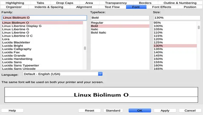
Using font size percentage is a good choice for web developers when designing a website. To ensure consistency across devices and screen sizes, relative font sizes (such as em or rem units) are recommended over absolute values (such as px or pt).
Start by setting the body font size in relation to the default browser size or root element. Use media queries or viewport width (vw) to adjust the surrounding text accordingly. Remember that different font sizes affect the layout, so use line height and padding as needed.
How To Use Font Size Percentages In CSS
First, use font size percentages in CSS to determine the base font size for your document or website. Then, set the parent element’s font size and apply a percentage value to the child element.
For example, if the parent element’s font size is 16px, and you want the child element to be 20% larger, you would set the child element’s font size to 1.2em (equivalent to 120%). Use this technique cautiously and modestly to ensure readability and adaptability on various screen sizes.
Relative units of measurement like em or rem should be preferred over pixels when working with font-size percentages in CSS as they offer better scalability across devices and screen sizes. Using media queries is an effective way to adjust text size for different viewport widths and maintain readability.
It’s also important to consider content hierarchy while choosing percentile values for your fonts. Experimentation is necessary to achieve an ideal balance between aesthetics and legibility while keeping accessibility in mind.
How Does Font Size Percentage Work?
Font size percentage in CSS works by applying a percentage value to the font size of an element relative to its parent element or the default browser size. For example, a font size of 120% on a child element with a parent font size of 16px would result in a font size 19.2px (16px x 1.2 = 19.2px). This allows for scalable and adaptable text sizes across different screen sizes and devices.
Troubleshooting Common Issues With Font Size Percentages
For a flawless rendition of web designs, it is essential to troubleshoot common issues that may arise with font size percentage usage. Correctly setting the font-size property with CSS is vital when designing for accessibility across different browsers and devices.
Adjusting the em unit or using media queries such as vw or rem units can also be a good choice in some instances. However, due to varying screen sizes, web developers must be careful not to use absolute values like px when designing mobile web development sites.
Why Is Font Size Percentage Important For Web Designing?
Font size percentage is important for web designing because it allows for scalability and adaptability of text sizes across different screen sizes and devices. This helps maintain readability and accessibility, key factors in creating a user-friendly website.
It also offers better control over font hierarchy, leading to an ideal balance between aesthetics and legibility. Properly setting the font-size property with CSS is essential for a flawless rendition of web designs.
Things To Keep In Mind While Using Font Size Percentage
In web designing, using font size percentage can greatly impact the rendition of web designs. It is important to remember that relative size is a good choice over fixed size. Paying attention to the hierarchy of your content ensures that your headings are appropriately sized while the body text remains readable.
Testing your font size percentages on various devices will help you create pixel-perfect designs. Always choose relative units like em instead of absolute values like px or pt.
What Are The Benefits Of Using Font Size Percentages?
Font size percentage is beneficial for responsive design as it adjusts font size based on screen size. It also maintains consistency in font sizes and improves accessibility by letting users adjust the font size.
Additionally, using font size percentages can optimize the website for search engines and enhance SEO performance. The benefits of using font size percentage in web designing are:
- Scalability: It allows text sizes to adapt to different screen sizes and devices.
- Readability: It helps maintain the readability and accessibility of the website.
- Control: It offers better control over font hierarchy, leading to an ideal balance between aesthetics and legibility.
- Consistency: It ensures consistent text size throughout the website.
- Compatibility: It works well with responsive design, making the website compatible across various devices.
Conclusion
To sum up, using font size percentage is essential to web designing. It helps create a responsive design that adapts to different screen sizes, enhances the user experience, and makes your content more accessible to all users. Using font size percentage in CSS allows you to create a consistent and proportional design across all website elements.
However, it’s crucial to remember some best practices while using font size percentages, such as balancing readability with aesthetics, avoiding excessive use of fonts, and testing your design across different devices. By following these guidelines, you can perfect your design with font size percentage and ensure a seamless user experience for your audience.
Frequently Asked Questions
Can You Do Font Size As A Percentage?
Yes, font size can be set as a percentage in web design. Using relative units such as percentages over fixed units like pixels or points is recommended.
What Does Font Size 200% Mean?
When the font size is 200%, the text is twice as big as its default size. While this can improve readability, increasing font size too much may impact design. Font size percentage is relative and varies across devices. Testing different sizes on various screens ensures optimum results.
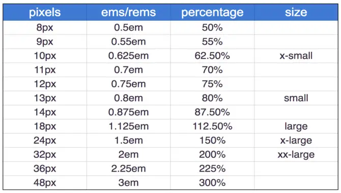
What Is The Px Of Font Size 100%?
The px value for font size 100% varies depending on the browser’s default font size, usually 16px. Using percentage values for font sizes can improve website responsiveness across devices. Testing your website on various devices is crucial to guarantee the legibility and consistency of font sizes.
Why Is The Font Size In Percent, Not Points?
Font size is measured in percent instead of points because it provides flexibility and responsiveness to different screen sizes. Absolute measurements like points make it difficult for fonts to adjust to various devices, while percentages maintain consistency and allow scalable designs.
What Is The Best Way To Increase Font Size Percentage?
To increase font size percentage, modify the CSS stylesheet using the “font-size” property and designate a percentage value or em/rem measurement unit. However, ensure consistency and balance with other elements on your website when adjusting font sizes.

David Egee, the visionary Founder of FontSaga, is renowned for his font expertise and mentorship in online communities. With over 12 years of formal font review experience and study of 400+ fonts, David blends reviews with educational content and scripting skills. Armed with a Bachelor’s Degree in Graphic Design and a Master’s in Typography and Type Design from California State University, David’s journey from freelance lettering artist to font Specialist and then the FontSaga’s inception reflects his commitment to typography excellence.
In the context of font reviews, David specializes in creative typography for logo design and lettering. He aims to provide a diverse range of content and resources to cater to a broad audience. His passion for typography shines through in every aspect of FontSaga, inspiring creativity and fostering a deeper appreciation for the art of lettering and calligraphy.
