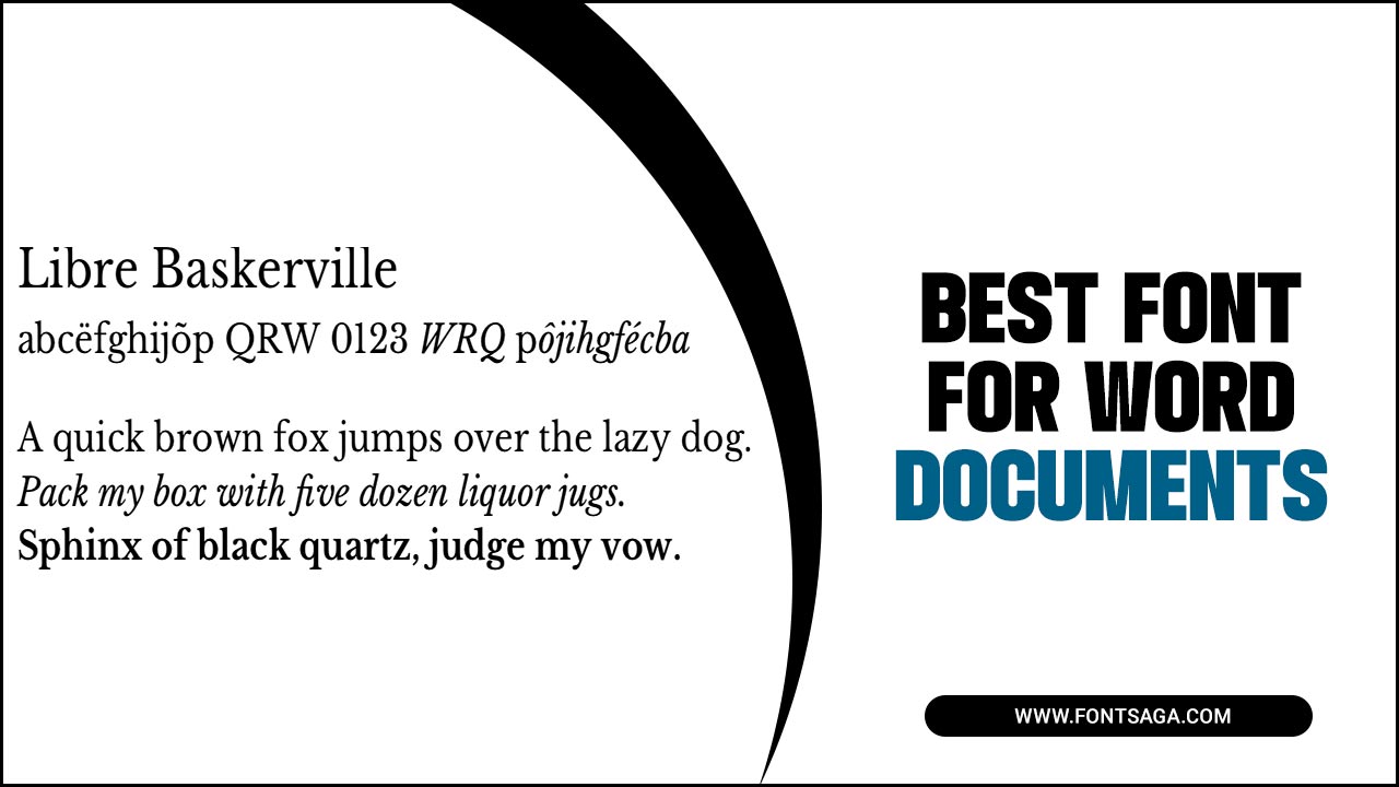
Choosing the right font for your Word documents is an important decision that can impact how your content is perceived. Your font can affect readability, professionalism, and overall aesthetic appeal.
When selecting a font for your Word documents, it is important to consider factors such as legibility, compatibility across different devices and operating systems, and the tone or message you want to convey.
We will discuss the 7 best font for word documents, including Times New Roman, Arial, Calibri, Verdana, Georgia, Garamond, and Helvetica. We will also provide some tips on what to consider when choosing a font for your Word document.
The 7 Best Font For Word Documents
Choosing the right font for your Word documents is crucial for effective communication. To ensure readability, opt for fonts that are easy to read, especially in smaller sizes. It’s also important to consider the tone and purpose of your document, selecting a font that aligns with your message.
Stick to standard fonts to ensure compatibility across different devices and systems. Avoid fonts with excessive decoration, opting for clean and simple designs. Choosing the best font for your Word documents can greatly impact your work’s overall readability and professionalism. Here are seven fonts that are widely considered to be some of the best options for Word documents:
Times New Roman
Times New Roman, a widely used serif font for word documents, is favored for its professional appearance and readability. People often recommend this classic font for academic or formal documents, but it may not be the best choice for creative or informal contexts. When selecting a font, always consider your document’s purpose, audience, and overall tone to ensure the right fit. Remember, readability is crucial, so choose a font that is easily read in different sizes, both in print and digital screens.
Arial
When choosing the perfect font for word documents, Arial emerges as one of the top contenders. This highly versatile and commonly used sans-serif font offers exceptional legibility, making it a great choice for printed and digital documents. With its contemporary and uncluttered appearance, Arial lends a modern touch to various document types, such as reports, presentations, and resumes. Its diverse range of weights and sizes allows for customization, ensuring consistency throughout your document. In your quest for the best font for word documents, consider Arial seriously.
Calibri
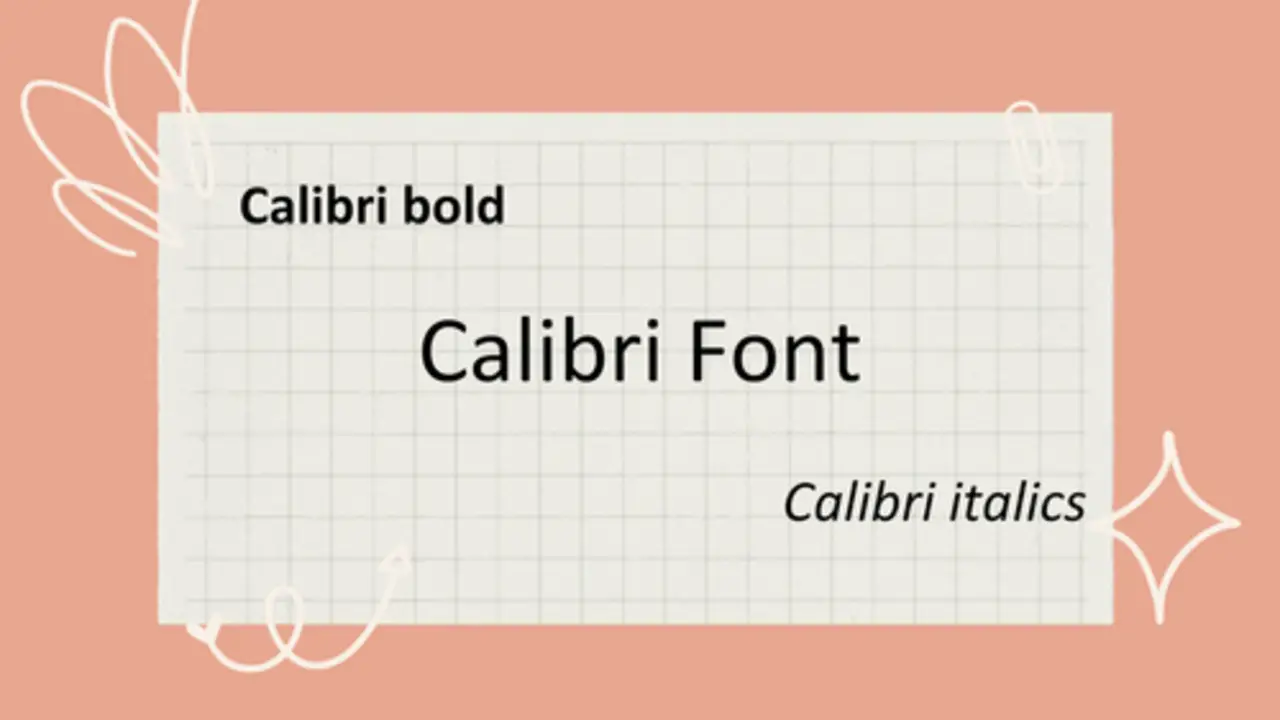
Calibri is a widely used and popular font for word documents. Its clean and modern look makes it easy to read and gives a professional appearance to your documents. Developed specifically for on-screen reading, Calibri is compatible with digital documents, ensuring legibility on computer screens or when printed. Being a sans-serif font, it offers simplicity and ease of reading without the small decorative lines. Calibri provides various weights, allowing you to highlight important text or headings in your document, emphasizing consistency.
Verdana
Verdana is known for its readability and versatility, making it a popular choice for Word documents. This font, designed specifically for on-screen display, ensures easy readability on different devices. Its clean and modern appearance makes it suitable for a wide range of professional or casual documents.
The wide spacing between letters and clear distinction between characters contribute to its legibility. With multiple weights available, Verdana offers flexibility in design and allows for emphasis where needed. Verdana should be a top consideration when choosing the best font for your word documents.
Georgia
Georgia, a versatile serif font, is widely recognized as one of the best options for word documents. It’s excellent readability and timeless design make it a popular choice for professional and creative projects. Specifically designed for on-screen reading, Georgia ensures optimal legibility for digital documents.
With its wide letter spacing and large x-height, this font remains clear and easy to read even at smaller sizes. Available on most operating systems, Georgia guarantees consistency across different devices and mediums.
Garamond
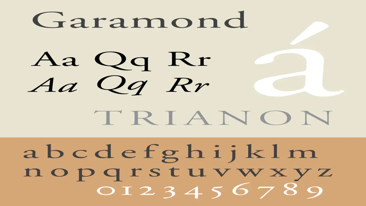
Garamond is a versatile and widely used font for professional documents. With excellent readability, well-balanced letterforms, and clear spacing, Garamond ensures your content is legible and visually appealing. Its timeless serif typeface adds a touch of sophistication, making it a popular choice among professionals.
Garamond is available in various weights and styles, allowing you to customize your document’s appearance while maintaining consistency. Whether you’re creating legal documents, business reports, or other professional content, Garamond is the right font to convey a professional and polished look.
Helvetica
When it comes to choosing the right font for word documents, Helvetica is a top contender. This highly versatile font is known for its clean and modern appearance, making it a popular choice for printed documents and on-screen reading. Perfect for professional documents, Helvetica exudes a sense of professionalism and neutrality with its sleek sans-serif design.
Helvetica will ensure your content looks polished and legible, whether you need to create memos, legal documents, or business reports. Take advantage of the various weights and styles available for this font, and customize your document’s design while maintaining consistency. With Helvetica, you can trust that your words will make a powerful impact.
What To Consider When Choosing A Font
When choosing a font for your word documents, it’s important to consider a few key factors. First and foremost, prioritize readability by opting for a font that is easy to read, especially for longer documents. Additionally, make sure the font aligns with your document’s overall tone and purpose. For professional documents, you may want to consider serif fonts such as Garamond or Georgia for their touch of sophistication.
If you prefer a more neutral and modern look, sans-serif fonts like Helvetica can be a great choice. It’s also important to ensure your chosen font is widely available and compatible across different devices and platforms. Don’t forget to adjust the font size and spacing to enhance readability and visual appeal. Lastly, maintain consistency by using the same font throughout your document for a professional and polished look.
Conclusion
Choosing the best font for word documents is essential to create a professional and visually appealing look. Consider factors such as readability, style, and compatibility when selecting. Remember that different fonts convey different tones and emotions, so It is important to consider factors such as readability, professionalism, and compatibility with different devices and software.
Some popular fonts used for word documents include Arial, Times New Roman, Calibri, and Helvetica. Ultimately, the best font choice will depend on the intended audience and purpose of the document. It may be helpful to test different fonts and gather feedback from others before making a final decision.
Frequently Asked Questions
1.What Is The Best Font For- Word Documents?
Ans: The best font choice for word documents depends on various factors such as the purpose and audience. Popular fonts like Arial, Calibri, and Times New Roman are commonly used for general documents, while professional documents often use fonts like Helvetica, Garamond, or Georgia. Consider factors like readability, legibility, and compatibility when selecting a font for your Word documents.
2.Which Font Is Better: Arial, Helvetica, Times New Roman Or Courier New?
Ans: The best font depends on the purpose and tone of your document. For a professional look, choose Arial or Helvetica. Times New Roman is ideal for formal documents, while Courier New is great for coding or creating a vintage feel. Consider the context and aesthetics when selecting a font.
3.Can I Install Additional Fonts In Microsoft Word?
Ans: Yes, you have the option to install additional fonts in Microsoft Word. Simply access the font settings in your computer’s control panel or settings menu, download trusted font files, and install them on your computer. These new fonts will then be available for selection in the font dropdown menu in Microsoft Word. Remember to choose legible and suitable fonts for your document’s content.
4.Is It Important To Match The Font Style To The Tone Or Purpose Of The Document?
Ans: Yes, it is crucial to choose a font style that aligns with the tone and purpose of the document. Formal documents should use clean and professional fonts like Arial or Times New Roman, while creative or playful documents can benefit from fonts like Comic Sans or Brush Script. The right font choice improves readability and effectively communicates the intended message.
5.How Do You Choose A Good Font For Word Documents?
Ans: When selecting a font for word documents, prioritize readability, especially for longer texts. Ensure the font aligns with the document’s tone and purpose. Opt for common and widely available fonts to ensure compatibility. Experiment with different styles to find the one that suits your specific document best.

David Egee, the visionary Founder of FontSaga, is renowned for his font expertise and mentorship in online communities. With over 12 years of formal font review experience and study of 400+ fonts, David blends reviews with educational content and scripting skills. Armed with a Bachelor’s Degree in Graphic Design and a Master’s in Typography and Type Design from California State University, David’s journey from freelance lettering artist to font Specialist and then the FontSaga’s inception reflects his commitment to typography excellence.
In the context of font reviews, David specializes in creative typography for logo design and lettering. He aims to provide a diverse range of content and resources to cater to a broad audience. His passion for typography shines through in every aspect of FontSaga, inspiring creativity and fostering a deeper appreciation for the art of lettering and calligraphy.
