The font is more than just a design choice; it influences how your message is perceived. A typeface can impact your message’s believability, authority, and trustworthiness.
That is why choosing a visually appealing and purposeful font type is essential. Here, we’ll discuss the standard font and its features.
We also cover how to use standard fonts on your website, outline the best font for resumes in 2023, and how to use standard fonts in your documents. Additionally, we will highlight the benefits and disadvantages of using a standard font and considerations while using it.
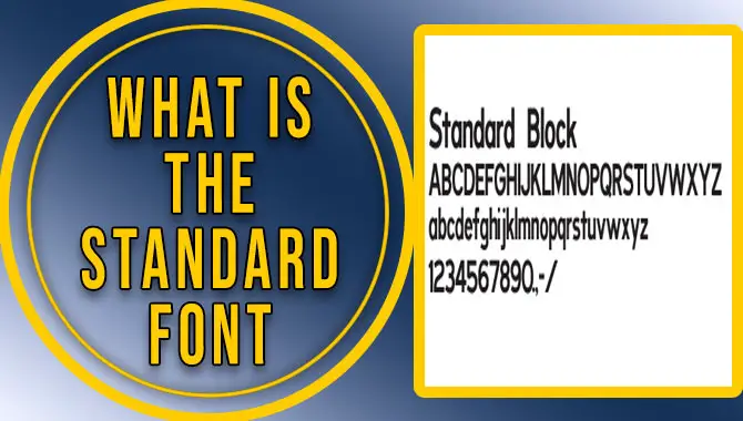
What Is The Standard Font?
The standard font used in different contexts varies. Courier New is the default font used in movie screenplays, coding displays, and emails. On the other hand, the default font for documents such as Microsoft Word is Times New Roman. Comic book creation involves different technical aspects, including font size, which influences the readability of the content. Comic book artists use specialized fonts that can be either handwritten or digital.
For academic papers, the Modern Language Association (MLA) recommends an easily readable serif font, such as Times New Roman, and a standard size of 10-12 points. This makes the content more accessible and helps readers understand the content better. Understanding the standard font used in different contexts is important to convey your message effectively.
Standard Font Features
The standard font is a fixed-width typeface designed to be used consistently across different media, such as print, web, and mobile. A standard font is typically not intended to be used in every situation.
It might be a better choice for body text than headers or logos. In general, search for a standard font with a legible and readable style suitable for the intended use. Here are some features to look for when selecting a standard font:
Clear and readable letters: A standard font should have clear and readable letters that are easy on the eyes. Look for fonts that are well-spaced and have good kerning and tracking.
Consistent appearance: A standard font should be consistent across different media, such as print, web, and mobile. That means it should look the same no matter where or how it uses.
Legibility at various sizes: A standard font needs to be legible at various sizes, such as 14-point fonts on paper or 12 pixels on a screen.
Versatility: A standard font should be versatile enough to be used in many situations. For example, it might be better for body text than headers or logos.
How To Use Standard Fonts On Your Website?
Standard fonts like Times New Roman or Arial can give your website a consistent and professional look. Generally, it’s best to avoid custom fonts unless necessary for branding or style. However, if you use custom fonts, ensure they are legible and accessible to all users. Consistency is key, so stick to one font and size throughout your website. Consider using a widely available and easily readable serif font for academic papers or other submission formats.
A standard font a specific typeface commonly uses in many different media types. One way to use standard fonts in your website is by using them as the main text color and font size. Choosing a standard font will guide your audience’s eye toward the main focus of your content, which can increase usability and readability. Another way to use standard fonts in your website is by choosing a body font for your paragraph text.
This will make it easier for readers to read because it has a larger and more consistent amount of text than using individual font sizes. Finally, using standard fonts can also do subconsciously by using them in your images, buttons, and headlines. All these small choices can help increase your website’s readability and overall design.
Best Font For Resume In 2023
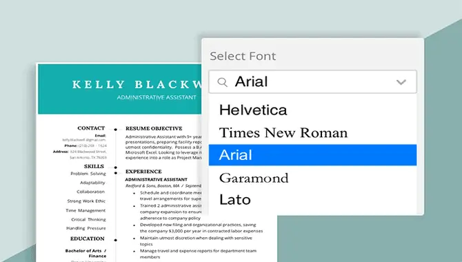
The best fonts for a resume in 2023 are Times New Roman and Arial. Times New Roman is the classic resume font used for years. Arial is a modern, clean font considered one of the most readable. For clarity, you should consider using sans-serif fonts like Arial, Verdana, and Helvetica.
Calibri

Calibri is an excellent choice for a resume font. It has a classic, elegant feel that will help to make your resume look professional and well-written. Calibri is available in numerous weights and styles, making finding a suitable version easy.
Additionally, Calibri is commonly handy in many professional settings, such as government agencies, law firms, and businesses, which helps to cement further its reputation as a great choice for a resume font. Overall, Calibri is an excellent choice for a font that can enhance the professionalism of your resume.
Cambria
When choosing the best font for your resume in 2023, experts recommend Cambria as the top option. This serif font is easy to read and professional-looking, making it a perfect choice for resumes. Other options for serif fonts include Georgia and Garamond.
Cambria is a font perfect for signaling a more personal, creative tone in your resume. It has a modern feel that will set you apart from other candidates and give you the edge when applying for jobs or interviewing with companies. Additionally, Cambria is versatile enough for traditional and nontraditional applications to fit any design scheme.
Helvetica
When it comes to creating a resume, you want to ensure that you have the best font to make it look professional. Helvetica is a great choice for this. It is a sans serif font that is easy to read and has a modern and classic look that will make it look professional. It is also a versatile font, meaning that it can be used in various contexts and doesn’t take away from the document’s content.
Helvetica is a popular and easy-to-read sans-serif font often used for signage and business forms. While it may lack a distinctive character, its simplicity makes it versatile for different scenarios and designs. The New York City subway system and BMW use Helvetica for their signs.
Georgia
Georgia is one of the top choices when considering which font to use on your resume. Georgia is an easy-to-read font with a classic and timeless style. It is a serif font with little “feet” at the ends of its letters, giving a professional and classic look.
Georgia is a serif font popular for its elegant appearance. It’s ideal for resumes that want to project a more polished and professional look. Additionally, Georgia is a great choice if you’re looking to stand out in the crowded competition of job applications.
Verdana
When choosing the best font for a resume in 2023, Verdana is worth considering. Created by Microsoft to be a highly legible sans-serif font, Verdana is a solid alternative to Helvetica and Arial. It is well-suited for fitting a lot of text into a small space, making it a popular choice for online and printed documents.
Because of its clean, sans-serif design, Verdana is a great font for highlighting important information and can be easily adjusted to fit various sizes and layouts. Plus, it’s available on all major word processing programs, making it easier to use when creating your resume.
Garamond
Garamond is a serif font that has a classic appearance. It’s often used in academic and legal documents, as well as for advertising and logos. While Garamond may be a little more expensive than other fonts on this list, its unique style will set you apart from your competition.
Garamond is a great font to use on a resume. It is a serif font that is easy to read and has a classic look. It is a good choice for those looking for a professional, timeless look on their resume. It is also great for making small resume alterations without drastically changing the document’s look.
How To Use The Standard Font In Your Documents
The default font for most documents is usually a serif font like Times New Roman or sans serif fonts like Arial and Helvetica. Maintaining a minimum font size is crucial for legibility, and adjusting the font weight, size, and color helps establish a hierarchy.
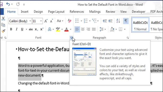
First, open your word processor or text editor. Next, choose the Font tab on the ribbon and click the More Options button next to the font name you want to use. Select the Standard option from the list of fonts and press OK. Your word processor or text editor will now use that standard font when printing documents with that specific font.
You can also change fonts by choosing any other standard font in your list. If you don’t find a standard font, you can create your custom one by clicking the +Add New button in the bottom-right corner of the Standard Fonts dialog box. You can also try checking out some of these popular open-source fonts, which give you a lot of freedom in terms of typeface and style: http://www.themesfreedownload.com/free-fonts-download/.
What Are The Benefits Of Using A Standard Font?
A standard font, like Times New Roman, can make documents more easily read. They provide readers with a consistent and familiar appearance and reduce the time and effort required to adjust to new fonts. It’s equally important to ensure legibility by maintaining a minimum font size, especially when adjusting text size is possible.
Another widely-used font, Courier New, is a monospace serif font typically seen in coding displays and movie screenplays. In contrast, the new font type Tenorite has a traditional sans-serif appearance with a crisp, clean style. Tenorite is designed to be comfortable to read in smaller sizes on digital screens.
Adjusting font weight, size, and color can also help emphasize essential information and maintain the visual hierarchy. Consistency in font usage can provide a professional and polished appearance for all documents. When used correctly, the standard font can make your work more accessible to your audience, build credibility, and make your document more visually appealing.
What Are The Disadvantages Of Using A Standard Font?
Standard fonts like Times New Roman are classic and safe choices for documents, but they may not always be the best choice. First, font size is critical for legibility, so consider Dynamic Type settings for better reading. Secondly, default fonts, like Times New Roman, lack uniqueness and may be perceived as boring. Avoid heavily stylized fonts that can be difficult to read or convey a lack of seriousness, especially on a professional resume.
Going for custom or gimmick fonts may also be a disadvantage, as people may find them difficult to read against printed manuscripts. Additionally, many Applicant Tracking Systems (ATS) struggle with converting non-standard fonts, and compatibility issues arise. It’s important to balance readable and unique typography for standard fonts.
Considerations While Using Standard Fonts
When using standard fonts, there are certain considerations that one must take into account. Minimum font size should be easily readable and may vary based on device display and environmental factors. The default font is a computer’s text styling when opening a document.
Font size balance is crucial in a resume to avoid being too long or small. Use larger font sizes for important information and maintain logic. Standard font sizes are 10.5 for bullets and 12 or 14 for company names, dates, and past job titles, depending on the font.
One must also adjust font weight, size, and color to emphasize important information and maintain the relative hierarchy. It is important to keep it pleasing to the eye, legible, and not too long. Don’t forget to decrease the font size if it spills onto the second page but doesn’t cram too much information into one page.
Conclusion
A standard font is a go-to option for many businesses, blogs, and professionals. A standard font has numerous features that aid readability and convey a trustworthy and professional message. These fonts are easily readable and convey the required information clearly and concisely. However, they may have limitations.
You should be conscious about using them in certain situations, such as attracting attention or conveying a more creative or unique message. In conclusion, a standard font is an excellent choice for a straightforward, easy-to-read style. To learn more about the best font options, check out our comprehensive blog on standard fonts and their features.
Frequently Asked Questions
Is The Standard Font Size 11 Or 12?
There is no definitive answer to whether the standard font size is 11 or 12. Most books, magazines, and newspapers use type sizes smaller than 12 points, but the size of lettering can vary depending on the font used. Common Desktop Environment platforms offer at least six point sizes for each font with Standard Font Name.
What Is The Standard Letter Font And Size?
Comics have no standard letter font and size, as various fonts have different sizes and styles that can affect how readers interpret the text. Some common font designs include Serif, Serif proportionally spaced, Sans-serif, and Sans-serif proportionally spaced. While Times New Roman is a common default font, font selection and sizing are crucial in comic book lettering.
Is Arial A Standard Font?
Arial can be considered a standard font due to its widespread use in online and printed media. It is available on all major operating systems, making it a safe choice for web fonts. The Arial font family is popular for various types of online media, including reports, presentations, logos, brochures, blogs, and advertising.
What Is The Normal Font Style?
The normal font style can vary depending on the context. Times New Roman is a common and classic font often used for readability, while Arial is recommended for resumes. Courier New is a popular choice for coding and screenplay formatting.
Is There A Difference Between Web, Vector, And Bitmap Fonts?
There are differences between web, vector, and bitmap fonts. Web-safe fonts include serif, sans-serif, monospace, cursive, fantasy, and MS. Default fonts, like Times New Roman, are commonly used by computers.

David Egee, the visionary Founder of FontSaga, is renowned for his font expertise and mentorship in online communities. With over 12 years of formal font review experience and study of 400+ fonts, David blends reviews with educational content and scripting skills. Armed with a Bachelor’s Degree in Graphic Design and a Master’s in Typography and Type Design from California State University, David’s journey from freelance lettering artist to font Specialist and then the FontSaga’s inception reflects his commitment to typography excellence.
In the context of font reviews, David specializes in creative typography for logo design and lettering. He aims to provide a diverse range of content and resources to cater to a broad audience. His passion for typography shines through in every aspect of FontSaga, inspiring creativity and fostering a deeper appreciation for the art of lettering and calligraphy.