The white font is the text that appears as bright or light on a dark background. It’s often used in graphic design and website layouts for its high contrast effect.
However, it’s important to consider legibility and readability, especially for those with visual impairments. We will explore the power of white font on black background. Discover why designers opt for this striking contrast and gain valuable tips for incorporating it into your designs. Get ready to make a visual impact with white font on a black background.

The Impact Of White Font On Black Background
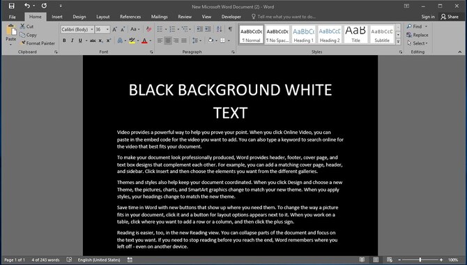
White font on black background creates a visually striking and high-contrast effect, enhancing readability in low-light environments. This elegant and sophisticated design choice is commonly used. However, it may cause eye strain if used for long-form reading or large blocks of text. The impact of white font on a black background varies depending on the design and context.
Using white font on a black background can significantly impact a piece’s overall design and readability. The high contrast between the white text and the black background makes the text stand out and adds a bold, dramatic effect to the design. This can be particularly effective for creating a sense of urgency or drawing attention to important information.
However, it is important to consider the context in which white font on a black background is handy. While it can be visually striking, it may not suit all content or audiences. It is also important to ensure that the font size and style are appropriate for readability, as small or intricate fonts may become difficult to read against a black background.
Reading Vs Scanning

Reading white text on a black background can present difficulties for some people, unlike reading black text on a white background. The high contrast generated by the white font on a black background makes it more legible for certain individuals.
However, extended exposure to this combination may result in eye strain and fatigue. Conversely, scanning or quickly going through text is typically easier with black font on a white background since it enables rapid identification of key information. When choosing between white font on a black background or the opposite, it’s crucial to consider the specific audience and the intended purpose of the visual content.
Paragraph Text
White font on a black background can create a visually striking and high-contrast effect, making it stand out prominently. Graphic designers, advertisers, and web developers commonly use this combination to create a bold and modern look.
However, it is important to consider legibility when using this color scheme, especially in smaller sizes. The high contrast can sometimes make the text harder to read, affecting readability and usability. We recommend using larger font sizes and fonts with good readability to enhance legibility. Finding a balance between aesthetics and readability is crucial when using a white font on a black background to ensure optimal user experience.
Headings, Titles, And Labels
Black backgrounds with white font create a visually bold and attention-grabbing effect commonly used for headings, titles, and labels. This high-contrast combination enhances readability and ensures that the text stands out. Designers often associate visual styles like minimalism, modern or futuristic designs with white font on a black background.
Carefully selecting legible fonts and appropriate font sizes, you can maximize the readability of white font on a black background for your users. Incorporating this color combination adds a touch of sophistication and style to your design, making it visually appealing and engaging.
The Different Types Of White Fonts
Different types of white fonts can be effectively used against a black background to create visually striking designs. Regarding white text on a black background, popular choices include sans-serif fonts like Arial or Helvetica for their excellent readability.
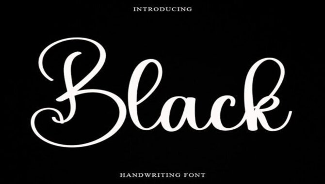
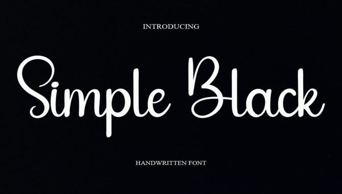
Serif fonts such as Times New Roman or Georgia can be used for a more elegant or traditional look. You can employ handwritten or script fonts to add a unique touch. When selecting the font, consider the size and spacing to ensure optimal readability.
Reasons To Use White Font For Black Background
White font on a black background provides numerous benefits when used in the design. One of the primary advantages is the high contrast it creates, making the text stand out and grab the reader’s attention. This is particularly useful for headings, titles, and labels, allowing them to make a bold impact.
Moreover, white font for black background is handy in design styles such as minimalism, modern, or futuristic, providing a sleek and stylish appearance. In addition to aesthetics, the high contrast between white text and a black background enhances readability, making the text easier to comprehend. However, selecting a legible font style and size is essential to ensure optimal readability and usability.
Why Use White Fonts On A Black Background?
Using white fonts on a black background can enhance the visual appeal of your design and create a sense of sophistication and style. The high contrast between white text and a black background grabs attention and makes the text stand out.
This color combination is particularly effective for headings, titles, and labels, allowing them to make a bold impact. Moreover, white font on a black background is commonly used in design styles like minimalism, modern, or futuristic, providing a sleek and stylish appearance. Apart from aesthetics, the high contrast enhances readability, making the text more easily comprehended.
Tips For Using White Fonts On A Black Background

To achieve a visually striking and modern design, it is recommended to use white fonts on a black background. One important aspect to remember is ensuring sufficient contrast between the white font and black background for improved readability.
Use a clean and simple font that is easy to read, and avoid using small font sizes that may pose difficulties on a black background. Consider implementing design elements such as drop shadows or outlines to enhance visibility further. Following these guidelines can create an aesthetically pleasing and user-friendly design without compromising readability.
Conclusion
To sum up, the impact of using white font on black background can be visually striking and attention-grabbing. It can enhance readability and make certain elements stand out. However, it’s important to use white fonts carefully and consider the context in which they are used.
White fonts work best for headings, titles, and labels but may not be suitable for long paragraphs of text. When used correctly, white font on a black background can create a visually appealing design.
Frequently Asked Questions
Should You Use White Text On Black Background?
Yes, using white text on a black background can be a visually appealing choice for your design. It creates strong contrast and grabs attention, making the text stand out. However, ensuring sufficient contrast and legibility is important for optimal readability.
How Do You Get The White Font On A Black Background?
To achieve white font on a black background, you can use CSS code by setting the font color to white and the background color to black. In graphic design software, select the text and change the font and background color. For word processing software, choose a black background and change the font color to white.
What Is White Text On A Black Background?
White text on a black background is a design choice where white-colored text is placed against a black-colored background. It’s a popular style in graphic design, websites, and presentations due to its high contrast and striking effect.
Why Do I Struggle To Read White Text On Black Background?
Reading white text on a black background can be difficult due to the high contrast, glare, and strain it causes on the eyes. The small gaps between letters can also distort the characters, making them harder to read. Individuals with visual impairments or conditions like dyslexia may find this even more challenging.
What Is The Best White Font On A Black Background?
Regarding choosing the best white font on a black background, prioritize high contrast and readability. Opt for sans-serif fonts like Arial, Helvetica, or Verdana. Make sure the font size is large enough for easy reading. Feel free to experiment with different fonts that align with your design style and readability requirements.

David Egee, the visionary Founder of FontSaga, is renowned for his font expertise and mentorship in online communities. With over 12 years of formal font review experience and study of 400+ fonts, David blends reviews with educational content and scripting skills. Armed with a Bachelor’s Degree in Graphic Design and a Master’s in Typography and Type Design from California State University, David’s journey from freelance lettering artist to font Specialist and then the FontSaga’s inception reflects his commitment to typography excellence.
In the context of font reviews, David specializes in creative typography for logo design and lettering. He aims to provide a diverse range of content and resources to cater to a broad audience. His passion for typography shines through in every aspect of FontSaga, inspiring creativity and fostering a deeper appreciation for the art of lettering and calligraphy.
