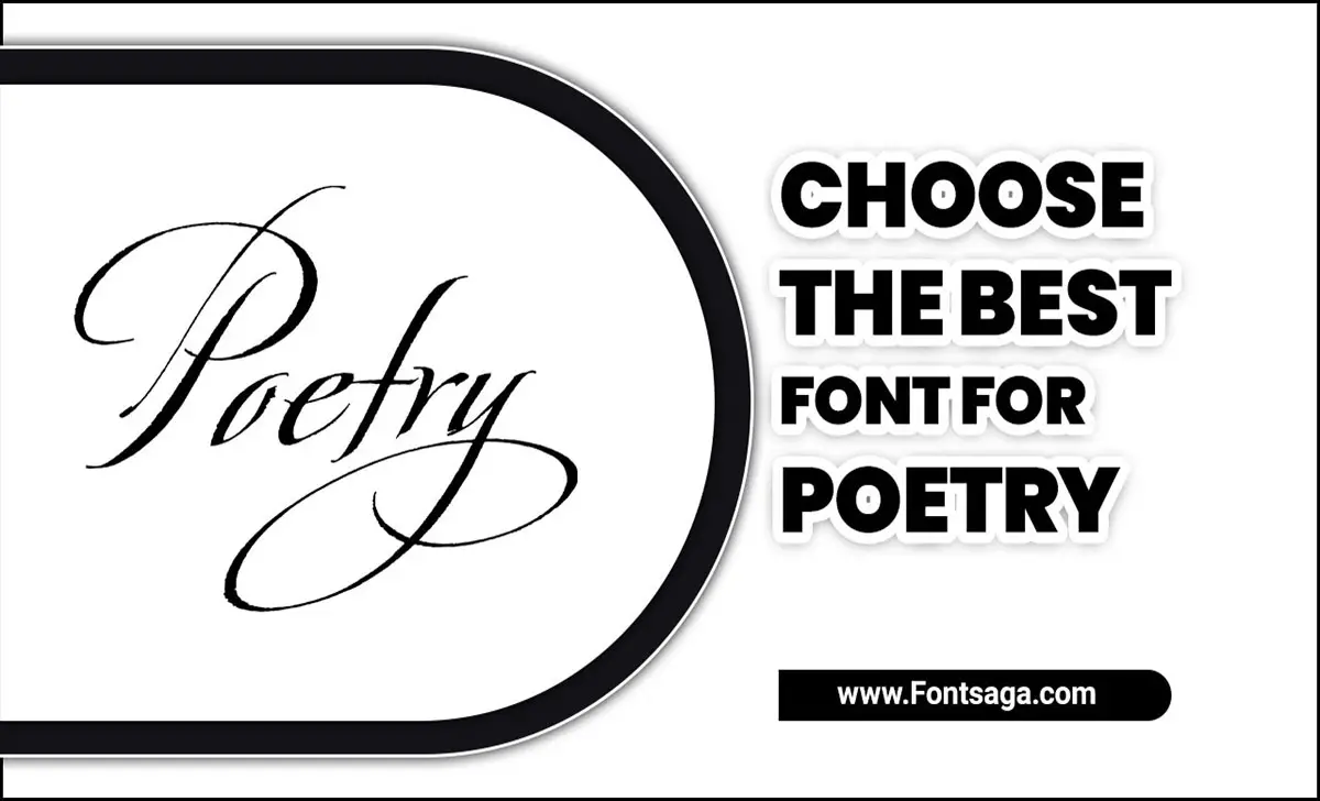
From the use of metaphors and meter to the choice of words, poets pour their hearts and souls into each line they write. However, one crucial element often overlooked is the font in which the poem is presented.
The right font can help enhance the mood and tone of a poem, while the wrong one can distract and detract from its intended impact. As such, choosing the best font for poetry is a decision that should not be taken lightly.
Here, we will delve into how to choose the best font for poetry and provide tips on choosing the perfect font to bring your words to life on the page. Whether you are just starting your creative journey, understanding the nuances of font selection can elevate your poetry to new heights.
Importance Of Font Choice In Poetry
The importance of choosing the perfect poetry book fonts cannot be overstated. The selection of fonts can greatly impact how the poem is perceived and understood. Regarding web design, the choice between standard fonts, script fonts, and sans serif fonts can make a significant difference in the readability and aesthetic appeal of the poem.
Fonts like PT Sans, Open Sans, and Gill Sans perfectly balance readability and style. In applications like Microsoft Word or Google Fonts, selecting the right font style and font pairing can enhance the overall presentation of the poetry.
Fonts like Font Awesome can add a touch of creativity and uniqueness to the text. Ultimately, the font chosen for a poem can play a crucial role in conveying the intended emotions and messages to the readers. Here are a few reasons why font choice matters in poetry:
- Visual Appeal: Different fonts for books have distinct visual qualities that can evoke certain moods or atmospheres. A flowing cursive font may convey elegance and grace, while a bold and angular font may create a sense of strength or urgency. The right font can complement the content and enhance the reader’s visual experience.
- Emphasizing Meaning: Font choice can help emphasize specific words or phrases, guiding the reader’s attention to key elements in the poem. By adjusting the font larger font size, weight, or style, poets can create visual emphasis that enhances the intended meaning or emotions behind certain lines.
- Creating Rhythm: Just as the choice of words and line breaks contribute to the rhythm of a poem, font selection can also influence how a poem is read and interpreted. Fonts with varying capital letter heights, spacing, or unique letterforms can introduce a sense of musicality and rhythm to the poem, enhancing its overall flow.
- Reflecting Themes Or Concepts: The font choice can also reflect or reinforce the themes or concepts explored in the poem. For example, a font that mimics the organic shapes and forms in the natural world may present a poem about nature.
Top 5 Poetry Book Fonts
Selecting the perfect font is crucial in poetry, as each typeface conveys a unique tone and enhances the overall message. Utilizing different fonts can add visual interest and depth to the poetry presentation. From Claude Garamond’s elegance to Font Awesome’s versatility, choosing the right font can elevate the impact of a poem.
Display fonts captivate readers, while decorative fonts add flair. Even email and cover letter fonts shape the reader’s experience, demonstrating the importance of a thoughtful font selection in poetry. Some popular choices for poetry book fonts include:
1.Kirimomi Swash

When choosing the best font for a poetry book, Kirimomi Swash is an excellent option. This elegant and sophisticated font adds a touch of artistic flair to your poetry, making it visually appealing to readers.
The swashes and flourishes in this font create a beautiful flow on the page, enhancing the overall aesthetic of your book. Whether publishing a collection of love poems or exploring deep philosophical concepts through verse, Kirimomi Swash can add that extra layer of beauty and elegance to your poetry book.
2.Portoluce
Portoluce is a beautiful font that is perfect for poetry books. Its elegant and flowing design adds a touch of sophistication to the text, enhancing the overall reading experience. The tall, slim letterforms create a sense of elegance and grace, while the subtle serifs give the font a classic and timeless feel.
Portoluce is highly legible even at smaller sizes, making it ideal for longer poems or verses. Whether you’re publishing your own poetry collection or designing a book cover for a renowned poet, Portoluce is sure to elevate the aesthetic appeal of your work and captivate readers with its poetic charm.
3.Kenac
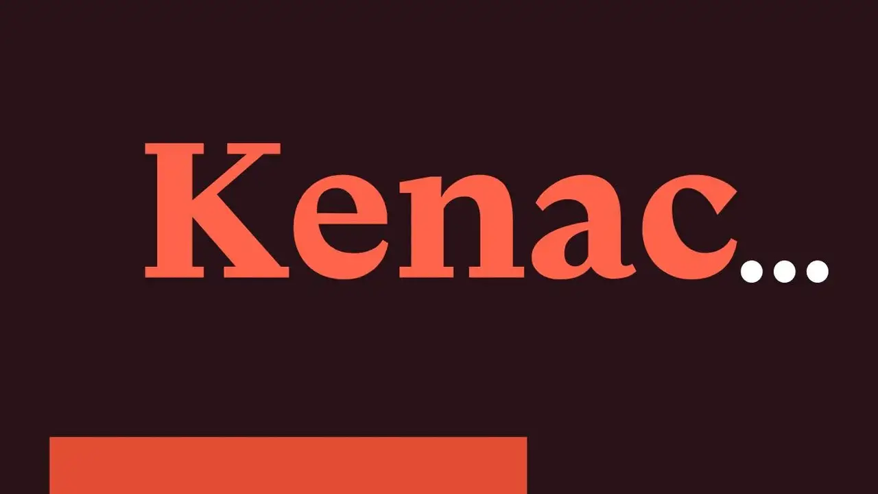
Kenac Poetry Book Fonts are a popular choice among poets and designers alike. With their elegant and artistic appearance, these fonts add a touch of sophistication to any poetry book. Kenac fonts offer a variety of styles, from classic serif fonts to more modern and minimalist options.
Whether you’re looking to create a traditional poetry collection or a contemporary anthology, Kenac fonts can help bring your words to life on the page. With their clean lines and subtle flourishes, these fonts will surely enhance your audience’s reading experience. So, if you’re searching for the perfect font for your poetry book, consider Kenac as an excellent option.
4.Barnaby
One of the best fonts for poetry books is Barnaby. With its elegant and sophisticated design, Barnaby adds a touch of class to any poetry collection. Its clean lines and balanced letterforms make it easy to read, while still maintaining a sense of artistry and creativity.
Whether you’re publishing your own poetry or designing a book for someone else, choosing Barnaby as the font can help enhance the overall aesthetic and experience of reading poetry. So if you’re looking for a font that captures the essence of poetic beauty, consider using Barnaby in your next poetry book design.
5.Artifex CF
Artifex CF is a beautiful and elegant font that is perfect for poetry books. With its delicate letterforms and graceful curves, it adds a touch of sophistication to any page. The thin strokes and intricate details of Artifex CF create a sense of artistry and craftsmanship, enhancing the reading experience for poetry lovers.
Whether you’re publishing your own collection of poems or designing a book cover for a renowned poet, Artifex CF is sure to make your poetry book stand out and captivate readers with its timeless beauty.
How To Choose The Best Font For Poetry
Choose the best font for poetry can be subjective, as it largely depends on personal preference and the poem’s tone. However, there are a few factors to consider when making your choice.
First, readability is key. Opt for a font that is clear and easy to read, even in smaller sizes. Second, consider the mood of your poem. Fonts like Times New Roman or Garamond may be a good fit if you’re going for a more traditional style or classic vibe.
On the other hand, if you want to convey a more modern or experimental feel, fonts like Arial or Helvetica might be more suitable. Ultimately, the best font for your poetry enhances your work’s overall aesthetic and meaning. So don’t be afraid to test different options and see which resonates with you and your readers.
Fonts And Their Impact On The Reader’s Experience
Fonts are crucial in book design, influencing the reader’s experience. Century Gothic is a modern and sleek choice, while Book Antiqua adds a touch of elegance to the text. An accessible font is essential for readability, and Adobe Fonts offer a vast selection.
The book cover font sets the tone for the reader’s journey and can greatly impact their engagement with the content. Selecting the right font is a delicate balance between aesthetics and functionality, ensuring the reader’s experience is visually appealing and easy to digest. Here are a few examples of fonts commonly used in poetry and their potential impact on the reader:
- Serif Fonts: Times New Roman, Garamond, or Baskerville are often associated with traditional and formal writing. They can add a touch of elegance and sophistication to the poem, creating a classic and timeless feel.
- Sans-serif Fonts: Arial, Helvetica, or Calibri have a more modern typeface and clean appearance. They are often handy to convey simplicity and clarity. Sans-serif fonts can be suitable for contemporary poetry that aims for a minimalist or experimental style.
- Handwritten Fonts: Fonts that imitate handwriting, such as Brush Script or Lucida Handwriting, can add a personal and intimate touch to the poem. They can evoke a sense of authenticity and warmth, making the reader feel a deeper connection with the words.
- Decorative Fonts: Fonts with elaborate and ornamental designs, such as Edwardian Script or Old English Text, can create a visually striking impact. These fonts are often handy for poetry that aims to evoke a sense of nostalgia, fantasy, or mystery.
- Experimental Fonts: Some poets may use unconventional and avant-garde fonts to enhance the visual impact of their work. These fonts can be highly expressive and unique, reflecting the experimental nature.
Serif Fonts
The serifs in these fonts also guide the reader’s eye along the lines of text, making it easier to follow and read. This can enhance readability, especially in longer passages of text. The additional strokes also help distinguish individual characters, reducing the chance of confusion between similar-looking spacing between letters.
Furthermore, people often associate serif typeface fonts with authority and trustworthiness. As a result, they are commonly handy in academic research papers, legal documents, and official publications. This association can positively impact the reader’s perception and make the content appear more reliable and credible.
Sans-Serif Fonts
In the reader’s experience, sans-serif fonts bring a sense of clarity and straightforwardness to the text. They often convey a more informal and casual tone, making them suitable for various content types, such as websites, emails, and social media posts.
Additionally, sans-serif fonts are handy for headings, titles, and captions due to their bold and attention-grabbing nature. Regarding readability, people often prefer sans-serif fonts for screens as they are less likely to cause eye strain and fatigue.
The letterforms’ simplicity allows for easy character recognition, particularly when viewing text on mobile devices or in low-resolution environments. Moreover, you can pair sans-serif fonts with serif fonts to create visual contrast and hierarchy in a text.
Script Fonts
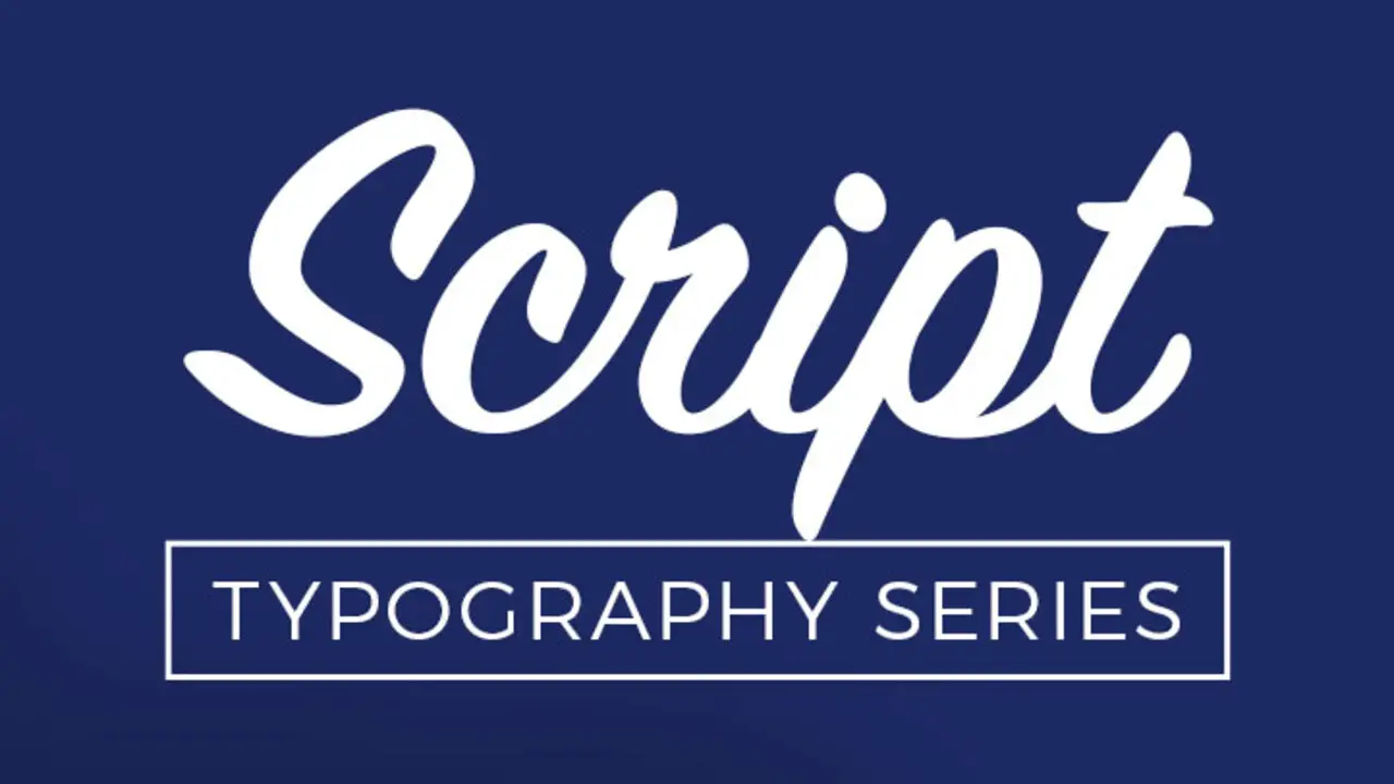
When used appropriately, script fonts can add a touch of personality and uniqueness to various design projects, such as invitations, greeting cards, logos, and advertisements. They can convey emotions, a particular theme, or create a specific atmosphere depending on the context.
However, using fonts sparingly and considering their legibility is important due to their intricate and often elaborate nature; excessive use or small size can make them difficult to read, especially for longer texts or digital formats. Reserve script fonts for headlines, titles, or short phrases to ensure readability and clarity.
Handwritten Fonts
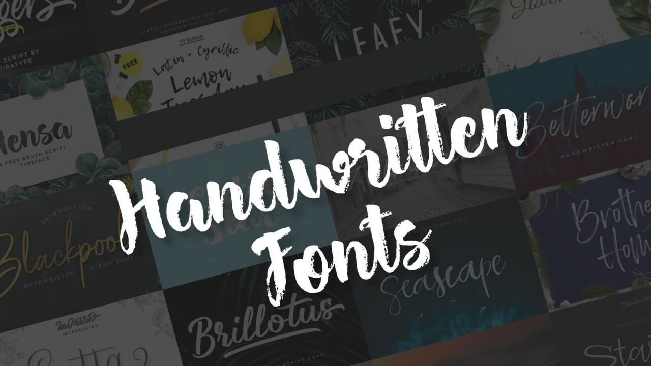
Handwritten fonts can have a significant impact on the reader’s experience. They add a personal and unique touch to the text, creating a sense of authenticity and warmth. Handwritten fonts evoke nostalgia and a feeling of being handcrafted, connecting the content more to the reader.
The irregularities, imperfections, and variations in handwritten fonts can also add visual interest and enhance the overall aesthetic appeal of the text. They can make the reading experience more enjoyable and engaging as they break away from the uniformity of traditional typefaces.
Conclusion
Choosing the best font for poetry is a subjective decision that ultimately depends on personal preference and the overall aesthetic you want to convey. Whether you opt for a classic and elegant serif font or a modern and minimalist sans-serif font, the most important thing is to ensure that the font enhances the reading experience and complements the tone and style of your poetry.
Experiment with different fonts, sizes, and spacing to find the perfect combination that brings your words to life on the page. Remember, the font you choose should enhance, not distract from, the beauty and power of your poetic verses. The font’s readability is crucial, as you want your readers to connect easily with your words.
Frequently Asked Questions
What Is The Best Google Font For Poetry?
There is no definitive “best” Google font for poetry, as it ultimately depends on personal preference and the poem’s tone. However, some popular choices for poetry include Playfair Display, Cormorant, and Montserrat.
What Font Is Used In Poetry Manuscripts?
Poetry manuscripts do not universally use a specific font. The choice of font may vary depending on the poet’s preference or the guidelines of the publishing house or literary magazine.
What Font Size Should I Use For My Poetry Book?
The font size for a poetry book will depend on various factors, such as the style and length of the poems, the overall design of the book, and the target audience.
What Font Do Most Writers Use?
Most writers use standard fonts such as Times New Roman or Arial. Writers widely accept and find reading this family of fonts easy, making them popular choices.
What Font Is Harry Potter Written In?
Typically, authors write the Harry Potter books in the font “Baskerville Old Face.” Apart from the captivating storyline and memorable characters, readers know the Harry Potter books for their distinctive typography.

David Egee, the visionary Founder of FontSaga, is renowned for his font expertise and mentorship in online communities. With over 12 years of formal font review experience and study of 400+ fonts, David blends reviews with educational content and scripting skills. Armed with a Bachelor’s Degree in Graphic Design and a Master’s in Typography and Type Design from California State University, David’s journey from freelance lettering artist to font Specialist and then the FontSaga’s inception reflects his commitment to typography excellence.
In the context of font reviews, David specializes in creative typography for logo design and lettering. He aims to provide a diverse range of content and resources to cater to a broad audience. His passion for typography shines through in every aspect of FontSaga, inspiring creativity and fostering a deeper appreciation for the art of lettering and calligraphy.
