In today’s digital age, we often find ourselves surrounded by an array of fonts used to express many emotions and ideas. From bold and decorative to minimalist and elegant, fonts are crucial in conveying the intended message.
However, amidst all the font options, one type often goes overlooked – text font. While it may not seem as glamorous as some of the more elaborate fonts, text font is a necessity in many fields, particularly in the realm of business and academia.
The clean and simple design of the text font makes it easy to read, comprehend, and transfer data. However, not all text fonts are equal, and choosing the right one can make all the difference. That’s why we’ve created this ultimate guide to plain text font.
The Top 10 Plain Text Fonts For Modern Design
When it comes to modern design, choosing the right text font is crucial. A clean and minimalist font can add a touch of elegance and professionalism to any design project. The font you use can greatly impact your design’s overall look and feel. Here are the top 10 plain text fonts perfect for modern design.
Helvetica
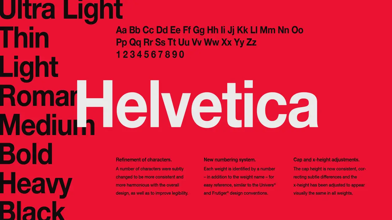
Helvetica is a widely recognized and widely h text font that has become a staple in the design and typography world. Known for its clean and simple lines, Helvetica is often chosen for its readability and versatility. It is frequently handy in various industries, from advertising to branding, due to its timeless appeal and ability to convey a sense of professionalism.
Helvetica’s neutral tone and balanced proportions make it an excellent choice for conveying information clearly and effectively. Whether you’re designing a website, creating a logo, or formatting a document, Helvetica is a reliable font that can enhance the overall visual appeal of your text.
Arial
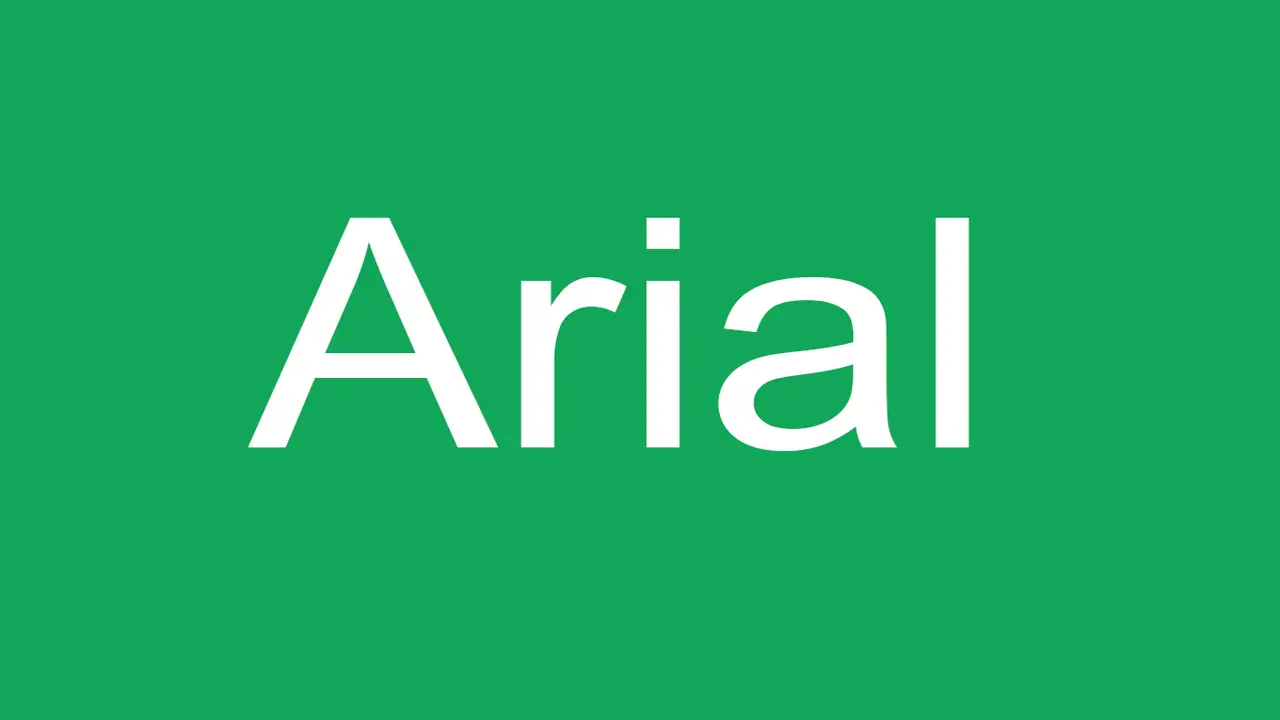
Arial, a widely used and versatile font, is popular for plain text. Developed by Robin Nicholas and Patricia Saunders in 1982, boasts a clean, modern appearance that suits body text and headings. It finds application in print materials, websites, and presentations owing to its legibility and simplicity. As a sans-serif font, it eliminates decorative strokes, exhibiting a neat and professional appeal. Arial’s popularity among designers and writers stems from its ability to deliver readability and adaptability.
Open Sans
Open Sans is a highly versatile text font widely handy for its clean and modern appearance. Designed by Steve Matteson and released in 2011 as part of the Google Fonts project, Open Sans has become popular for print and digital design projects. With its legible and readable design, Open Sans is suitable for various purposes, including body text, headings, and captions.
Its neutral appearance and slightly rounded shape add a touch of modernity to any design. The font offers a range of weights and styles, from regular to italic, bold, and bold italic, providing flexibility for designers. Open Sans can enhance the visual appeal of documents, websites, and other design projects without compromising readability.
Lato
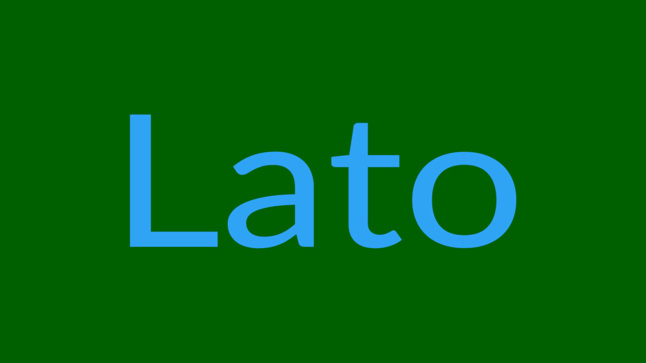
Lato, a highly versatile typeface, stands out for its smooth adaptability and effortless legibility. Created by Łukasz Dziedzic, Lato offers a range of weights and styles, making it incredibly versatile for various design projects. This modern font is widely utilized in website design, print materials, and digital interfaces. Its clean and contemporary appearance makes it a popular choice amongst designers.
Lato excels in readability even at smaller sizes and across different devices, making it ideal for all body text applications. With Lato, your website, print materials, or digital projects are sure to impress with its adaptability and easy-to-read characteristics.
Roboto
Designed by Google, Roboto is a versatile and modern font that adds a touch of elegance to any plain text. Its clean and minimalist design makes it easy to read on Android devices of all sizes, making it suitable for various applications.
With multiple weights and styles available, you have the flexibility to experiment and create visually appealing designs. Roboto is widely used from websites to mobile apps and print materials, highlighting its popularity. Incorporating Roboto into your projects can enhance the overall visuals and make your text more engaging.
Pt Sans
PT Sans, a widely used and versatile font with a clean and modern look, is highly acclaimed for its clean and minimalist design. Known for its simple and geometric letterforms, PT Sans offers a wide range of flexibility in design with its availability in multiple weights and styles.
This font’s high legibility makes it an optimal choice for body text in various applications, whether in print or digital mediums. Moreover, PT Sans stands out as a free and open-source font, ensuring accessibility for budget designers.
Montserrat
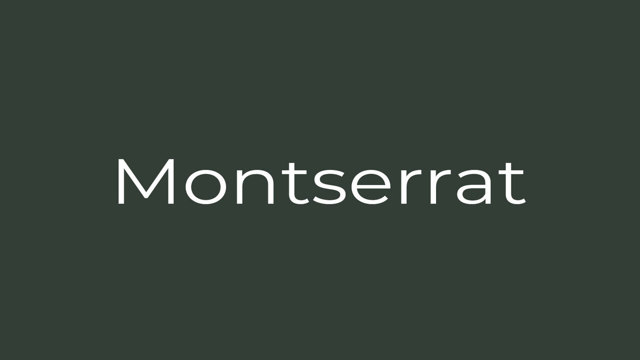
Montserrat, a widely used modern sans-serif font, adds elegance and sophistication to any design project. Taking inspiration from Buenos Aires’ urban typography, this font boasts clean lines and a geometric structure. With its bold appearance, use Montserrat for headings and titles.
Experiment with its multiple weights and styles to create visually striking designs. Whether you’re designing a website, flyer, or branding project, Montserrat offers versatility and a sleek look. Embrace the contemporary feel of this text font that enhances readability and captivates your audience.
Source Sans Pro
Source Sans Pro, a sans-serif font developed by Adobe, is perfect for print and digital design. Its clean and modern appearance, rounded edges, and open letterforms guarantee high readability. This font’s versatility shines through with its availability in multiple weights and styles, allowing you to create designs that truly stand out.
Source Sans Pro shines in on-screen reading, making it an exceptional choice for websites and digital publications. Its extensive character range and language support ensure its suitability for international design projects. With Source Sans Pro, you can effortlessly craft professional and visually appealing content that leaves a lasting impression.
Proxima Nova
Proxima Nova, a popular font for modern design, offers a clean and contemporary appearance. Created by Mark Simonson, this text font is highly versatile, with multiple weights and styles for various design applications. Its legibility and readability make it suitable for headlines and body text, ensuring optimal communication.
Proxima Nova combines modern aesthetics with functional design, making it an excellent choice for designers searching for a professional look. Proxima Nova is a reliable print or online platform option that seamlessly integrates style and clarity.
Futura
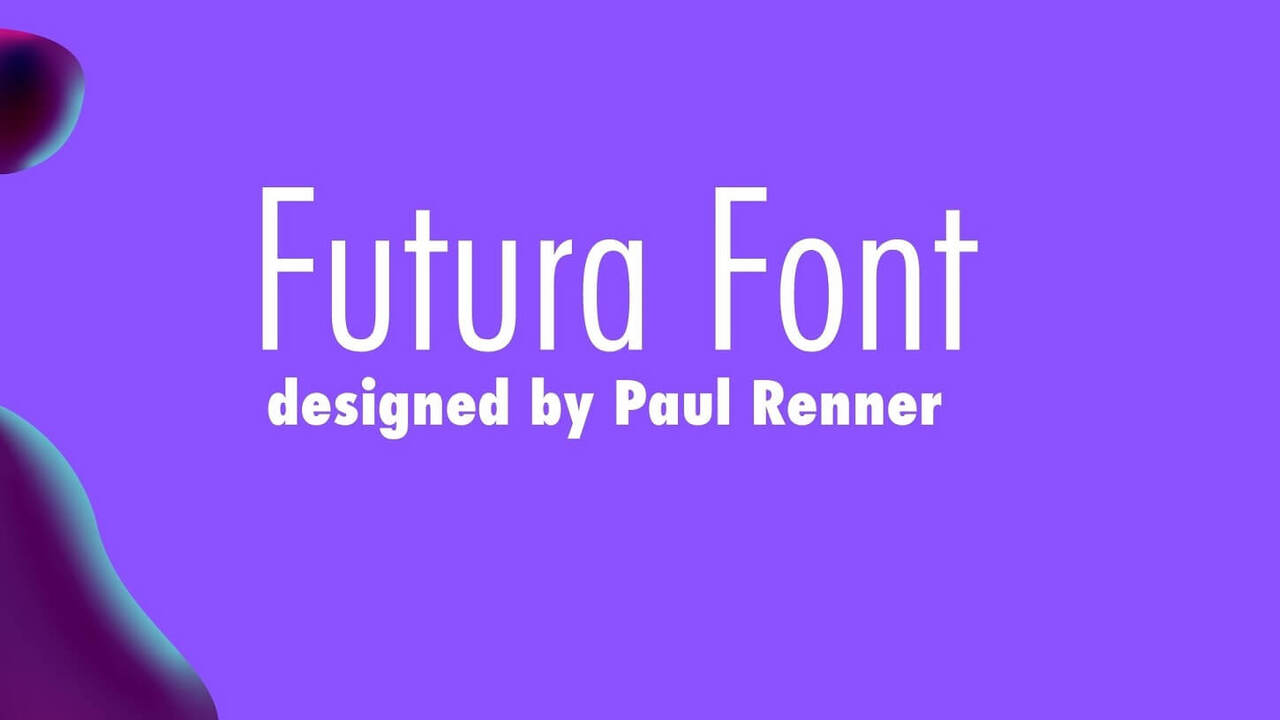
Futura, a geometric sans-serif typeface designed in the 1920s, showcases a clean, modern look with uniform letterforms and consistent stroke width. Highly favored in advertising and branding, this font captivates with its bold and attention-grabbing design. Embraced by the graphic design realm, it has catalyzed various typefaces.
Futura’s versatility shines through as it effortlessly accommodates headings and body text, making it a frequently chosen option in contemporary design projects. Resilient and striking, Futura remains a timeless choice amidst an ever-evolving typography landscape.
Conclusion
Choosing the right font for your plain text can significantly impact how your content is perceived and understood. The plain text font has provided valuable information on the different types of fonts available, their characteristics, and how to use them effectively.
Following the tips and recommendations shared in this guide ensures that your plain text is visually appealing, easy to read, and enhances the overall message you want to convey. Whether creating documents, emails, or website content, understanding the importance of font selection will help you communicate more effectively and leave a lasting impression on your audience.
Frequently Asked Questions
What Is Plain Text In Word?
Plain text in Word refers to unstyled, unformatted text that lacks any special formatting, such as bold, italics, or underlines. A default font typically represents it and is commonly used for coding, writing emails, and creating basic documents without visual enhancements.
What Are Examples Of Plain Text Format?
Plain text formats, such as TXT, CSV, and LOG files, are unformatted and devoid of styling or special characters. Any text editor or word processor can read them, and they are commonly used for storing and transmitting data in a simple and universally compatible format.
What Is A Plain Text Character?
A plain text character is a character that has no special formatting or styling and represents itself as it is. These characters are commonly used for simple communication and storing data. Examples include letters, numbers, punctuation marks, and symbols. They are compatible with various devices and platforms.
What Is Plain Text Vs Rich Text?
Plain text is simple, unformatted text without any special styling. It only uses basic characters. Rich text, on the other hand, includes formatting options like font styles and colors, allowing for visually appealing and customized formatting.
How Do Different Plain Text Fonts Affect Readability?
Different text fonts have varying effects on readability. Sans-serif fonts like Arial or Helvetica are generally easier to read on screens, while serif fonts like Times New Roman or Georgia are often preferred for printed materials. Consider factors such as font size, line spacing, and contrast to optimise readability.

David Egee, the visionary Founder of FontSaga, is renowned for his font expertise and mentorship in online communities. With over 12 years of formal font review experience and study of 400+ fonts, David blends reviews with educational content and scripting skills. Armed with a Bachelor’s Degree in Graphic Design and a Master’s in Typography and Type Design from California State University, David’s journey from freelance lettering artist to font Specialist and then the FontSaga’s inception reflects his commitment to typography excellence.
In the context of font reviews, David specializes in creative typography for logo design and lettering. He aims to provide a diverse range of content and resources to cater to a broad audience. His passion for typography shines through in every aspect of FontSaga, inspiring creativity and fostering a deeper appreciation for the art of lettering and calligraphy.
