Typography is a crucial aspect of graphic design that can make or break the aesthetic appeal of any project. One font that has stood the test of time and continues to be a favorite among designers is the Old Style Numbers font.
This classic font has a distinct elegance and sophistication that can lend timeless beauty to any design. But, with so many fonts available today, it can be challenging to properly use and showcase Old Style Numbers to their fullest potential.
We’ll explore the history and features of Old Style Numbers and provide tips and tricks for effectively incorporating them into your designs. Whether you’re a beginner just starting out in graphic design or a seasoned professional looking to add some flair to your projects, it will provide valuable insights on how to unleash the beauty of this classic font.
What Are Old Style Numbers Fonts?
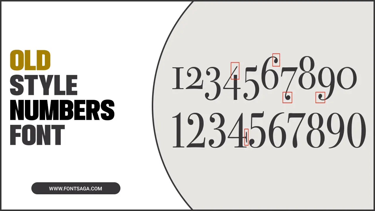
Old Style Numbers Fonts, also known as text figures or lowercase numbers, are a type of font that features numerals with varying heights and shapes. Unlike traditional numeral fonts, where all numbers have the same height and shape, Old Style Fonts mimic the proportions and style of lowercase letters, resulting in a more harmonious and cohesive design.
These fonts are often used in typography for their aesthetic appeal and readability, particularly in contexts where a more elegant and vintage look is desired. Whether for a book, website, or branding project, Old Style Fonts can add a touch of sophistication and nostalgia to any design.
History And Evolution Of Old Style Numbers Font
The history and evolution of old font numbers can be traced back to the early days of printing. Old-style numbers, lowercase or text figures, were first introduced in the 18th century. The designers designed them to harmonize with lowercase letters, making them more aesthetically pleasing in body text.
These numbers have a distinctive appearance, with varying heights, ascenders, and descenders resembling lowercase letters. People have continued to use old-style numbers in various contexts, including books, newspapers, and signage, over time.
Today, they are still appreciated for their classic and elegant look, often seen in vintage-inspired designs or for adding a touch of sophistication to modern projects. The history of old numbers font showcases the enduring appeal of timeless design elements in typography.
Exploring Different Uses Of Old Style Numbers Font
Old-style numbers font, also known as text figures or lowercase numbers, is a type of typography that mimics the appearance of handwritten numbers. This versatile font can be used in various design projects to add a touch of elegance and sophistication.
One popular use of old-style font is in print materials such as books, magazines, and newspapers. The irregular shapes and varying heights of the numbers can create a visually interesting and unique layout.
Additionally, old-style fonts can also be used in digital designs such as websites and logos to bring a vintage or classic aesthetic. Whether designing for print or digital, experimenting with old-style font can add a charming and timeless element to your project.
Typography Techniques For Old Style Numbers Font
Regarding old-style fonts, there are several techniques you can use to enhance their visual impact and appeal. Understanding the unique characteristics of old-style numerals, such as their varying heights and proportions, is key. This knowledge allows for optimal spacing and alignment, ensuring the numbers are easily readable.
Combining the old-style font with complementary typefaces is another effective technique. You can create a cohesive design by selecting fonts that harmonize with the vintage aesthetic. Additionally, considering the context and purpose of your design will help you choose the most suitable old-style font variation, adding depth and significance to your project.
Lastly, don’t stop experimenting with different styles and variations of old-style numbers. This can add visual interest and make your designs stand out. By following these typography techniques, you can unlock the timeless beauty of old-style font, adding a touch of elegance to your designs.
Best Practices For Implementing Old Style Numbers Font
When incorporating old-style font into your designs, it is crucial to follow several best practices. One of the most important aspects is selecting the right font that aligns with your design’s aesthetic and purpose. Ensure the chosen font is readable and complements other design elements harmoniously.
Pay attention to spacing and alignment while incorporating old-style font to optimize readability and visual appeal. Experiment with various styles and variations to add unique visual interest to your designs. Moreover, use old-style numbers font in appropriate contexts, especially in designs that evoke nostalgia or timelessness. This font style often enhances the aesthetic of vintage or classic designs.
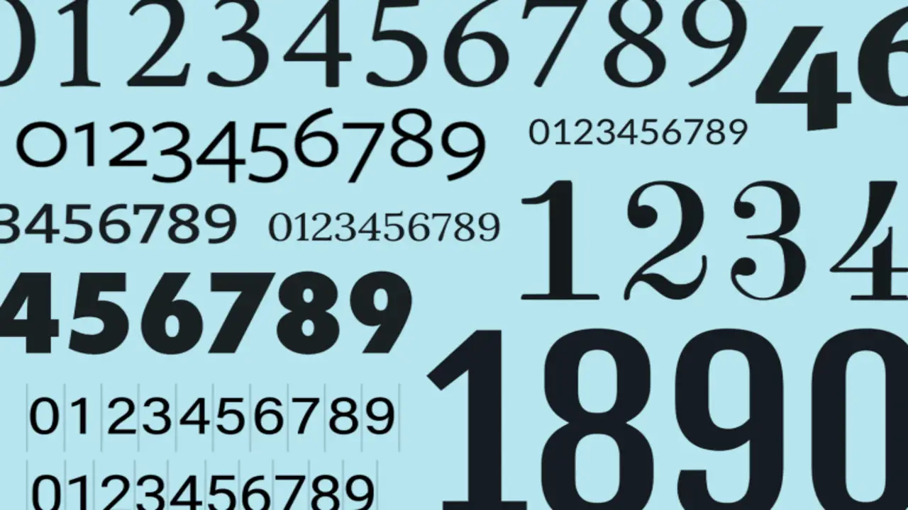
Lastly, don’t shy away from exploring different old-style numbers fonts. A wide range of options are available, including free fonts and those from reputable foundries. Take advantage of their varying heights, widths, and characteristics to create captivating and elegant designs.
Benefits Of Using Old Style Numbers Fonts
Using old-style numbers, fonts can bring your designs a unique and timeless aesthetic. These fonts, characterized by their varying heights and weights, mimic the appearance of traditional print typography. These fonts, characterized by their varying heights and subtle variations in stroke widths, are reminiscent of traditional typography from centuries past. The benefits of using old-style numbers fonts include:
- Aesthetic appeal: Old-style numbers fonts add elegance and sophistication to your designs. They can give your project a vintage or antique look, perfect for creating a nostalgic or timeless feel.
- Readability: Despite their unique design, old-style numbers fonts are still highly legible. The varying heights and subtle variations in stroke widths help to differentiate each number, making them easy to read even at small sizes.
- Versatility: Old-style numbers fonts can be used in various design projects, from invitations and wedding stationery to websites and branding materials. They work well in print and digital formats, making them versatile for any project.
- Visual hierarchy: The distinct design of old-style numbers fonts can help create visual interest and establish a clear visual hierarchy in your designs. Using an old-style font for headings or important numerical information, you can draw attention to these elements and make them stand out.
Conclusion
Old style numbers fonts have a timeless beauty that adds sophistication and elegance to any design. Understanding the history and evolution of these fonts helps us appreciate their significance and versatility. Whether you’re designing for print or digital media, old-style numbers fonts can enhance readability and create a sense of authenticity.
Implementing these fonts requires careful consideration of typography techniques and best practices. The benefits of using old-style fonts are numerous, from maintaining consistency in design to evoking a sense of nostalgia. Always consider legibility, contrast, and hierarchy in your design choices to ensure your message is effectively communicated.
Frequently Asked Questions
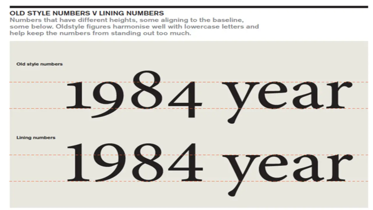
1.What Is The Difference Between Lining And Old Style Numbers?
Ans: Lining numbers have a uniform height and are preferred for modern designs and digital displays, while old-style numbers have varying heights and give a vintage feel. People often use old-style numbers in body text, whereas they commonly use lining numbers in headlines. It’s crucial to align old-style numbers properly with the surrounding text for a cohesive design.
2.What Are The Two Styles Of Numerals?
Ans: There are two primary styles of numerals: proportional and tabular. Proportional numerals have varying widths and an elegant appearance, while tabular numerals have fixed widths for improved readability in tables and data. The choice between the two depends on the project’s design aesthetic and functional requirements.
3.What Are Lining Numbers?
Ans: Lining numbers are numerals that align vertically with capital letters in a font. They’re called “lining” because they have the same height and alignment. Designers often use these numbers in headings, titles, and display text to create a consistent and visually appealing design.
4.What Is Proportional Old Style Font?
Ans: Proportional Old Style font refers to a font style where characters have different widths, creating a more natural and flowing look. People often use it for body text in printed materials like books and magazines to improve readability and add aesthetic appeal to the design.
5.What Are Old-Style Numbers Fonts And How Do They Differ From Other Fonts?
Ans: Old-style numbers fonts, or text figures, imitate handwriting with varying heights and proportions. People prefer them for elegance and visual appeal in print materials and formal documents. Unlike other fonts, they blend harmoniously with the surrounding text rather than standing out prominently.

David Egee, the visionary Founder of FontSaga, is renowned for his font expertise and mentorship in online communities. With over 12 years of formal font review experience and study of 400+ fonts, David blends reviews with educational content and scripting skills. Armed with a Bachelor’s Degree in Graphic Design and a Master’s in Typography and Type Design from California State University, David’s journey from freelance lettering artist to font Specialist and then the FontSaga’s inception reflects his commitment to typography excellence.
In the context of font reviews, David specializes in creative typography for logo design and lettering. He aims to provide a diverse range of content and resources to cater to a broad audience. His passion for typography shines through in every aspect of FontSaga, inspiring creativity and fostering a deeper appreciation for the art of lettering and calligraphy.
