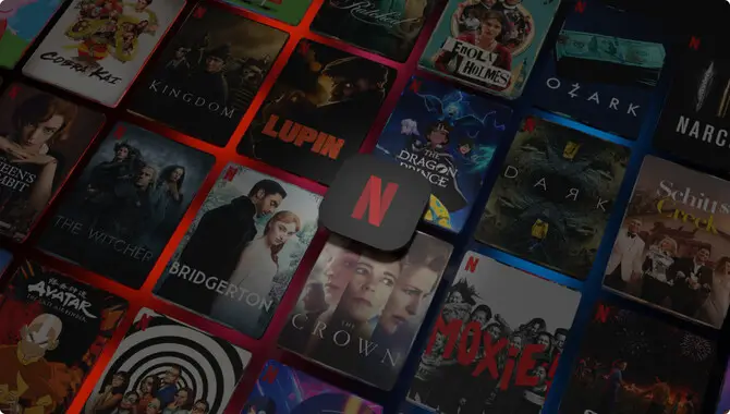
Netflix is an undeniable giant in the world of streaming services, and its logo has become an iconic symbol in the entertainment industry.
However, many don’t know that the logo font is a source of much fascination and interest for typography enthusiasts and designers alike. The typography used in the Netflix logo is unique and carefully crafted, contributing to the company’s brand identity and recognition.
Designers and fans alike have analyzed and scrutinized the font, all seeking to uncover the mystery behind its design as a result. We’ll discuss the typography secrets of the Netflix logo font, its exploration, and the reasoning behind its use. We will discuss the typefaces used, color schemes, and subtle changes made to fonts over the years.
![]()
Netflix Logo Font How To Unveil The Typography Secrets
The Netflix logo font has become instantly recognizable to millions of worldwide viewers. But have you ever wondered about the secrets behind the typography? Netflix designed a custom typeface called “Netflix Sans” for the font in their logo.
Netflix collaborated with Dalton Maag, a renowned type foundry, to create Netflix Sans. Which embodies the brand’s modern and approachable aesthetic. The clean and bold letterforms of Netflix Sans communicate a sense of simplicity and ease, reflecting the company’s commitment to delivering an enjoyable and seamless streaming experience.
So next time you binge-watch your favorite show, take a moment to appreciate the thought and craftsmanship that went into creating the logo font.
The Selection Process Of The Netflix Logo Font
Netflix’s design team and Dalton Maag, a renowned design firm, collaboratively selected the logo font. Their goal was to create a distinctive and adaptable font that would embody the essence of the Netflix brand.
Considering factors such as legibility, versatility, and brand representation, they arrived at Netflix Sans, a custom typeface with clean lines and a bold aesthetic. This font ensures easy readability on various devices and screen sizes, strengthening the recognition of the Netflix brand among its subscribers.
Understanding Typography Basics
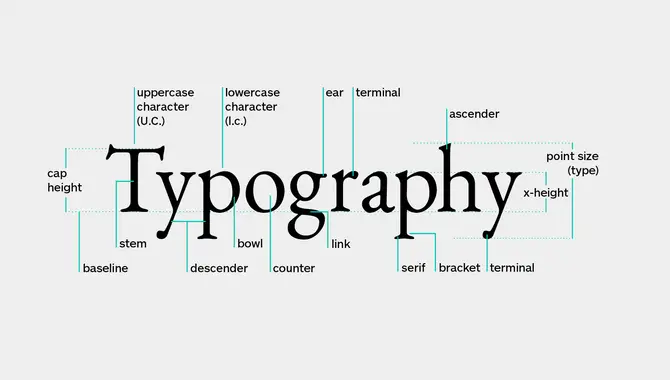
Understanding the fundamentals of typography is key to appreciating the influence and significance of the logo font. Typography encompasses skillfully arranging typefaces, ensuring visual appeal and readability. Netflix Sans, the customized font utilized in the Netflix logo, exemplifies a sophisticated and clean sans-serif design.
The company meticulously crafted it to ensure effortless legibility across different screens and sizes, showcasing its devotion to simplicity, elegance, and technological advancement. Typography plays a vital role in shaping brand identity and can evoke a wide range of emotions and associations in viewers.
Anatomy Of The Netflix Font
People know the logo font for its simple yet bold design. The font used in the Netflix logo is Graphique, a custom-designed typeface created specifically for the company. The font features clean lines and sharp edges, making it modern and sleek. The designer slightly condensed the letterforms, creating a compact and balanced composition.
The capital letters have distinctive curves and angles, adding visual interest to the overall design. The color of the Netflix font is predominantly red, which adds to its eye-catching appeal. Overall, the anatomy of the Netflix font exemplifies the brand’s commitment to bold and captivating design.
Typeface Classification Of The Netflix Font
The Netflix font is a unique typeface that falls into the classification of geometric sans serif. Geometric sans serif fonts are known for their clean lines, modern look, and simple geometric shapes. The Netflix font features evenly spaced letters with rounded corners, giving it a sleek and contemporary feel.
This typeface choice reflects the brand’s commitment to creating a visually appealing and modern aesthetic that aligns with its streaming platform. Using a geometric sans serif font, Netflix effectively communicates its innovative and forward-thinking approach to entertainment.
Color Psychology Of The Netflix Font
The color psychology behind the font is truly captivating. Introduced in 2018, the font, also referred to as “Netflix Sans,” was carefully crafted to exhibit a modern and simplistic aesthetic, ensuring easy readability for users. Incorporating the bright red color in the logo adds a touch of energy, excitement, and passion to Netflix’s brand identity.
This dynamic combination captures attention and creates a sense of urgency and action, making the brand highly memorable and instantly recognizable.
The Impact Of The Netflix Font On Brand Recognition
The impact of its logo font greatly influences Netflix’s brand recognition. “Netflix Sans,” the custom-designed font, embodies the company’s commitment to innovation and simplicity, making it easily recognizable worldwide.
The logo font has become iconic and synonymous with quality streaming by evoking familiarity and trust. From award-winning shows like “Stranger Things” to gripping dramas like “House of Cards,” the font’s clean lines and modern aesthetic enhance the brand experience across various devices.
With millions of subscribers worldwide, the Netflix font stands as a testament to the success and popularity of the streaming service.
Conclusion
Netflix’s logo font is a prime example of how a simple yet effective typography design can help a brand stand out in today’s digital age. From custom lettering to carefully selecting a color scheme, every element of the Netflix logo embodies the company’s focus on innovation, creativity, and boldness.
By understanding the typography secrets behind the Netflix logo, designers and marketers can learn valuable lessons about crafting a strong brand identity that resonates with audiences across the globe. Ultimately, the Netflix logo font serves as a testament to the power of typography in shaping the perception of a brand.
Frequently Asked Questions
What Font Is The Netflix Logo?
The Netflix logo uses a custom-made font that is not publicly available. It draws inspiration from the Graphique typeface but has been modified for the logo’s unique design. The font is bold and sleek, with distinct curves and sharp edges. The red color in the logo is an integral part of Netflix’s branding.
How Do I Make A Netflix Logo?
You’ll need graphic design skills and software to create a logo similar to Netflix’s. Choose a clean, modern font that aligns with Netflix’s style and customize it by adjusting spacing, size, and color. For best results, consider hiring a professional graphic designer.
Can I Use The Netflix Logo Font For My Projects?
No, using the Netflix font, known as “Netflix Sans,” is not permissible for your projects. This font is protected by copyright; using it without permission would infringe upon intellectual property rights. Exploring alternative fonts or consulting a graphic designer to create distinctive typography for your projects is recommended.
Are There Any Similar Fonts I Can Use As Alternatives To The Netflix Logo Font?
Yes, alternative fonts can be used as substitutes for the Netflix font. Popular options include Bebas Neue, Gotham Bold, and Proxima Nova, which offer a similarly bold and modern appearance. However, knowing that the exact Netflix font could infringe copyright laws is crucial.
Is There A Specific Reason Why Netflix Chose This Font For Its Logo?
Netflix chose the font “Netflix Sans” for its logo to establish a distinct brand identity. The font’s sleek and contemporary design reflects Netflix’s emphasis on innovation and technology. It was carefully crafted to ensure legibility on various platforms and screen sizes, while its clean and bold letterforms convey a strong sense of confidence and authority.

David Egee, the visionary Founder of FontSaga, is renowned for his font expertise and mentorship in online communities. With over 12 years of formal font review experience and study of 400+ fonts, David blends reviews with educational content and scripting skills. Armed with a Bachelor’s Degree in Graphic Design and a Master’s in Typography and Type Design from California State University, David’s journey from freelance lettering artist to font Specialist and then the FontSaga’s inception reflects his commitment to typography excellence.
In the context of font reviews, David specializes in creative typography for logo design and lettering. He aims to provide a diverse range of content and resources to cater to a broad audience. His passion for typography shines through in every aspect of FontSaga, inspiring creativity and fostering a deeper appreciation for the art of lettering and calligraphy.
