Helvetica is a versatile and widely used font that pairs well with many other typefaces. Its clean and modern design makes it popular for various design projects, from logos to websites to print materials.
When choosing a font to pair with Helvetica, it’s important to consider your design’s overall aesthetic and purpose. Try Helvetica font pairing with serif fonts like Times New Roman or Garamond for a classic and timeless look.
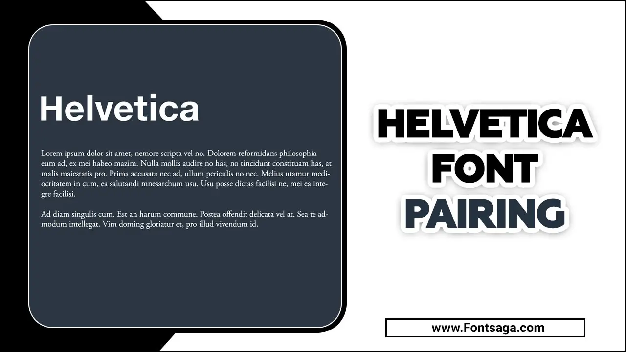
Here we will explore the world of Helvetica font pairing and provide you with tips and examples to help you master the art of combining this classic font with other typefaces to achieve the perfect balance and create visually stunning designs. Whether you are a graphic designer, a web designer or simply someone looking to elevate their design game.
What Is Helvetica Font?
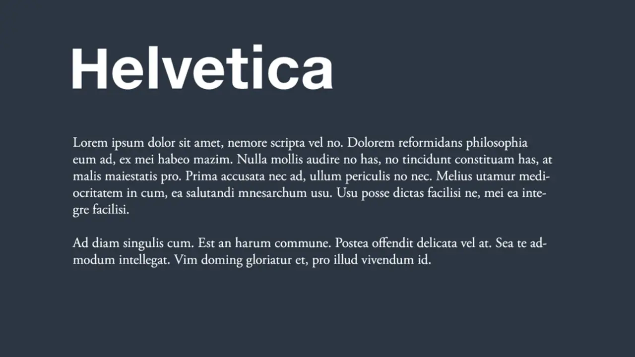
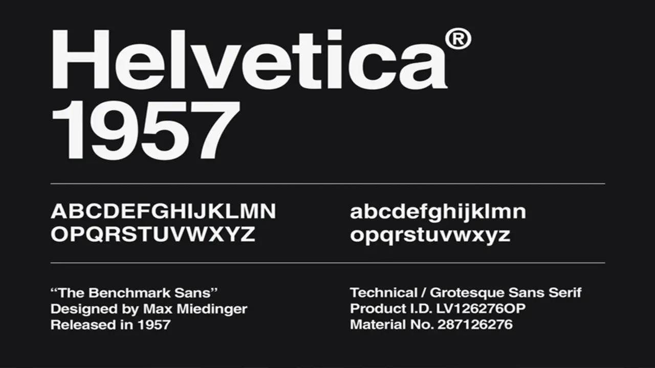
Helvetica is a widely recognized and influential font used in various design applications since its creation in 1957. Developed by Max Miedinger and Eduard Hoffmann, Helvetica is known for its clean, modern, and versatile aesthetic.
It is a sans-serif typeface, meaning it does not have the small decorative lines at the ends of each letter stroke. The font’s simple and neutral design makes it highly adaptable to different contexts and purposes, making it a popular choice for branding, signage, print materials, and digital media. Helvetica’s timeless appeal and legibility have made it a staple in the design world for over six decades.
Elevate Your Design With Helvetica Font Pairing
Helvetica is a timeless and versatile font that can bring a sense of modernity and sophistication to any design. However, pairing it with the right fonts ensures your design stands out. When choosing font pairings for Helvetica, it’s important to consider the overall aesthetic and tone you want to convey. Consider pairing Helvetica with other sans-serif fonts, such as Arial or Gotham, for a clean and minimalist design look. So, elevate your design by exploring different Helvetica font pairings and see how they can enhance the overall impact of your project.
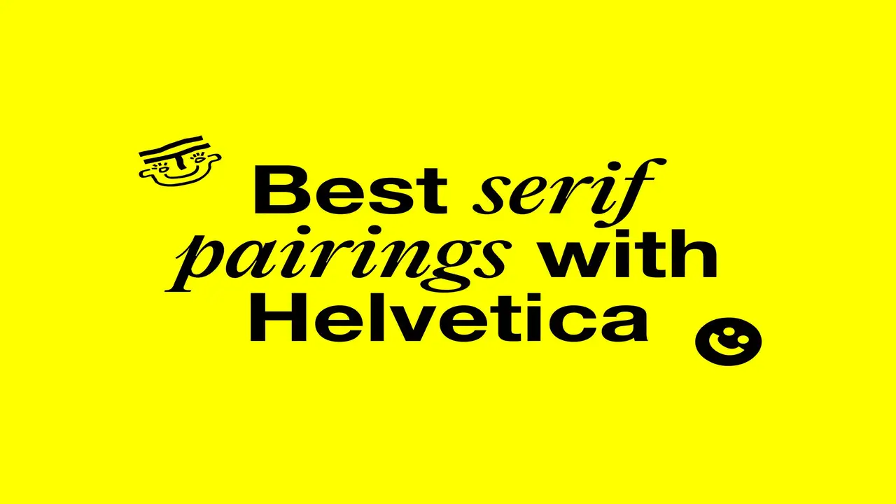
Pairing Helvetica With Serif Fonts
When pairing Helvetica with serif typefaces, it’s important to create balance and maintain a professional look. Select a serif font that complements Helvetica’s clean and modern aesthetic. Opt for serif fonts with similar proportions, such as medium to high x-height and moderate contrast, to achieve visual harmony in your design.
It is recommended to experiment with various weights and styles of Helvetica and the chosen Slab serif typeface to find the ideal combination. Utilize hierarchy and contrast in font sizes, colours, and spacing to generate visual interest and effectively guide the reader’s eye.
Pairing Helvetica With Sans-Serif Fonts
Pairing Helvetica with other sans-serif fonts results in a sleek and contemporary design. Experiment with different combinations of fonts, such as Futura, Montserrat, or Arial, to find the perfect font pairing.
Consider your design’s overall aesthetic and message to create a seamless visual experience. Utilize hierarchy, font sizes, colours, and spacing to guide the reader’s eye and create an impactful design.
Pairing Helvetica With Script Fonts
Pairing Helvetica with script fonts in your design creates a harmonious and visually captivating composition. You can create a balanced layout by considering the contrast between Helvetica’s clean and modern aesthetic and the unique style of a script font.
Opt for a script font that complements Helvetica without overpowering it, selecting one with similar characteristics like weight or rounded edges. Experiment with different font sizes and weights to strike the perfect balance and ensure your design conveys the desired tone and message.
Pairing Helvetica With Display Fonts
Pairing Helvetica with display fonts offers a world of possibilities for your Print design. This versatile font, known for its clean and modern appearance, effortlessly complements display fonts, adding visual interest to your creations.
Opting for a classic and elegant serif font when pairing with Helvetica can create a timeless look while experimenting with whimsical script fonts adds a playful humanist touch.
Prioritize contrast by selecting display fonts with weights, styles, or proportions different from Helvetica. Let your design’s overall tone and purpose guide you in finding the perfect Helvetica font combination to elevate your visual aesthetics. Helvetica is a popular font choice for modern designs, especially when paired with display fonts, to create a classic font pairing that appeals to a wide audience.
Pairing Helvetica With Script Or Handwritten Fonts For Contrast

Regarding font pairing, Helvetica can be an excellent, versatile choice. One effective way to create contrast and add visual interest is by pairing Helvetica with a script or handwritten fonts. Helvetica’s clean and modern lines can provide a balanced backdrop for the more decorative and expressive nature of script or handwritten fonts.
This combination creates a dynamic, eye-catching design that captures attention while maintaining readability. Whether designing a logo, website, or print materials, experimenting with pairing Helvetica with script or handwritten fonts can help you achieve a unique and visually appealing result.
Pairing Helvetica With Raleway – A Bold piece
Pairing Helvetica with Raleway can create a bold and eye-catching design. Helvetica, known for its clean and timeless aesthetic, is a versatile font that pairs well with many other geometric typefaces. Combined with Raleway, a sleek and modern sans-serif font, the result is a powerful combination that exudes confidence and sophistication.
The strong lines of Helvetica complement the elegant typeface curves of Raleway, creating a visually striking contrast. Whether designing a logo, website, or print materials, this font pairing can help you make a bold version statement and leave a lasting impression on your audience.
Pairing Helvetica With DIN Font – Professional Use
Regarding font pairings, combining Helvetica with DIN can create a professional and polished look. Both fonts are known for their clean and modern aesthetics, making them a great choice for professional use in various design projects such as logos, brochures, and websites. The key to successfully pairing these two fonts is to ensure they complement each other without overpowering one another.
Consider using Helvetica for headlines or main text design elements while using DIN for subheadings or captions. This combination creates a harmonious balance between the timeless elegance of Helvetica and the sleek sophistication of DIN, resulting in a visually appealing and professional design.
Pairing Helvetica With Bodoni – High Contrast
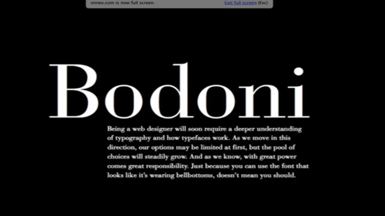
Pairing Helvetica with Bodoni can create a high contrast and visually striking effect in typography. With its clean and modern serif lines, Helvetica is a neutral and versatile choice for body text. On the other hand, Bodoni, with its elegant and dramatic serifs, adds a touch of sophistication and flair to headings or titles. This combination of contrasting styles can create an interesting visual hierarchy and make your design stand out. However, it is important to use this pairing sparingly and thoughtfully to avoid overwhelming the reader or distracting from the overall message of your design.
Pairing Helvetica With Georgia – A Classic Alternative
Pairing Helvetica with Georgia can be a classic serif alternative that adds a touch of elegance and sophistication to your design. The clean lines and modern simplicity of Helvetica complement the timeless appeal of Georgia’s serif font.
This serif font combination creates a harmonious balance between readability and visual interest, making it suitable for various design projects, such as websites, print materials, and branding. The versatility of these two fonts allows them to work seamlessly together in both headline and body text, enhancing the overall aesthetic appeal of your design.
Pairing Helvetica With Avenir – A Look Into The Future
Helvetica and Avenir are popular fonts that can be combined for a modern and sleek design. The clean lines of Helvetica and the geometric style shapes of Avenir add depth and visual interest. Consider the tone and purpose of your project when pairing these fonts. Helvetica is known for simplicity and readability, while Avenir has a futuristic feel. By combining them, you can create a unique aesthetic that is both timeless and forward-thinking. Whether it’s a website, logo, or print ad, pairing Helvetica with Avenir will give you a fresh and contemporary look that impacts you.
Tips For Choosing A Helvetica Font Combination
When choosing a Helvetica font combination, remember a few tips. Following these tips, you can create visually appealing designs using the versatile Helvetica font. Helvetica is a versatile and timeless font that can be paired with various other typefaces to create visually appealing combinations. Here are some helpful suggestions:
- Consider The Contrast: Pairing a bold version of Helvetica with a lighter, thinner version can create an interesting contrast that adds visual interest to your design.
- Stick To Similar Styles: When combining Helvetica with other fonts, choose ones with a similar overall style and feel. This will help create a cohesive look and prevent the fonts from clashing.
- Experiment With Weights: Helvetica comes in various bold weights, from light to bold. Mixing different weights within your design can add hierarchy and emphasis to different elements.
- Use Complementary Typefaces: While Helvetica is versatile and can work well independently, pairing it with complementary typefaces can enhance your design. Experiment with serif or script fonts that complement the clean lines of Helvetica.
- Test Readability: No matter what combination you choose, make sure it’s readable at different sizes and on different devices. Test your font pairing in various contexts to ensure optimal legibility.
Conclusion
Helvetica font is a versatile and timeless choice for any design project. Pairing it with the right fonts can elevate your design and create a cohesive and visually appealing result. By combining Helvetica with the right complementary fonts, you can enhance the impact of your message and make it more memorable. Helvetica’s versatility and timeless appeal make it a popular choice, but pairing it with the right fonts can take your designs to the next level.
Whether designing a website, creating a logo, or working on a print project, the Ultimate Guide to Helvetica Font Pairing is a valuable resource that will help you choose the perfect fonts to complement Helvetica and achieve the desired look and feel.
Frequently Asked Questions
What Fonts Go Well With Helvetica?
You can add custom fonts to Salesforce using the Salesforce Lightning Design System (SLDS) and CSS. This allows you to customize the appearance of your Salesforce org by adding and using your fonts.
What Adobe Font Matches Helvetica?
Adobe’s font that closely matches Helvetica is called “Adobe Helvetica.” It is a near-identical digital version of the original Helvetica font.
How Do I Make Helvetica Look Good?
Helvetica is a versatile and widely used sans-serif font that pairs well with various serif fonts. One popular serif font that complements Helvetica is Garamond. The elegant and timeless characteristics of Garamond create a harmonious balance when paired with Helvetica’s clean lines and simplicity.
Is Helvetica Good For Body Text?
Yes, Helvetica is generally considered good for body text. It is a versatile and legible typeface that works well in various contexts. Its clean and simple design makes it easy to read, and its neutral appearance allows it to blend seamlessly with different design styles.
Which Font Is Most Similar To Helvetica?
Arial is the font that is most similar to Helvetica. Both fonts have a clean and modern aesthetic, with similar letterforms and proportions. Arial was designed as a substitute for Helvetica and is often used as a default font on Windows operating systems

David Egee, the visionary Founder of FontSaga, is renowned for his font expertise and mentorship in online communities. With over 12 years of formal font review experience and study of 400+ fonts, David blends reviews with educational content and scripting skills. Armed with a Bachelor’s Degree in Graphic Design and a Master’s in Typography and Type Design from California State University, David’s journey from freelance lettering artist to font Specialist and then the FontSaga’s inception reflects his commitment to typography excellence.
In the context of font reviews, David specializes in creative typography for logo design and lettering. He aims to provide a diverse range of content and resources to cater to a broad audience. His passion for typography shines through in every aspect of FontSaga, inspiring creativity and fostering a deeper appreciation for the art of lettering and calligraphy.
