When it comes to website design, every element matters. One of the most overlooked aspects is font thickness and how it can impact your website’s overall impact.
Many people aren’t unaware that font thickness CSS can be a powerful tool in enhancing your website’s aesthetic appeal and readability. We will explore font thickness CSS, why it’s important in web design, how to set it up, and tips for using it effectively. We’ll also address the benefits and drawbacks of using font thickness CSS and its limitations and challenges. You’ll better understand how font thickness can transform your website’s look and feel.

What Is Font Thickness CSS?
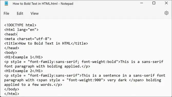
Font thickness in CSS refers to the weight or boldness of a font. There are several ways to adjust the font thickness using CSS, including using the font-weight property, which allows you to specify a numeric value from 100 (thin) to 900 (bold).
Additionally, you can use keywords such as “normal” and “bold” to adjust the font thickness. Not all fonts will have the same range of thickness options available, so it may be necessary to experiment with different fonts and settings to achieve the desired effect. Understanding CSS’s font thickness can help you create visually appealing and effective designs for your website or project.
The Importance Of Font Thickness In CSS Design

The thickness of a font plays a vital role in the readability and tone of your web page. To enhance your website’s impact, use CSS to control the weight or boldness of your text instead of using plain HTML.
With various properties like font size and typeface available in CSS code, you can experiment with multiple font families like Arial and Helvetica to create custom fonts using numerical values for thinner or bolder characters. Incorporating media queries like Flexbox and CSS Grid can also help you optimize typography on different screen sizes.
Setting Font Thickness In CSS

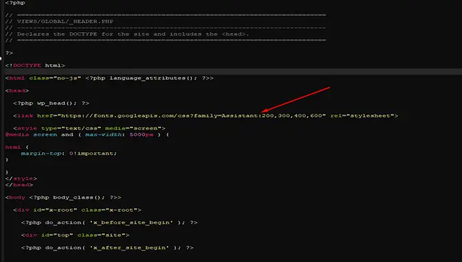
CSS offers numerous options for setting font weight, ranging from numerical values to keywords like “bold” and “lighter.” Choosing a font family with varying weights or creating custom fonts with specific thickness levels can provide even more control over your typography.
However, it’s crucial to test and adjust as needed since the thickness of your font may affect its appearance on different devices. Additionally, not all fonts offer the same thickness options, so selecting one that aligns with your desired aesthetic is important.
How To Use Font Thickness For Different Purposes
When using font thickness in CSS, there are various purposes and techniques to keep in mind. For example, using a bold font can help emphasize important information or headings on a page. Font thickness can play an important role in your website’s overall design and readability. Here are some tips on how to use font thickness for different purposes:
- Emphasizing important text: Using a bold or heavier font, you can draw attention to the important text, such as headings or call-to-action buttons.
- Creating contrast: Using a mix of font weights can create visual interest and help separate different content sections on your website.
- Improving legibility: Choosing an appropriate font-weight can also improve the legibility of your text, especially for users with visual impairments. A thicker font weight may be easier to read for those with low vision.
When choosing a font weight, it’s important to consider the overall design aesthetic and ensure that it complements the rest of your website’s typography. Don’t be afraid to experiment with different weights and combinations to find what works best for your website.
What Are The Benefits Of Using Font Thickness CSS?

Using font thickness CSS can have several benefits for web designers and developers. One of the main benefits is that it allows for greater control over the appearance of text on a website. By using font thickness CSS, designers can adjust the weight of the text to make it stand out more or blend in with other elements on the page.
This can be particularly useful when designing headings, where thicker fonts can help draw attention to important information. Additionally, using font thickness CSS can also improve the readability of text. As it allows for better contrast between different elements on the page. Incorporating font thickness CSS into your web design toolkit can help you create more visually appealing and user-friendly websites.
What Are The Drawbacks Of Using Font Thickness CSS?

While using font thickness CSS can be a great way to make your text stand out and give it a unique look, there are some drawbacks to consider. One of the biggest concerns is that not all web browsers support font thickness CSS. Which means your text may not display correctly for all users.
Additionally, too much font thickness can make your text difficult to read and cause eye strain for some users. Using font thickness sparingly and only when it serves a specific design purpose is important. Be sure to test your website thoroughly across different devices and browsers to ensure that your font thickness settings work as intended, and that your text remains readable and accessible to all users.
What Other Effects Can Font Thickness Have On Your Website?
When designing a website, font thickness can have more effects than just making text bold or thin. For example, using thicker fonts can create a sense of weight and importance, while thinner fonts can convey a feeling of delicacy or sophistication. Additionally, varying font thicknesses within a design can help to create contrast and hierarchy, making important information stand out.
However, it’s important to use font thickness in moderation and with consideration for readability, as overly thick or thin fonts can be difficult to read. By experimenting with different font weights and finding the right balance for your website’s design. You can create a visually appealing and effective user experience for your audience.
Tips For Using Font Thickness In Web Design
When using font thickness in web design, there are a few tips to keep in mind. First, choose a font that offers a range of thickness options, such as bold and light variations. This can help you create a visual hierarchy and draw attention to important pieces of content. Additionally, consider the overall aesthetic of your website and match the font thickness with the overall style.
For example, a modern and minimalist website may benefit from thinner fonts, while a bold and impactful site may require thicker and bolder fonts. Finally, be mindful of readability – ensure your chosen font and thickness are easy to read on different devices and screen sizes. By following these tips, you can effectively use font thickness in your web design to enhance your website’s overall look and feel.
How To Style Text With Font Thickness CSS
Styling text with font thickness in CSS is a great way to add emphasis and visual interest to your website’s typography. You can use the “font-weight” property in CSS to adjust the font thickness. This property accepts values ranging from 100 (thin) to 900 (bold), with the default value typically being 400 (normal). To make your text thicker or thinner, adjust the value of “font-weight” accordingly.
Not all fonts will have all font weights available, so it’s a good idea to test out different options and find what works best for your design. With some experimentation, you can create beautifully styled text that helps your website stand out.
Limitations And Challenges Of Using Font Thickness CSS

While font thickness CSS can be a helpful tool for web designers and developers, it is important to know its limitations and challenges. One major limitation is the lack of consistency across different browsers and devices. What looks bold on one device may appear thinner on another, leading to inconsistencies in the overall design.
Additionally, too much font thickness can make text difficult to read, especially for visually impaired users. It is important to balance boldness and legibility when using font-thickness CSS. Another challenge is finding the right font weight for different types of content, such as headlines versus body text. Ultimately, it is important to carefully consider the use of font thickness CSS to create a cohesive and accessible design.
Conclusion
Font thickness CSS is an important design element that can enhance the impact of your website. Proper use can improve readability, create visual hierarchy, and add personality to your content. It’s essential to be aware of its limitations and challenges, such as cross – browser compatibility issues and accessibility concerns.
To get the most out of font thickness CSS in your web design, consider the purpose of your text and choose a thickness that matches that purpose. Use it consistently throughout your site for a cohesive look and feel.
With just a few changes to your typography, you can make a big difference in how your website communicates with visitors and converts them into customers.
Frequently Asked Questions
How Do I Make The Font Thicker In CSS?
To increase font thickness in CSS, adjust the “font-weight” property with values ranging from 100 (thin) to 900 (bold). For a moderate increase, try values around 500 or 600. Experiment with different weights for optimal website design.
What Is The CSS For Font Size Bold?
To make font size bold in CSS, use “font-weight: bold;”. This property can be applied to any font size, improving text readability and impact. It’s worth experimenting with various font weights to determine the best fit for your website design.
How Do I Make Text Thinner In CSS?
To adjust text thickness in CSS, utilize the font-weight property with numeric values or keywords like “lighter” and “bolder.” Experiment with various weights to achieve optimal website design and readability.
What Does 500 Font-Weight Mean?
In CSS, font weight is measured on a scale of 100-900, with 500 being considered “medium” – between normal and bold. A higher weight can make text appear bolder. However, a font’s appearance at a particular weight can vary depending on the typeface used.
How Does Font Thickness Impact The Readability Of Website Text?
The thickness of the font used on a website can affect how easily the text is read, as it impacts the contrast with the background. While thicker fonts may be more legible on low-resolution screens or in bright light, using too-thick fonts can make text appear cluttered and hard to read. When choosing fonts for your website, it’s important to balance thickness and readability.

David Egee, the visionary Founder of FontSaga, is renowned for his font expertise and mentorship in online communities. With over 12 years of formal font review experience and study of 400+ fonts, David blends reviews with educational content and scripting skills. Armed with a Bachelor’s Degree in Graphic Design and a Master’s in Typography and Type Design from California State University, David’s journey from freelance lettering artist to font Specialist and then the FontSaga’s inception reflects his commitment to typography excellence.
In the context of font reviews, David specializes in creative typography for logo design and lettering. He aims to provide a diverse range of content and resources to cater to a broad audience. His passion for typography shines through in every aspect of FontSaga, inspiring creativity and fostering a deeper appreciation for the art of lettering and calligraphy.

