Font Rem is a term used to refer to a font size relative to a web page’s root element. This means that the font size of other stuff on the page is based on the root font size.
Font Rem is becoming increasingly popular among web designers as it offers a more responsive and flexible way of designing web pages. Fonts are the unsung heroes of design.
They are crucial in communicating your message’s tone, mood, and voice. The right font can make your message stand out, convey professionalism, and establish your brand identity. This blog post will be a comprehensive guide to help you maximize the Rem font.
Understanding Font Rem
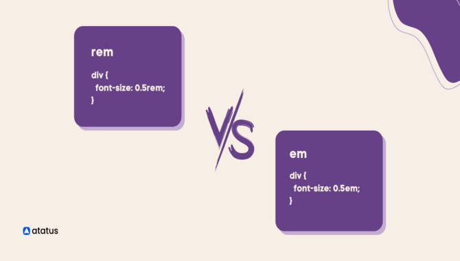
Understanding font rem can significantly improve the design of your website. As a unit of measurement, rem stands for “root em,” which is based on the font size of the root or HTML element. This means that when you set a font size in rem, it will be relative to the root element’s size.
This is particularly useful when creating responsive designs that need to adjust to different screen sizes and resolutions. By using rem to define font sizes, you can ensure that the typography on your website remains consistent and readable across other devices.
It’s important to note that using rem for font sizes differs from using pixels or ems. Pixels are an absolute unit of measurement, which can lead to problems when scaling up or down.
Ems, conversely, are relative to the font size of the parent element, making it difficult to maintain consistency across the design. Rem strikes a balance between the two, as it is based on the root element.
Why Font Rem Is Perfect For Your Project
f you’re looking for the perfect font for your project, you might want to consider Rem as your go-to choice. Here’s why. First and foremost, Rem is a scalable unit of measurement based on your document’s root font size. This means that it’s very flexible and can be easily adjusted to suit your needs.
Rem can easily adapt to your requirements without issues, whether you need a smaller or larger font size. Additionally, Rem is great for responsive design. It ensures that your website or application looks great on any screen size, which is especially important in today’s mobile-first world.
With Rem, you won’t have to worry about your website looking weird on a smaller screen or too small on a larger one. Finally, Rem is incredibly easy to use. You can specify the font size in Rem units, and you’re ready. It’s that simple. With all of these benefits, it’s no wonder why Rem is a popular choice.
The Benefit Of Using Font Rem
The use of Font Rem has many benefits for web developers and designers. One of the most significant advantages is creating a responsive design that can adapt to different screen sizes and resolutions.
This means the font size and style can adjust dynamically, ensuring the text remains readable and visually appealing on any device.
Additionally, using Font Rem can improve accessibility by making it easier for users with different visual impairments to read the content. With this tool, developers can set a minimum font size that ensures the text is legible, regardless of the screen size or resolution.
This can be particularly beneficial for older users or those with conditions such as presbyopia. Another benefit of using Font Rem is that it allows designers to maintain a consistent look and feel across different devices and platforms.
Using scalable fonts, they can ensure that the typography looks the same on all devices, whether desktop computers, tablets, or smartphones. Finally, Font Rem can help improve the overall user experience by making.
How To Install Font Rem Step By Step Guideline

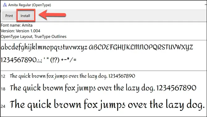
The importance of installing Font Rem cannot be overstated in today’s digital era. Font Rem is an application that allows users to manage and customize computer fonts. With the ever-increasing amount of content being produced digitally, it has become crucial to have a tool that can help you manage your fonts efficiently.
Font Rem lets you keep track of the fonts you have installed and makes it easy to install new ones. This is particularly useful for designers, artists, and anyone who works with typography. To install the Font Rem tool on your computer, follow these step-by-step guidelines:
1. Download Font Rem:
Visit the official Font Rem website or a trusted source to download the tool. Look for the download link or button on the website and click on it to initiate the download. Please save the file to a location on your computer where you can easily access it.
Extract The Files:
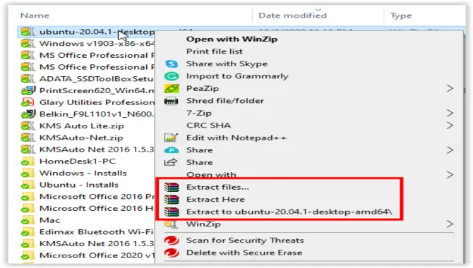
Once the download is complete, locate the downloaded file on your computer and extract its contents. Most operating systems have built-in tools for file extraction. Right-click the downloaded file and select “Extract” or “Extract Here” to extract the files.
Open The Extracted Folder:
After completing the extraction process, open the folder containing the extracted files. This folder usually contains the Font Rem executable file and other necessary files.
Run Font Rem: Double-click on the Font Rem executable file to run the tool. Depending on your operating system, you may be prompted with a security warning. If started, click “Run” or “Allow” to proceed.
Choose The Font To Install:
Font Rem will open with a user interface that allows you to select the font you want to install. Browse through your computer’s directory to locate the font file you wish to install. Select the font file and click “Open” or a similar button to proceed.
Install The Font:
Font Rem will install the selected font on your computer. The installation process may take a few seconds or longer, depending on the font file’s size.
Confirm Installation:
Once the font installation is complete, Font Rem will display a message confirming the successful installation of the font. You can now close the Font Rem tool.
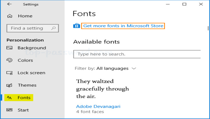
Check Installed Font:
To ensure that the font was installed correctly, open a text editing or word processing software (such as Microsoft Word) and check if the newly installed font appears in the font selection menu. If the font is listed, it has been successfully installed.
By following these step-by-step guidelines, you should be able to install fonts using the Font Rem tool on your computer. Remember always to download the tool from trusted sources to ensure the safety of your computer.
How To Adjust Font Rem Step By Step Guideline
Adjusting Font Rem is a bit vague since Font Rem is primarily a font installation tool rather than a configurable application. However, if you’re referring to adjusting font settings or preferences within Font Rem, such as changing the font size or style, unfortunately, that functionality does not exist.
Font Rem is explicitly designed for installing fonts onto your computer and does not have built-in features for adjusting font properties.
To adjust font settings or preferences for text in specific applications or on your computer, you’ll need to utilize the settings and options provided by those individual programs or operating systems. Here are some general guidelines for adjusting font settings on different platforms:
Windows:
For system-wide font settings: Open the Control Panel, search for “Fonts” or “Font Settings,” and adjust the font settings according to your preferences.
For specific applications: Many applications, such as word processors or graphic design software, have font settings within their options or preferences menus. Look for “Font” or “Text” settings and adjust accordingly.
Mac:
For system-wide font settings: Go to the Apple menu, select “System Preferences,” and then choose “General.” You can adjust the system font, font size, and other related settings from there.
For specific applications: Similar to Windows, their font settings are often accessible through the preferences or options menus. Look for “Fonts” or “Text” settings within the specific application.
Linux:
Font settings in Linux can vary depending on your distribution and desktop environment. Generally, there are system-wide font settings within the desktop environment’s settings or control panel.
For specific applications: Similar to Windows and Mac, individual applications often have font settings accessible through their options or preferences menus.
Adjusting font settings typically applies to specific applications or the overall system rather than Font Rem. Font Rem is a tool for installing fonts and does not offer direct font adjustment features.
Font Rem Common Problem And Solution
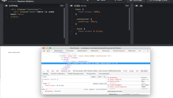
The importance of finding a solution to the Font Rem problem lies in its impact on web design and accessibility. The Font Rem problem refers to the issue of inconsistent font sizing when using the “rem” unit in CSS (Cascading Style Sheets) for responsive web design.
The “rem” unit is a relative unit that represents the root element’s font size. It is commonly used to create scalable and responsive designs. However, when the root element’s font size is changed dynamically, it can lead to unexpected and inconsistent font sizes throughout the website.
Font rendering issues are a common problem affecting the appearance and legibility of text on screens. Here are some common font rendering problems and potential solutions:
Blurriness Or Fuzziness:
Sometimes, fonts can appear blurry or fuzzy, especially on lower-resolution screens. This issue is often caused by anti-aliasing settings or improper font hinting. To address this problem, you can adjust your device’s anti-aliasing settings or use fonts optimised explicitly for screen rendering. Additionally, correctly applying the font hinting can help improve clarity.
Jagged Or Pixelated Edges:
Fonts with rough or pixelated edges can occur when the screen’s resolution is not high enough to render the fine details of the font. Increasing the resolution or using fonts designed for screen use can alleviate this problem. Additionally, using subpixel rendering techniques, such as ClearType on Windows or font smoothing on macOS, can enhance the smoothness of font edges.
Incorrect Line Spacing Or Kerning:
In some cases, fonts may display improper line spacing or kerning, resulting in uneven or cramped text. This issue can be addressed by adjusting the line height or leading settings in the design software or text editor. Kerning issues can also be resolved by changing the kerning pairs in the font or through the layout software.
Inconsistent Appearance Across Devices:
Fonts can sometimes look different when viewed on other devices or operating systems. This discrepancy is often due to variations in font rendering engines and anti-aliasing algorithms.
To ensure consistent font appearance, testing fonts across different platforms and devices during the design process is advisable. Choosing widely supported fonts and web-safe fonts can also help mitigate this problem.
Missing Glyphs Or Character Substitutions:
Occasionally, certain characters or glyphs may be missing or substituted with alternative shapes, resulting in incorrect rendering. This issue can occur if the font being used lacks support for specific characters, or there are encoding or compatibility issues.
Ensuring that the font being used supports the required character set and using appropriate encoding standards (such as Unicode) can help resolve this problem.
Licensing And Font Embedding Restrictions:
Font licensing agreements may restrict embedding or using fonts in specific contexts, such as web embedding or mobile apps. Reviewing and compiling the font licensing terms is essential to avoid legal issues. Using web-safe fonts or fonts that permit embedding can help circumvent this problem.
It’s worth noting that various factors, including the operating system, screen resolution, browser or software settings, and the font itself, can influence font rendering. Therefore, it’s essential to consider these factors and test font rendering across different scenarios to ensure optimal results.
Conclusion
Using font rem effectively is crucial in design. Following these guidelines can enhance your designs’ visual appeal and readability. Remember to experiment, explore different font combinations, and create designs that effectively communicate your message.
Understanding the guidelines for practical font usage is essential for creating visually appealing and easy-to-read designs. By paying attention to font size, spacing, and contrast, you can effectively communicate your message and keep your audience engaged.
Whether creating a website, a presentation, or a print design, using fonts correctly can help you achieve your goals and make a lasting impression on your viewers. So, take the time to learn and apply the Font Rem guidelines to your designs, and you will see a significant improvement in their overall quality and effectiveness.
FAQs (Frequently Asked Questions)
1.Can I Use Any Font For Commercial Purposes?
Ans: It depends on the font’s license. Some fonts are free for commercial use, while others require approval or purchase. Always check the font’s licensing terms before using it commercially.
2.What Is The Recommended Font Size For Body Text?
Ans: The recommended font size for body text is usually between 10 to 12 points, depending on the font and the medium of presentation. Test the readability of your chosen font at different sizes to ensure optimal legibility.
3.Are There Any Font Pairing Rules I Should Follow?
Ans: With no strict rules, aim for contrast and harmony when pairing fonts. Combine different font styles, such as serif and sans-serif, to create visual interest. Experiment and trust your eye for design.
4.How Can I Ensure My Design Is Accessible For Visually Impaired Readers?
Ans: Choose fonts that are easy to read, especially for individuals with visual impairments. Consider factors like font size, contrast, and legibility. Adhering to web accessibility standards, such as providing alt text for images, also helps improve accessibility.
5.Where Can I Find High-Quality Fonts For My Design Projects?
Ans: There are various sources for high-quality fonts, including Google Fonts, Adobe Fonts, and reputable font foundries. Explore these platforms and consider free and paid options for your design needs.

David Egee, the visionary Founder of FontSaga, is renowned for his font expertise and mentorship in online communities. With over 12 years of formal font review experience and study of 400+ fonts, David blends reviews with educational content and scripting skills. Armed with a Bachelor’s Degree in Graphic Design and a Master’s in Typography and Type Design from California State University, David’s journey from freelance lettering artist to font Specialist and then the FontSaga’s inception reflects his commitment to typography excellence.
In the context of font reviews, David specializes in creative typography for logo design and lettering. He aims to provide a diverse range of content and resources to cater to a broad audience. His passion for typography shines through in every aspect of FontSaga, inspiring creativity and fostering a deeper appreciation for the art of lettering and calligraphy.
