Font Outline CSS is a styling method to add an outline around the text. It can highlight text and enhance legibility with customized colors, widths, and styles.
Font Outline CSS can be applied to HTML elements like headings, paragraphs, or buttons for visual appeal. Are you looking to add some extra oomph to your website’s text? Look no further than font outline CSS. This simple but effective tool can make your text pop and stand out. We will dive into what font outline CSS is and how it works.
You’ll learn how to create eye-catching text using the ‘text-stroke’ property or add a font outline using the ‘text-shadow’ property. We’ll even show you how to create a double outline effect for an even more impressive result. Plus, we’ll cover the advantages of using font outline CSS and things to remember when implementing it on your website.
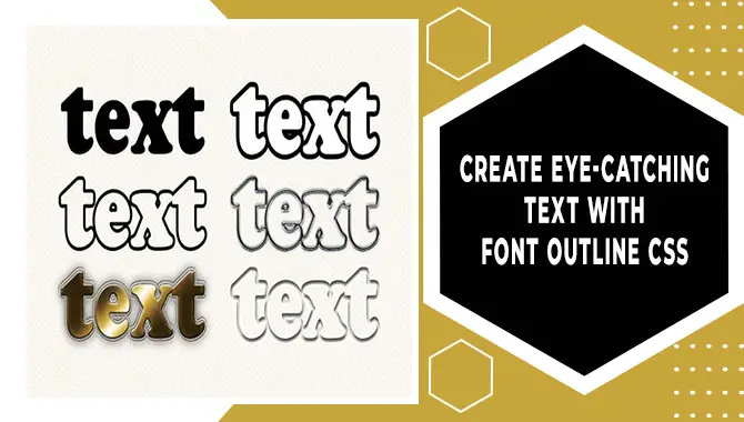
How To Create Eye-Catching Text With Font Outline CSS
Font Outline CSS is a great way to make your website’s text more visually appealing. You can outline your text using the ‘text-stroke’ property or the ‘text-shadow’ property. With customized colors, widths, and styles, you can create eye-catching effects to make your text stand out. Don’t forget to keep in mind the advantages and best practices when implementing font outline CSS on your website.
Developers can create eye-catching text using font outline CSS by following specific steps. Firstly, they must use the CSS outline property to create a border around the text. Secondly, they can experiment with different fonts and styles to get the best outline effect for their website.
Developers can use the font-weight property to emphasize specific words or phrases within the text. Remember not to overuse font outlines, which could reduce their impact on readers. By following these steps, developers can improve their website’s readability and overall look.
Using The ‘Text-Stroke’ Property For Font Outline
Adding an outline to your text using the ‘text-stroke’ property is a fantastic way to make it more visually appealing. By controlling the thickness and color of the stroke, you can create unique effects that will catch your reader’s eye. It is a popular CSS technique used by designers who want their text to stand out.
The great thing about this technique is that it’s compatible with most modern browsers, including Chrome, Firefox, and Safari. To use it, simply add the ‘text-stroke’ shorthand property to your CSS code, along with stroke width and color values. When using ‘text-stroke’, remember that less is often more. Too much of it can make your text look cluttered or difficult to read. Experiment with different values until you find one that works well for your application.
Adding Font Outline Using ‘Text-Shadow’ Property
To enhance your website’s typography, adding a font outline is one way to make it more visually appealing and stand out. One efficient way to achieve this effect is using CSS’s ‘text-shadow’ property.
This technique allows you to experiment with different font styles and sizes while creating distinct double, triple, or even colored outlines. Test these effects thoroughly on various devices and screen sizes to ensure they look good across all platforms for optimal impact.
Creating Double Outline Effect For Font
To add an outlined effect to your text, you can experiment with different font sizes and weights while using two colors for the inner and outer outlines. Using the text-shadow property will enable you to adjust the values that create various font outlines, such as double, triple, or colored outlines, compatible with most modern browsers like Chrome, Firefox, and Safari.
Testing your font outline on different devices and screen sizes will ensure it looks good across all platforms. Additionally, remember not to overdo it with stroke width or opacity settings; instead, use longhand properties such as stroke width or opacity for vector graphics.
Advantages Of Using Font Outline Css

Using font outline CSS can enhance your website’s typography, making it more visually appealing and easier to read. It also allows you to experiment with different font styles, sizes, and colors while creating distinct outlines that stand out. Moreover, font outline CSS is compatible with most modern browsers, making it an easy way to improve the design of your website.
By utilizing the font outline CSS property, website owners can enhance the appearance and readability of their text. This technique enables them to customize their fonts using a variety of colors and styles tailored to their preferences.
Besides aesthetics, it also increases accessibility for people with visual impairments while promoting consistency throughout the website design. Experimenting with different properties such as text-shadow or stroke width adds depth and dimension for an eye-catching effect. Incorporating this method into your HTML and CSS code will lead to a visually stunning outcome.
Using CSS SVG Filters For Font Outline
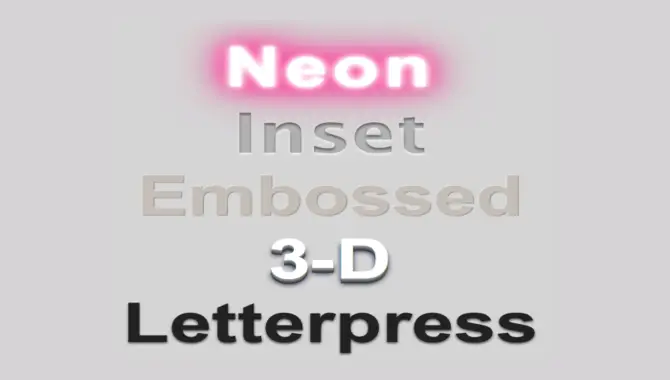
In web design, CSS SVG filters are handy for adding visually appealing font outlines. While the “text-shadow” property is commonly used for creating simple outlines with CSS, the “feMorphology” filter enables adjustment of size and shape, while the “feColorMatrix” filter changes outline colors.
Combining these filters produces unique effects that enhance visual appeal. With the text-stroke property, one can use different colors for inner and outer outlines, which creates a unique look. It’s best to experiment with different font sizes and weights to find the best combination for your design while considering that the preview may differ in various browsers like Chrome or Safari.
How To Use Font Outline CSS?
To add a font outline to your text using CSS, you can use the “text-stroke” property or the “text-shadow” property. For example, to add an outline with a color of red and a thickness of 2px, you would use the following code:
“`h1 {text-stroke: 2px red;}
“`Alternatively, you can use the text-shadow property as follows:
“`h1 {text-shadow: -1px -1px 0 #000,1px -1px 0 #000,-1 px 1px 0 #000,1px 1px 0 #000;}
“`Adding an outline to your font in CSS involves selecting the text and using the “text-stroke” property. Adjust the thickness and color with “text-stroke-width” and “text-stroke-color.” Not all browsers support this feature, so testing is crucial for cross-platform compatibility.
Things To Keep In Mind While Using Font Outline Css
To optimize your website’s design and readability when using font outline CSS, keep in mind these essential guidelines. Use the outline sparingly to avoid overwhelming the text, and select a contrasting color that makes it stand out.
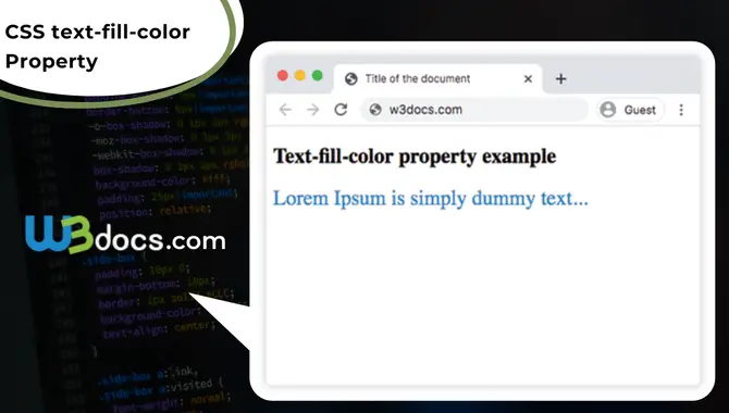
Experiment with different thicknesses and styles of outlines, such as text-stroke property, text-shadow property, webkit-text-stroke-width, webkit-text-fill-color, etc., to find what suits your design best. Test readability across various devices and screen sizes by adjusting stroke width or blur radius in codepen tutorials or CSS demos.
Conclusion
Font outline CSS is an amazing way to create eye-catching text. It is easy to use and provides a lot of flexibility in terms of design. With the different properties available like ‘text-stroke’, ‘text-shadow‘ and creating double outline effects, you can create some really cool designs.
Another advantage of font outline CSS is that it works across browsers and platforms. However, it is important to remember things like choosing the right font size and thickness, keeping it simple, and not going overboard with too many outlines. To learn more about using font outline CSS, check out our guide on creating stunning text designs now.
Frequently Asked Questions
Can You Outline The Font In CSS?
Indeed, CSS allows outlining fonts with the text-stroke property, which defines the outline’s thickness and color. However, not all browsers support this feature, and it must be used judiciously to maintain readability and accessibility.
How Do You Add A Font Border In CSS?
If you want to add a border around your font in CSS, use the text-stroke property. However, note that all browsers do not widely support it. Consider using other options like text-shadow or outline to achieve a similar effect in such cases. Set the text-stroke color and width to customize your font border.
How Do You Outline Letters In HTML CSS?
To create outlines for letters in HTML CSS, you can use the text-stroke property with a specified stroke width and color. However, it’s essential to check browser compatibility. Alternatively, you can use text-shadow with a high blur radius for outlining letters.
How Do I Make A Font Just An Outline?
To create a font outline, use the CSS property “text-stroke” and adjust the width with “text-stroke-width.” Set “text-fill-color” to transparent to show only the outline. This technique enhances text visibility on images or backgrounds.
How Does Text Outline Work In CSS?
CSS can create a border around the text using the text outline technique. While not an official property, it can be achieved through “text-shadow.” Text outline adds visual appeal to typography but should be used carefully, as excessive use may hamper readability.

David Egee, the visionary Founder of FontSaga, is renowned for his font expertise and mentorship in online communities. With over 12 years of formal font review experience and study of 400+ fonts, David blends reviews with educational content and scripting skills. Armed with a Bachelor’s Degree in Graphic Design and a Master’s in Typography and Type Design from California State University, David’s journey from freelance lettering artist to font Specialist and then the FontSaga’s inception reflects his commitment to typography excellence.
In the context of font reviews, David specializes in creative typography for logo design and lettering. He aims to provide a diverse range of content and resources to cater to a broad audience. His passion for typography shines through in every aspect of FontSaga, inspiring creativity and fostering a deeper appreciation for the art of lettering and calligraphy.
