The dynamic font in CSS allows font size to adapt to different devices and screen sizes, ensuring readability. It is achieved through media queries and viewport units, improving accessibility and user experience on websites across all devices.
As a web developer, you know that typography plays a significant role in your website’s overall design and functionality. What if we told you there is a way to make your font sizes dynamic? Adjusting automatically to different screen sizes? Dynamic Font Size CSS is the solution you have been looking for.
We will take you through everything you need about CSS Dynamic Font Size. From understanding absolute and relative font size keywords, percentage values, EM and REM units, viewport units, and CH units. With this powerful tool, you can create websites responsive to all devices while maintaining the perfect typography. Get ready to step up your web development game with our ultimate Dynamic Font Size CSS guide.
How To Use Dynamic Font Size CSS Effectively
To effectively use CSS Dynamic Font Size, define font sizes using relative units such as EM or REM. Use media queries to target specific screen sizes and adjust the font size accordingly using viewport units like VH and VW.
Avoid using absolute font size keywords such as px, as they will not adjust to different screen sizes. Always test your website on multiple devices to ensure readability and accessibility. With these tips, you can create a website with beautiful, dynamic typography that adapts seamlessly to any device.
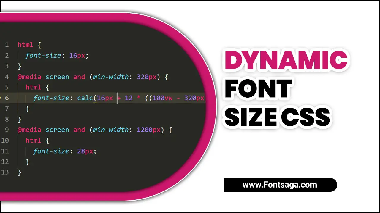
To optimize your web page’s accessibility and user experience, you need responsive typography techniques like Dynamic Font Sizes in CSS. This technique adjusts the font size based on the browser window’s width with relative units like ’em’ & ‘rem.’ The dynamic fonts can be implemented using CSS variables, viewport units (vw), or Javascript code snippets like ‘calc’ & ‘jQuery.’
Absolute Font Size Keywords And Values
When defining font sizes in CSS, you can use absolute values like pixels or keywords. But it’s better to use relative values. Using relative font size units such as em or percentages makes your webpage more accessible across various devices with varying screen widths and resolutions.
When designing a responsive website, it is important to consider the maximum font sizes based on viewport sizes. Ensuring that the font sizes are dynamic and responsive to different screen sizes while setting a specific font size of 20px as the maximum size for optimal readability. Compatibility testing of your website across multiple platforms is essential to ensure uniformity. Fallback fonts should also be considered when incorporating dynamic font sizing to enhance accessibility.
Relative Font Size Keywords
Setting font sizes based on the parent or root element is possible with relative font size keywords like ’em’ and ‘rem.’ To create an accessible and user-friendly website on screens of all sizes. It’s crucial to consider your webpage’s overall design and readability.
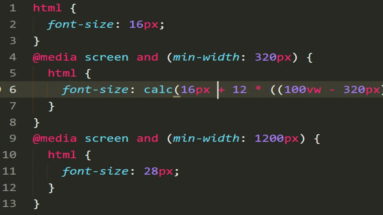
For a comprehensive solution, combine dynamic font size CSS with responsive typography, media queries, breakpoints, and viewport width (vw) units. Enhance accessibility by testing your website across different devices and screen resolutions. When designing a responsive website, it is crucial to consider pixel font sizes, preferred font sizes, size scales, viewport height, and CSS rules to ensure dynamic and adaptable font sizes.
Percentage Values For Font Size
Choosing the right font size is important for web design. One way to do this is by using percentage values in CSS for dynamic resizing depending on the device or screen size of the user. This technique improves accessibility and offers users greater control over text size.
The CSS property “font-size” allows for dynamic font size adjustments based on display sizes. With the default font size set as a reference point. It’s a great idea to tailor the font size to ensure optimal readability for users. You should select an appropriate base font size and test your dynamic font sizes across different devices and screens for optimal results.
The Em Unit For Font Size
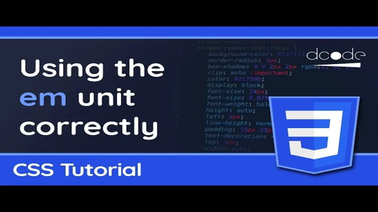
The EM unit is an incredibly useful tool for dynamic font sizes in CSS. Rather than being fixed like pixels, EMs adjust relative to their parent element, making them perfect for responsive typography that adapts to different screen resolutions. Combining EMs with media queries lets you easily set breakpoints and adjust the font size of your headings or body text depending on the viewport’s width.
One drawback of using EM units is that it can be challenging to maintain consistency across nested child elements with different font sizes. This issue can be resolved by switching to REM units instead of EMs since REMs calculate based on the default size of the HTML selector rather than the parent element. This way, you’ll know that your font sizes will stay consistent no matter where your code ends.
The Rem Unit For Font Size

Using dynamic font sizing with REM units can enhance the accessibility and user experience of your webpage. The REM unit for font size is a relative font size that adapts to different screen sizes through media queries. By setting a reasonable base font size, you can ensure good readability across all devices.
This feature offers design flexibility and caters to users’ varying visual needs. Incorporating responsive typography techniques like using child elements and parameters such as vmin and vh also contributes to the efficient use of space on small screens. When designing a website, it’s important to consider the hypothetical font size, the exact font size, and the current font size, as they all play a role in creating a dynamic and visually appealing CSS for the REM unit of font size.
The Ex Unit For Font Size
The EX unit is a powerful tool for dynamically adjusting your website’s text size. By basing its measurements on an ‘x’ width, the text remains consistently sized across various devices without compromising on readability or accessibility.
This feature allows you to create a responsive design that adjusts seamlessly across different screen sizes and browsers. Additionally, combining dynamic font size CSS with media queries provides greater control over tweaks for smaller screens. Remember to use this functionality judiciously; after all, no one wants their webpage’s text size to fluctuate uncontrollably.
Viewport Units For Font Size
Viewport units for font size are essential to CSS and responsive web design. Using VW and vh values rather than fixed pixels or ems makes text legible across all devices, from large desktop monitors to small mobile phones.
Designers can create dynamic and adaptable designs with other CSS features like media queries, responsive typography, calc() parameters, or fluid line height. Although there are drawbacks, like unpredictable sizing when combined with text overflow or small screens, using VW and vh units is a great way to ensure your website looks great on all devices regardless of screen resolution or browser window dimensions.
The Ch Unit For Font Size
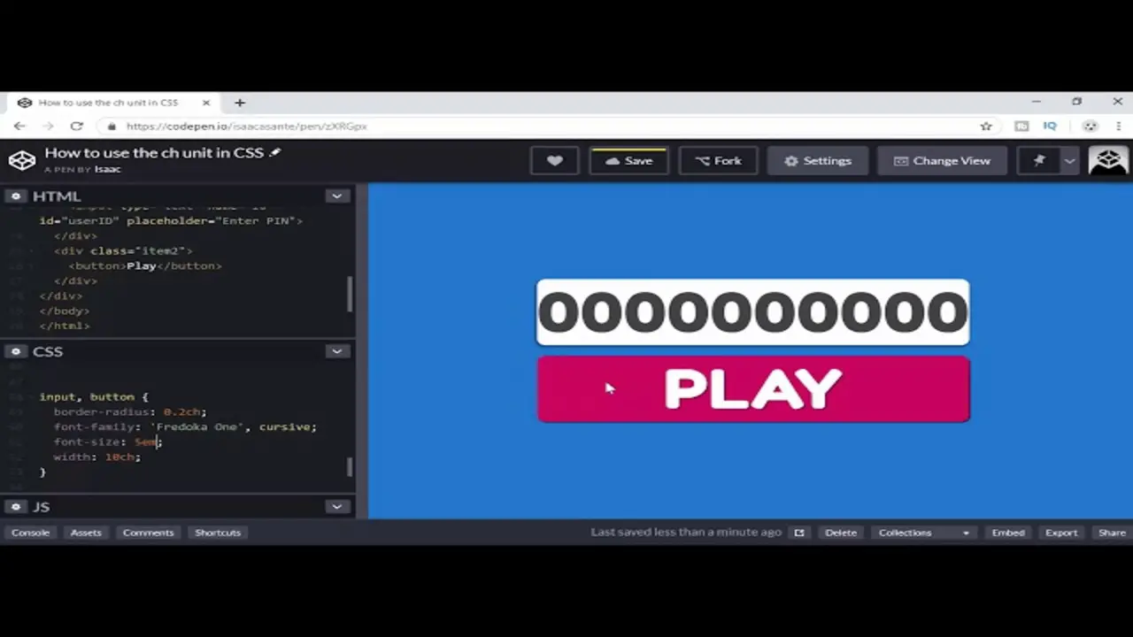
The CH unit is a handy tool CSS developers can use to guarantee consistent font sizes across multiple devices and screen resolutions. With this relative unit of measurement, you can set your text’s size based on the width of the character “0” in your chosen typeface, ensuring that your headings and paragraphs are legible on desktop and mobile browsers.
Additionally, you can create dynamic webpages that adapt to any user’s needs by combining this technique with other responsive design strategies, such as fluid typography and media queries in HTML and JavaScript code structure.
How To Implement Dynamic Font Size In Your Html And Javascript
When adding responsive typography to your webpage, following best practices for dynamic font sizing is important. One key recommendation is to use relative units like em or rem instead of pixels. This ensures the text remains readable even when viewed on different browser windows or devices with varying screen resolutions.
Media queries can change the font size based on device type and screen size. Additionally, implementing JavaScript code enables dynamic adjustments of text size based on user input parameters. Accessibility should also be considered while designing fonts so that people with visual impairments can read them easily.
Conclusion
Dynamic font sizing plays a vital role in responsive web design. By using relative units and media queries, you can ensure optimal readability and accessibility on all devices. Font size CSS is an excellent way to make your website more accessible and user-friendly. With its multiple units, you can adjust the font size of your content to suit different devices and screen sizes.
You can create a consistent and cohesive design across your website using relative units. Implementing dynamic font size in your HTML and JavaScript is straightforward, with many benefits. You’ll improve the readability of your content, make it easier for people with visual impairments to read, and generally enhance the overall user experience on your site. Get started today by reading our ultimate guide on dynamic font size CSS.
Frequently Asked Questions
How do I automatically change font size in CSS?
When changing font size in CSS, use the “vw” unit to make it relative to the viewport width. Use media queries for different screen sizes and consider JavaScript for user preferences. Avoid making text too small or too large as it can affect readability and user experience.
What is a dynamic font size?
Dynamic font size is a technique in CSS that modifies the font size according to the screen size or device. They are used in responsive web design to ensure readability, and em or rem units can create dynamic sizes based on user text preferences. This improves accessibility and user experience.
How will you make font size responsive in CSS?
To make font size responsive, apply media queries for screen-size-based adjustments. Use relative units like em or rem instead of fixed pixels. Consider using CSS frameworks with built-in responsive typography features. Test your design on various devices to ensure the best readability.
How do I scale a font in CSS?
To scale a font in CSS, set the base font size using the “font-size” property, then use relative units like em/rem or per cent values. Media queries can adjust font size based on screen size. Experiment with different scaling techniques to find what fits your design.
How to change font size depending on the width of the container?
To adjust font size based on container width, employ media queries to determine the width and set varying font sizes for different screen sizes within the query. Use relative units like “em” or “rem” for scalability and test to ensure optimal appearance on all devices.

David Egee, the visionary Founder of FontSaga, is renowned for his font expertise and mentorship in online communities. With over 12 years of formal font review experience and study of 400+ fonts, David blends reviews with educational content and scripting skills. Armed with a Bachelor’s Degree in Graphic Design and a Master’s in Typography and Type Design from California State University, David’s journey from freelance lettering artist to font Specialist and then the FontSaga’s inception reflects his commitment to typography excellence.
In the context of font reviews, David specializes in creative typography for logo design and lettering. He aims to provide a diverse range of content and resources to cater to a broad audience. His passion for typography shines through in every aspect of FontSaga, inspiring creativity and fostering a deeper appreciation for the art of lettering and calligraphy.
