Credit card font is the specific typeface used for numbers and text on credit cards. The most widely used font is OCR-B, which ensures legibility for machines and humans.
Regulators govern the size and style of the numbers on card fonts for security reasons. Regarding credit card design, every detail matters, including the font. The right card font can significantly impact your card’s overall look and feel. But with so many options available, how do you choose the best one?\
This guide will dive deeply into the world of card fonts. We will explore popular choices in the market. Additionally, we will provide valuable insights on choosing the right card font for your brand or business. So if you’re ready to elevate your credit card design game, read on.
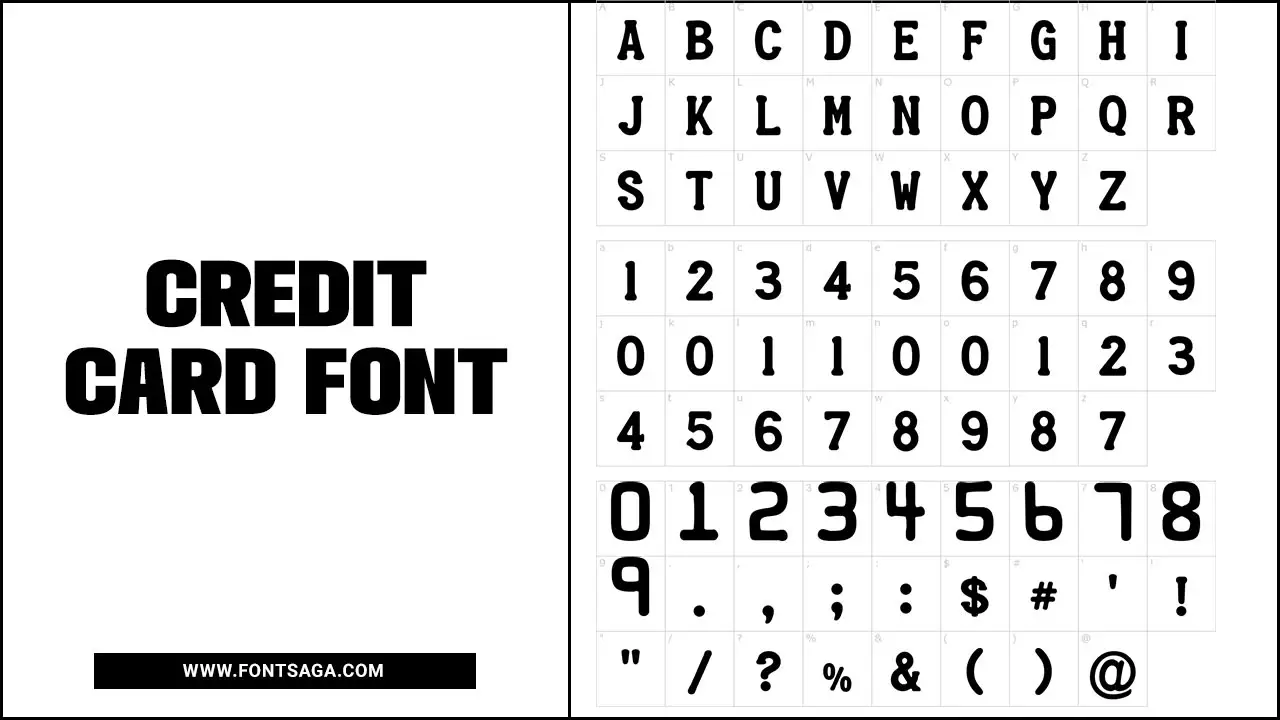
Choose The Best Credit Card Font
Credit card fonts provide several benefits to businesses and individuals. Incorporating visually appealing card fonts can enhance the overall aesthetic of credit card designs and attract customers. Clear and legible card fonts enhance readability, allowing readers to comprehend critical information easily.
Consistently using recognizable fonts establishes brand recognition and builds trust. Here we provide guidelines on choosing the right card font.
Popular Card Fonts

Several popular card fonts are available for your credit card design. People widely use fonts like Arial, Helvetica, Futura, Univers, Gotham, and Times New Roman. Arial has gained fame for its clean and professional appearance, while Helvetica is famous for its simplicity and readability. Futura exudes a modern and sleek look, making it a popular choice.
Univers provides versatility with its range of weights and styles, allowing designers to use it for various credit card designs. High-end credit card companies often prefer Gotham for its bold and contemporary aesthetic. People commonly use Times New Roman, a classic serif font, for credit card numbers and other essential details.
How To Choose The Right Card Font
When selecting the perfect font for your credit card, it’s crucial to prioritize readability and legibility. Choose a font that is clear and easy to read, even in small sizes. Additionally, consider matching the font to your brand’s personality and values, ensuring it conveys professionalism and trustworthiness.
You should also consider the credit card’s overall design and ensure the font complements its aesthetic appeal. Don’t be afraid to experiment with different font options to find the ideal fit. Remember, the correct card font can significantly impact your brand’s image and credibility.
Which Font Should Be Used For A Credit Card?
When choosing a font for a credit card, opt for a bold, sans-serif typeface like Helvetica, Arial, or Futura. Ensure the font is easily legible and clear, even in small sizes. It’s crucial to adhere to industry standards and guidelines when selecting the font for credit cards.
Things To Keep In Mind While Choosing A Card Font
Several factors must be considered when choosing a font for your credit card. Prioritize legibility by selecting a font that is easy to read, especially in small sizes. Align your font with your brand image and values to enhance your branding efforts.
Opt for a versatile font that works well across different platforms. Look for a font with built-in security features to prevent counterfeiting and prioritize accessibility for visually impaired users. Lastly, maintain consistency with the rest of your credit card design to create a cohesive and professional look.
Conclusion
The right credit card font is paramount when creating a professional and credible brand image. The chosen font should be visually pleasing and easy to read and identify. It should effectively convey the values and personality of your brand while adhering to industry standards.
Consistency is crucial in branding, so ensure that the font you choose aligns with your overall design elements. Suppose you want to delve deeper into this topic and discover some of the best card fonts available. If you follow the above outline correctly, you can now choose card font confidently.
Frequently Asked Questions
1.What Is The Best Font For A Card?
Ans: The ideal font for a card should be clear, legible, and easy to read. Sans-serif fonts like Arial, Helvetica, or Verdana are commonly used for their clean and modern look. Choose a font that doesn’t cause confusion or misinterpretation is essential.
2.What Font Is Used On Visa Credit Cards?
Ans: The font used on Visa credit cards is called “Bank Gothic.” It is a bold and geometric sans-serif typeface that gives the credit card design a modern and professional look. Other popular fonts used on credit cards include Helvetica, Arial, and Univers.
3.What Is The Font Size Of A Credit Card?
Ans: Credit check font size is typically small, ranging from 6 to 8 points. This allows for all the necessary information while maintaining legibility. Sans-serif typefaces are commonly used. Credit card embossed numbers and letters are slightly larger than the printed text.
4.What Is The Font On The Capital One Credit Card?
Ans: Capital One credit cards use Gotham font, a modern sans-serif typeface known for its clean and professional look. Gotham enhances the sleek and sophisticated aesthetic of the cards, making it a popular choice for branding and design.
5.What Are The Best Business Card Fonts?
Ans: When choosing a font for your business card, prioritize legibility and align it with your brand’s style. Popular options include Helvetica, Arial, Futura, and Garamond. Experiment with different fonts to find the one that best represents your brand.

David Egee, the visionary Founder of FontSaga, is renowned for his font expertise and mentorship in online communities. With over 12 years of formal font review experience and study of 400+ fonts, David blends reviews with educational content and scripting skills. Armed with a Bachelor’s Degree in Graphic Design and a Master’s in Typography and Type Design from California State University, David’s journey from freelance lettering artist to font Specialist and then the FontSaga’s inception reflects his commitment to typography excellence.
In the context of font reviews, David specializes in creative typography for logo design and lettering. He aims to provide a diverse range of content and resources to cater to a broad audience. His passion for typography shines through in every aspect of FontSaga, inspiring creativity and fostering a deeper appreciation for the art of lettering and calligraphy.
