The font size is one of the most crucial elements to consider. Choosing the right font size can significantly impact your text’s overall readability and visual appeal.
Whether designing a website, creating a marketing brochure, or drafting a report, selecting the appropriate font size is essential for effectively communicating your message to your target audience.
However, with an overwhelming range of font sizes available, it can be challenging to determine the perfect size for your project. That’s why we’ve put together this blog post to help you make an informed decision about choosing the right font size.

How To Choose The Right Font Size Considering A Few Variables

Choosing the right font size is crucial when designing any written material. Whether it is a website, brochure, or presentation, the font size can make or break the overall aesthetic appeal of the content. Therefore, choosing the right font size that will complement the design and convey the intended message effectively is essential.
Choosing Font Size For Print Materials

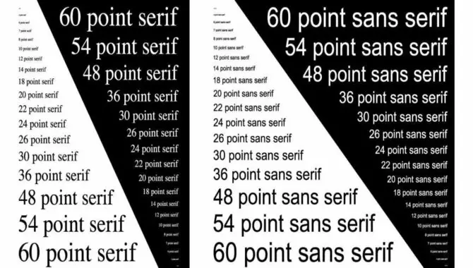
When choosing the font size for print materials, it is important to balance readability and aesthetic appeal. It’s crucial to consider the intended audience and the purpose of the print materials because the font size greatly influences how easily the text can be read. Generally, experts recommend using a font size between 10 and 12 points for body text to ensure readability without overwhelming the reader.
However, you can use a larger font size for headlines or titles to create visual impact and draw attention. The goal of selecting the font size for the printed materials should ultimately be to make the text easily readable. And engaging the target audience while aligning with the overall design and purpose.
Testing And Adjusting Font Size
Testing and adjusting font size is essential in designing and presenting written content. It involves experimenting with different font sizes to ensure optimal readability and visual appeal. By testing various sizes, designers can determine the ideal balance between legibility and aesthetics for a particular piece of text. The goal is to find a size that allows readers to comfortably consume the information without straining their eyes or losing interest.
Adjusting the font size can also be helpful in accommodating different devices and screen sizes. Ensuring that the text appears well-proportioned and easy to read across various platforms. By carefully testing and adjusting font size, designers can enhance the overall user experience and deliver content effectively communicating its message.
Best Practices For Font Size In Different Settings
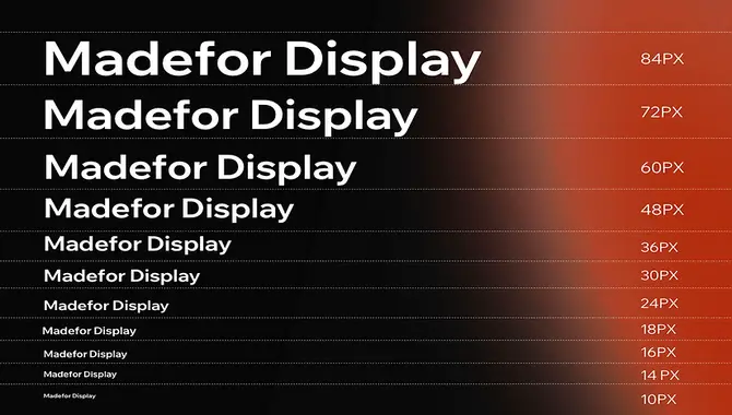
Choosing the right font size is crucial for effective communication in various settings. Print materials such as books or magazines generally recommend a font size between 9 and 12 points to ensure readability. For digital screens, where reading distances are typically shorter, 16 pixels or higher font size is recommended to enhance legibility.
In presentations or slideshows, a font size of at least 24 points is preferred to ensure the content can be easily read from a distance. In mobile applications, screen sizes are smaller, and using a font size of at least 14 points is advisable to provide a comfortable reading experience. These best practices for font size help to ensure that information is conveyed clearly and effectively across different mediums and settings.
Importance Of Choosing The Right Font Size
The importance of choosing the right font size cannot be overstated. The font size can affect any written communication’s readability and effectiveness. If the font size is too small, readers may struggle to read the text, leading to frustration and a lack of engagement with the content. Conversely, if the font size is too large, it can be visually overwhelming and detract from the message.
Choosing the appropriate font size is especially critical for marketing materials, where the goal is to capture the audience’s attention and convey a brand message effectively. A font that is too small or too large can be a turn-off for potential customers, and they may not give the message the attention it deserves.
Understanding Font Size And Its Impact On Readability
Understanding font size is crucial for ensuring readability in written content. Font size is measuring the text’s height, typically represented in points. The choice of font size directly impacts how easily readers can perceive and comprehend the text. When the font size is too small, it strains the reader’s eyes, leading to fatigue and decreased comprehension.
Conversely, excessively large font sizes can disrupt the reading flow and make the text appear cumbersome. Achieving optimal readability involves selecting a font size that balances legibility and aesthetics. Catering to the target audience and the medium of presentation. By carefully considering font size, content creators can enhance the reading experience. Making it more accessible and engaging for their audience.
Conclusion
Knowing the Right font size is a crucial task that requires attention to detail and precision. Choosing the right font size is also essential to creating a visually appealing and readable document, whether for print or digital use. By considering the purpose and audience of your document.
And the medium and design elements, you can make an informed decision about the appropriate font size. Remember, readability and accessibility should be top priorities in font size selection, and a professional and consistent approach to typography can significantly enhance your communication’s overall impact and effectiveness.
FAQ
How Do I Determine The Appropriate Font Size For My Document Or Design?
The ideal font size depends on various factors, such as the medium, audience, and content type. It is generally recommended to consider the readability requirements and test different sizes to find the best fit.
What Is The Standard Font Size For Body Text In Printed Materials?
Printed materials’ standard font size for body text typically ranges from 10 to 12 points. However, legibility should be the primary consideration, so adjust accordingly for specific requirements.
What Font Size Should I Use For Web Content?
Web content generally requires a slightly larger font size than print. A font size between 14 and 16 pixels (10 to 12 points) is commonly used to ensure readability on different devices and screen resolutions.
Is There A Recommended Font Size For Headings And Titles?
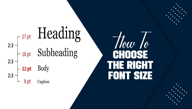
Headings and titles typically have larger font sizes than body text to create a visual hierarchy. Depending on the context, the specific size will vary based on the design but commonly ranges from 18 to 36 points.
Can Font Size Affect The Overall Design Aesthetics?
Yes, font size plays a significant role in the visual appeal of a design. It helps establish hierarchy, balance, and readability. Adjusting font size can greatly impact your design’s overall aesthetics and readability

David Egee, the visionary Founder of FontSaga, is renowned for his font expertise and mentorship in online communities. With over 12 years of formal font review experience and study of 400+ fonts, David blends reviews with educational content and scripting skills. Armed with a Bachelor’s Degree in Graphic Design and a Master’s in Typography and Type Design from California State University, David’s journey from freelance lettering artist to font Specialist and then the FontSaga’s inception reflects his commitment to typography excellence.
In the context of font reviews, David specializes in creative typography for logo design and lettering. He aims to provide a diverse range of content and resources to cater to a broad audience. His passion for typography shines through in every aspect of FontSaga, inspiring creativity and fostering a deeper appreciation for the art of lettering and calligraphy.
