Headline font is one of the most important elements of any newspaper or magazine. A headline font should be bold, clear, and eye-catching.
It should also be easy to read and fit well with the page’s overall layout. The newspaper title font is the first thing that catches the reader’s attention.
It can make or break their decision to read the article or move on. A good newspaper title font should be readable, legible, and attention-grabbing. We will cover the tips for choosing the right newspaper title font and the benefits of using a good font. We will also list the popular newspaper title fonts, their pros and cons, and how to use them effectively.
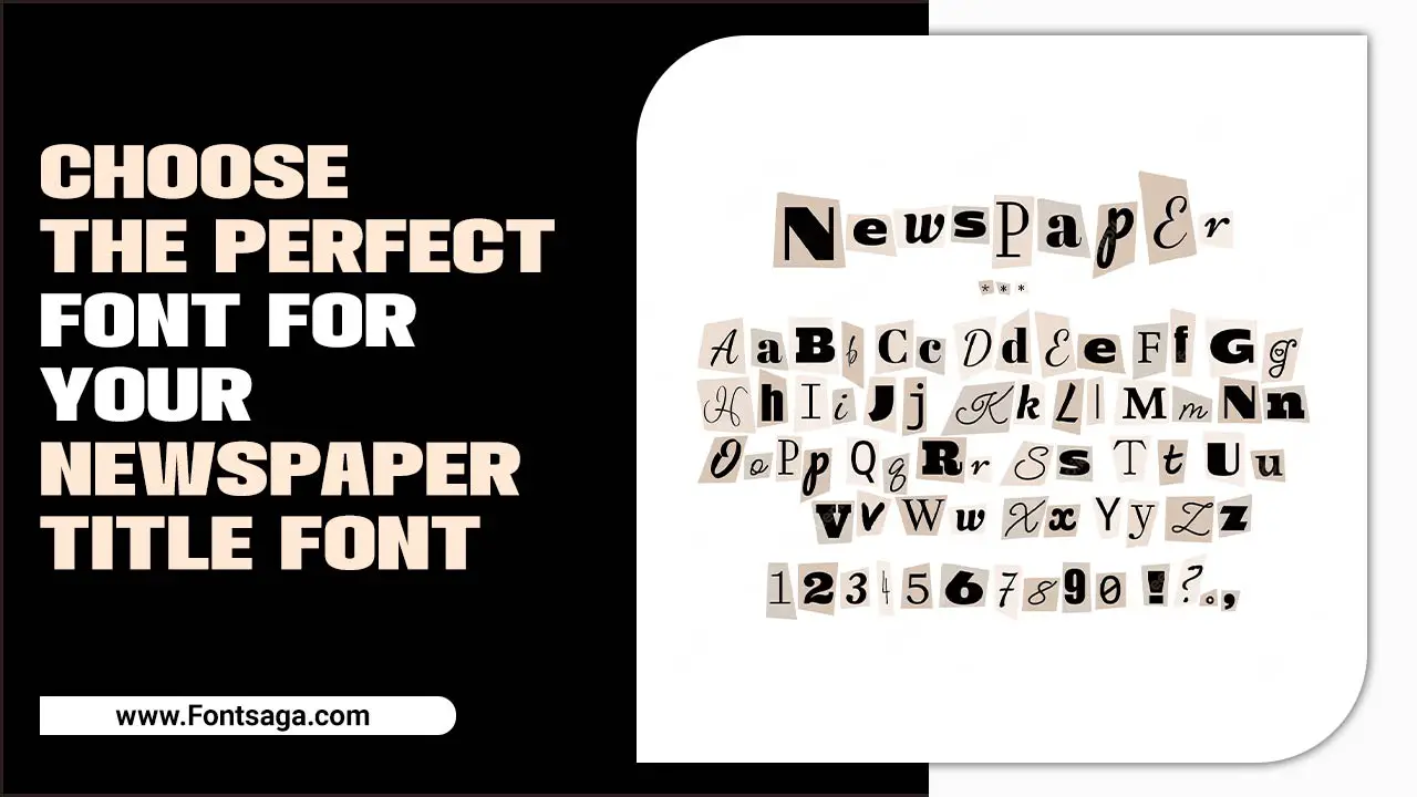
What Is A Newspaper Title Font?

In a newspaper, the title font is primarily used for mastheads and the first letter of a chapter. It adds a sense of identity and distinctiveness to the newspaper’s branding. Among the popular fonts used, Camera Obscura is a beautiful design serif typeface that comes in bold and light variations, perfect for newspapers and magazines.
Wilson Wells is a decorative blackletter font suitable for headlines and newspapers, while News of the World is a display font with four different styles, ideal for headlines, titles, and logos.
These newspaper fonts come in various file formats and support multiple languages, compatible with various software, including Photoshop, Illustrator, InDesign, and Microsoft Word. Choosing the perfect newspaper title font can make your publication stand out and add character to your publication’s identity.
The 6 Tips For Choosing The Right Newspaper Title Font
A well-written title is a vital component of any piece of journalism. It helps to draw readers in and gives them a sense of context and purpose, setting the tone for the article. A good title should be clear, concise, and attention-grabbing. It should also be written in an appropriate style for the subject matter. Here are six tips for choosing the right newspaper title font:
- Study the Competition: Look at other newspapers in your area to see if any have a particular style or font that stands out. Consider what makes them unique, such as a specific color scheme or font choice.
- Be flexible: Don’t be afraid to experiment with different fonts and styles. Try different sizes, weights, and colors to find one that fits your overall design scheme well.
- Please test it Out: Print a few sample headlines using various fonts and see how they look on the page. This will give you an idea of how the chosen font looks in print and help you understand what the readers will see when they read the title.
- Look for Inspiration: Check online for inspiration from other newspapers, books, magazines, or websites that use certain fonts or styles you like. It can be helpful to see what others are doing and take their cues when deciding.
- Consider Functionality: Consider how well the chosen font will work for readability on screen and in print when choosing a new title font for your newspaper or publication.
- Trust Your Gut: When choosing a new newspaper title font, trust your gut! If you feel strongly about one, go with it! Your instincts will help you balance familiarity and creativity when choosing a new title font for your publication.
Benefits Of Using A Newspaper Title Font
The newspaper title font you choose can greatly impact your publication’s overall look and feel. A headline font that is too large or too small can cause eye strain and fatigue for readers. Choosing a font that is easy to read and not too busy can keep your publication professional and reader-friendly.
Another benefit of using a newspaper title font is its versatility. You can use it to convey important information such as date, time, and location, or you can use it to add texture and dimension to your title. Using a title font that perfectly captures the essence of your publication’s subject matter can set it apart from other publications.
It can also boost readership and reach by attracting potential customers interested in your publication’s topic with its unique design. Using a newspaper title font can help bring your publication to life through its unique title design!
How To Use A Newspaper Title Font Effectively
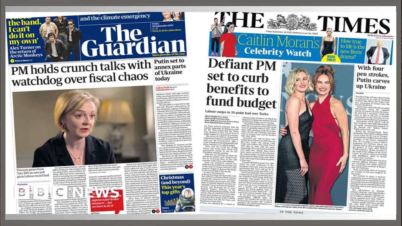
Choosing the right typeface for your newspaper title is crucial to creating a professional, eye-catching look. Legible typefaces like Times New Roman and Arial are excellent choices for newspaper headlines because of their simplicity and readability.
However, if you’re looking for something that stands out more, consider Wilson Wells, a black font perfect for newspaper titles, T-shirts, posters, and more. Another popular option is the Resgak Serif Font Family, which provides contemporary serif newspaper fonts for branding and advertisements.
- First and foremost, it’s important to choose the right font for the job. There are many variations of newspaper title fonts, each with a unique style and personality.
- When selecting a font, consider the tone and message of your design, as well as the overall aesthetic you’re trying to achieve.
- Once you’ve selected your font, be mindful of how you use it.
- Newspaper title fonts are typically bold and attention-grabbing, so use them sparingly to avoid overwhelming your audience.
- Additionally, pair your font with complementary typography and design elements to create a cohesive and visually appealing design.
Winchester is another blackletter font with stylistic alternates and ligatures, perfect for customized newspaper titles. When choosing a font, it’s important to ensure it has OpenType features and multi-language support for flexibility in design. By choosing the right font, you can create a unique and professional look for your newspaper title to draw readers in.
Conclusion
A newspaper title font is essential for communicating your brand identity and message. It creates the first impression and sets the tone for your content. Therefore, choosing the right font that aligns with your brand and conveys the intended message is crucial. With these six tips and popular newspaper title fonts, you can craft a unique and recognizable font that resonates with your audience.
However, it is equally important to understand the pros and cons of different font types to ensure your newspaper title font’s best readability and legibility. We have discussed some of the different font types and their uses. By understanding how fonts work, you can choose the perfect font for your needs and create a website or blog that is both stylish and effective.
Frequently Asked Questions
What Are Some Key Considerations When Selecting A Font For A Newspaper Title?
When selecting a font for a newspaper title, it is important to consider professionalism and the information hierarchy. Typography can set newspapers apart from competitors and draw readers in. Calligraphic fonts, like blackletter with or without serifs, are typically suitable for newspaper titles. Redig can be an eye-catching and memorable font for headlines, body copy, and newspaper design.
How Does Font Size Impact The Readability And Impact Of A Newspaper Title?
The choice of font size can significantly impact the readability and impact of a newspaper title. The right font can establish hierarchy and reflect professionalism. Times New Roman and Arial are recommended for skimming headlines in electronic newspapers.
Choosing the right font is crucial for improving typography and readability. Arial is considered easier to read than Times New Roman readers. Factors such as luminance contrast, color combinations, and search time also impact font legibility in brand icons.
How Can The Right Font Choice Enhance The Overall Design Of A Newspaper?
Choosing the right font can greatly impact the overall design of a newspaper. Fonts can evoke emotion and create a hierarchy of information that guides readers through the content. Different font styles like Times New Roman and Arial can affect legibility and reader preference.
Typography is key to setting a newspaper apart and attracting readers. Bold sans serif and vintage scripts are recognizable and versatile newspaper fonts. However, the wrong font choice can break the design of a newspaper.
What Makes A Font Appropriate For A Newspaper Title?
An appropriate font for a newspaper title is typically calligraphic, with or without serifs. It should be easy to read without causing eye strain. One font specifically created for newspaper titles and logos is Telegraph, available in three weights with custom ligatures and support for 17 languages.
Other fonts suitable for newspaper titles include Winchester, a blackletter font with stylistic alternates and ligatures, which can be customized to create unique branding.
Are There Any Font Trends I Should Know When Choosing A Newspaper Title Font?
Several font trends must be considered when choosing a font for newspaper titles. Bold and nostalgic fonts like Camera Obscura are great options for headlines and magazine covers. Bold sans-serif and vintage scripts are versatile and catchy. Nineties Headliner can be a good option for logos and primary header text, while classic and elegant fonts like Newsworthy offer more artistic freedom.

David Egee, the visionary Founder of FontSaga, is renowned for his font expertise and mentorship in online communities. With over 12 years of formal font review experience and study of 400+ fonts, David blends reviews with educational content and scripting skills. Armed with a Bachelor’s Degree in Graphic Design and a Master’s in Typography and Type Design from California State University, David’s journey from freelance lettering artist to font Specialist and then the FontSaga’s inception reflects his commitment to typography excellence.
In the context of font reviews, David specializes in creative typography for logo design and lettering. He aims to provide a diverse range of content and resources to cater to a broad audience. His passion for typography shines through in every aspect of FontSaga, inspiring creativity and fostering a deeper appreciation for the art of lettering and calligraphy.
