Anime has become a global phenomenon, captivating audiences with its unique storytelling and animation style. With its rise in popularity, it is no surprise that people have become more discerning about the quality of anime subtitles.
When creating subtitles and titles, choosing the right font can make a big difference in how effectively they convey information. The main difference between fonts for subtitles and titles is their size and readability. Subtitles need to be smaller and more legible so that viewers can easily read them while watching the action on screen.
Here, we will explore the world of Anime Subtitles fonts, providing insights into the best options. We will delve into the history of anime subtitles, explore the different types of fonts available, and offer tips on choosing a suitable font for different anime genres. We will explore guidelines for anime subtitles.
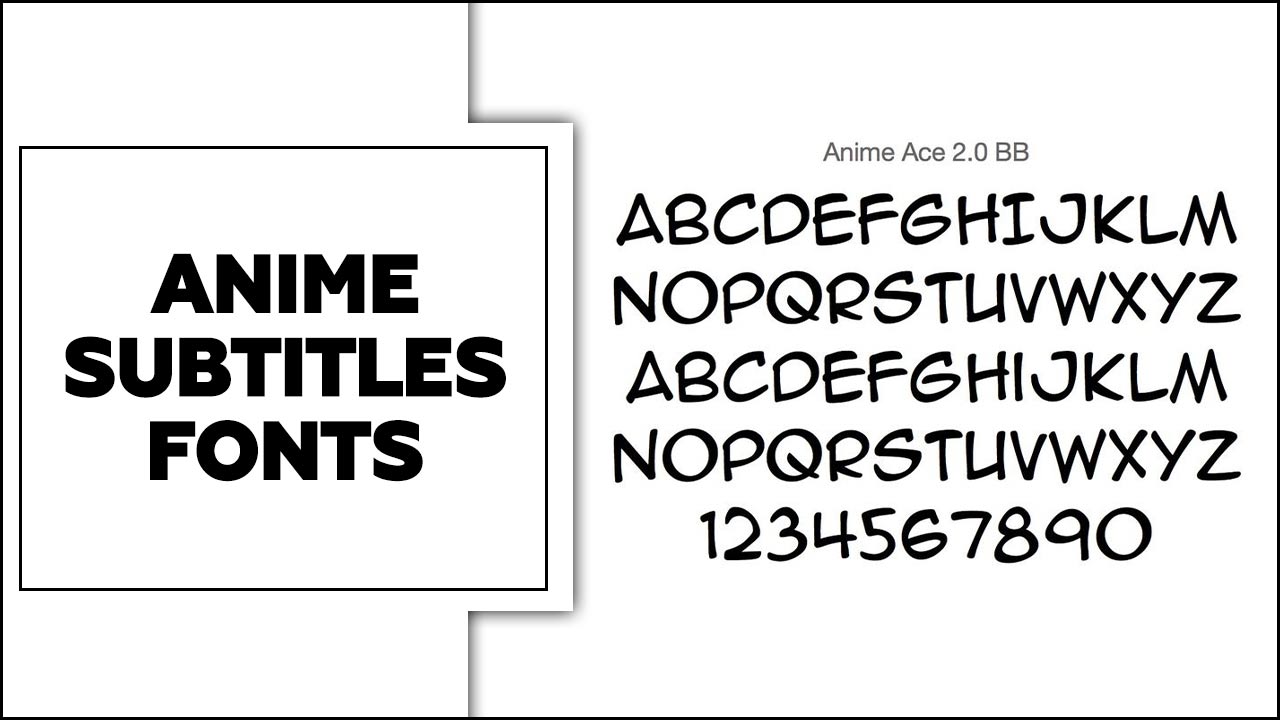
What Font Is Used In Anime Subtitles?
Regarding anime subtitles, the most commonly used font is Arial. This font is widely handy because of its clean and easy-to-read design, which makes it ideal for displaying subtitles on screen. Arial’s simplicity allows viewers to quickly and easily understand the dialogue without being distracted by overly decorative or complex fonts.
Additionally, Arial is a versatile font that can be adjusted in size and weight to accommodate different screen sizes and resolutions. Arial is the go-to choice for anime subtitles due to its readability and practicality.
List Of Anime Subtitles Fonts

Regarding anime subtitles, the font used can play a big role in enhancing the viewing experience. Several fonts are commonly handy for anime subtitles, each with a unique style and characteristics.
Fonts play a significant role in enhancing the viewing experience, as they contribute to the overall aesthetic and readability of the subtitles. First and foremost, it is important to choose a font that is clear and legible. This ensures that viewers can easily read the subtitles without any difficulty. Some popular Anime Subtitles fonts include;
1.Garamond
Garamond is a popular choice of subtitle font. Known for its elegance and readability, Garamond can enhance the viewing experience by providing clear and aesthetically pleasing subtitles. Its classic and timeless straightforward design adds a touch of sophistication to the overall presentation of the anime. Whether you are a fan or a creator, using Garamond for anime subtitles can help create a visually appealing and immersive experience for viewers.
- Typeface: Serif
- Features: Old-Style Figures, Elegant And Graceful Curves, High Contrast Between Thick And Thin Strokes
- Colour: Dark, Rich, And Intense
- Size: Legible At Small Sizes
- Design Elements: Narrow And Vertical Sturdy Serifs, Slightly Sloped Crossbars, Diagonal Stress On The Letterforms
2.Times New Roman

Regarding anime subtitle fonts, one popular option is Times New Roman. This classic font is widely recognized and easy to read, making it suitable for displaying subtitles in anime.
Times New Roman has a clean and professional look, which can enhance the overall viewing experience for fans. Its versatility allows it to work well with different anime genres, from action-packed series to heartfelt dramas.
- Typeface: Serif
- Features: Classic, Elegant, Traditional
- Color: Black (Default)
- Size: Available In Various Sizes
- Design Elements: Serifs, Moderate Stroke Contrast, Vertical Stress
3.Antique Olive & Open Sans
Two popular fonts that are commonly handy for anime subtitles are Antique Olive and Open Sans. Antique Olive is a classic, elegant font known for its readability and timeless appeal.
It adds a touch of sophistication to the subtitles and enhances the overall aesthetic of the anime. On the other hand, Open Sans is a modern, clean font that is widely handy for its simplicity and versatility.
It offers excellent legibility on screens of all sizes and is particularly well-suited for digital platforms. Ultimately, the choice between these two fonts will depend on the specific style and tone of the anime, as well as personal preference.
- Typeface: Sans-Serif
- Features: Wide Letter Spacing, Tall X-Height, Geometric Shapes
- Color: Black Or Dark Grey
- Size: Versatile, Suitable For Both Display And Body Text
- Design Elements: Rounded Corners, Minimalistic Design
4.Papyrus Open Sans
Papyrus is a unique and stylized font that can give subtitles a more artistic and whimsical feel. On the other hand, Open Sans is a clean and modern font that offers excellent readability, making it a popular choice for subtitles that need to be easily legible. Ultimately, the choice between these fonts will depend on the tone and style of the anime, as well as personal preference.
- Typeface: Sans-serif
- Features: Clean and modern look, easily readable on screens and in print
- Color: Comes in various weights and styles, ranging from light to bold, giving you the flexibility to match your design needs
- Size: Legible in small and large sizes
- Design Elements: Rounded edges, open letterforms, and a balanced x-height give it a friendly and approachable feel.
5.Lucida Grande Font

One popular option for anime subtitle fonts is the Lucida Grande font. This font is famous for its clean and easy-to-read style, making it a favorite among anime fans. The Lucida Grande font has a modern and sleek look that complements the visuals of the anime series.
It provides clear and legible subtitles that enhance the viewing experience for viewers. The Lucida Grande font ensures you won’t miss a single word.
- Typeface: Sans-Serif
- Features: Clear, Easy To Read, Modern
- Colour: Black Or Dark Grey
- Size: Available In Various Sizes
- Design Elements: Rounded Edges, Even Spacing Between Letters
6.Verdana

Verdana is popular for anime subtitle fonts due to its readability and versatility. This sans-serif font is famous for its clean and modern appearance, making it easy for viewers to read the subtitles without distractions.
Verdana’s wide letter spacing and generous x-height also contribute to its legibility, especially when the subtitles are displayed on smaller screens or in fast-paced scenes.
- Typeface: Sans-serif
- Features: Geometric, uniform width, large x-height, clear and legible at small sizes
- Color: Black
- Size: Available in various sizes, suitable for both print and digital media
- Design Elements: Rounded edges, consistent stroke width, modern and simple design
7.Helvetica Neue
Regarding anime subtitles, one popular font choice is Helvetica Neue. This font is popular for its clean and modern appearance, making it easy to read on screen. Its simple and elegant design also blends well with different anime styles and genres.
Helvetica Neue is a versatile font that can be handy for both English and Japanese subtitles, making it a preferred choice for many anime fans and subtitlers. Whether you’re watching a thrilling action series or a heartwarming romance, the Helvetica Neue font can enhance your viewing experience.
- Typeface: Sans-serif
- Features: Clean, modern, and versatile
- Color: Black or white, but it can be handy in a variety of colors
- Size: Can be handy in various sizes without losing its legibility
- Design Elements: Even spacing between letters and uniform stroke width
8.Futura
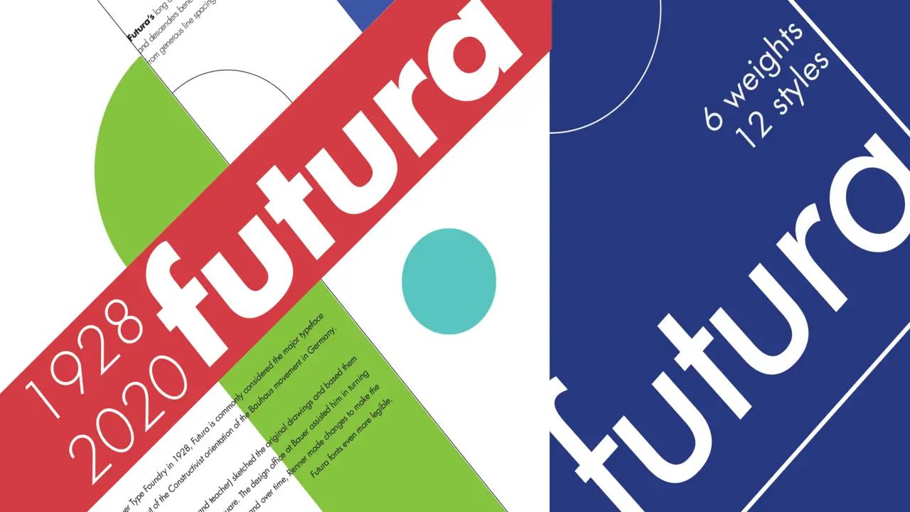
Futura is a popular choice for anime subtitles fonts. Known for its clean and modern look, Futura provides excellent readability on screen. Its geometric shapes and balanced proportions make it easy to read even at smaller sizes. Additionally, Futura’s versatility allows it to be handy for various genres of anime, from action-packed series to heartfelt dramas.
- Typeface: Geometric sans-serif
- Features: Clean, modern, and minimalistic design with straight lines and simple shapes
- Color: Available in different weights and styles, including regular, bold, Helvetica Medium italic, and condensed
- Size: Suitable for both headlines and body text, with a range of sizes to choose from
- Design Elements: Distinctive characters, such as the circular “O” and the triangular “A”
9.Arial
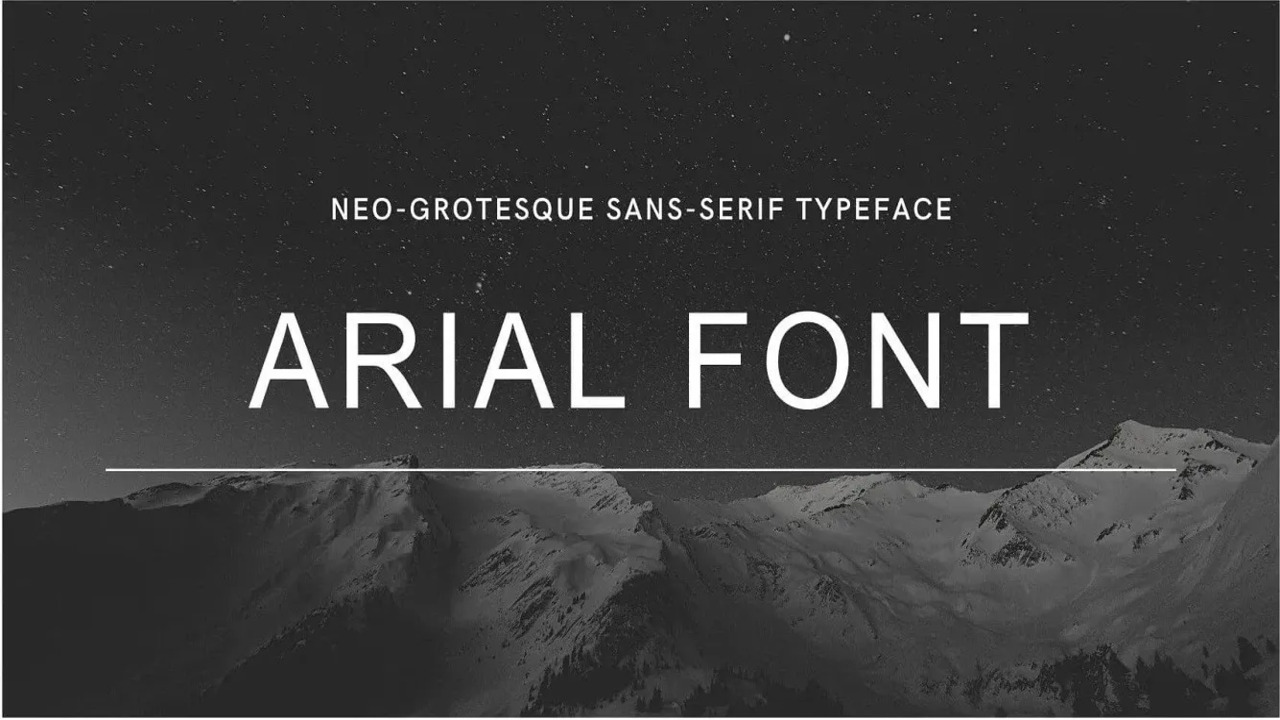
Arial is popular for anime subtitle fonts due to its readability and simplicity. With its clean lines and easy-to-read characters, Arial ensures that viewers can easily follow along with the dialogue while watching their favourite anime.
This choice of subtitle font is especially well-suited for fast-paced action scenes or dialogue-heavy moments, as it allows for a quick reading experience without sacrificing legibility.
- Typeface: Sans-serif
- Features: Clean and modern design, easy to read, widely used
- Color: Can be handy in any Background color, but typically black or dark grey
- Size: Available in a range of sizes, from small to large
- Design Elements: Simple, uniform letter shapes with no serifs or decorative elements
Which Apps Are Best For Adding Captions To Videos?
Several apps are highly recommended for adding captions to videos. One popular option for video projects is “Kapwing,” which offers a user-friendly interface and allows you to add and customize subtitles in various fonts easily.
Another great choice is “Adobe Premiere Pro,” a professional video editing software that provides advanced captioning features and extensive font options. If you prefer a mobile app, “InShot” and “VLLO” are excellent choices that offer a range of font styles and easy-to-use captioning tools.
Conclusion
Choosing the right for your anime subtitles font<span style=”font-size: inherit;”> can greatly enhance your viewing experience. With so many options, deciding which is best for you can be overwhelming.
Fonts play an important role in conveying the tone and feel of a piece of content. Choosing the right font for your subtitles can improve readability and make it easier for viewers to follow along with what is happening onscreen. Different fonts can also set a particular mood or atmosphere you want to achieve while watching your favourite show.
Be sure to test different fonts until you find the one that works best for your project. And don’t forget to use style sheet attributes like color, weight, line height, etc., to customize how they look on screen.
Frequently Asked Questions
What Font Do Anime Subtitles Use?
Anime subtitles typically use a variety of fonts, but some popular choices include Arial, Helvetica, and Verdana. These fonts are commonly used due to their readability and versatility across different devices and screen sizes.
What Is The Best Anime Font?
There is no definitive “best” anime font, as preferences for fonts can vary greatly among individuals. However, some popular choices for anime fonts include ones that resemble Japanese calligraphy or have a playful, bold, and energetic style.
How Are Subtitles Made In Anime?
Subtitles in anime are typically created by professional translators who watch the anime and transcribe the dialogue in the original language. They then translate the dialogue into the desired language and time the subtitles to match the audio.
What Type Of Font Is Comic Sans MS?
Comic Sans MS is a casual, informal font that resembles handwriting and is often used for light-hearted or playful purposes.
What Is The Most Popular Anime Subtitle Font?
The most popular anime subtitle font is usually considered to be “Arial” due to its clean and easy-to-read design. Arial is widely used in various media formats, including anime, as it provides clarity and legibility.

David Egee, the visionary Founder of FontSaga, is renowned for his font expertise and mentorship in online communities. With over 12 years of formal font review experience and study of 400+ fonts, David blends reviews with educational content and scripting skills. Armed with a Bachelor’s Degree in Graphic Design and a Master’s in Typography and Type Design from California State University, David’s journey from freelance lettering artist to font Specialist and then the FontSaga’s inception reflects his commitment to typography excellence.
In the context of font reviews, David specializes in creative typography for logo design and lettering. He aims to provide a diverse range of content and resources to cater to a broad audience. His passion for typography shines through in every aspect of FontSaga, inspiring creativity and fostering a deeper appreciation for the art of lettering and calligraphy.

This is a great guide! I’m always looking for new subtitle fonts to use and this is a great resource.