The right font size can make all the difference in how your content is perceived. It can enhance the readability of your text, ensure that it’s accessible to everyone and help you communicate your message effectively.
A font size chart can be an essential tool in helping you choose the perfect font size for your project. We will cover everything you need to know about font size charts.
From what they are, how to use them, and why they are important to tips on selecting the right font size for desktops and increasing or decreasing the font size. We will also discuss different fonts in different sizes and offer some do’s and don’ts for choosing the right font size. By the end of this post, you’ll better understand how to select the perfect font size for your project.
What Is A Font Size Chart?
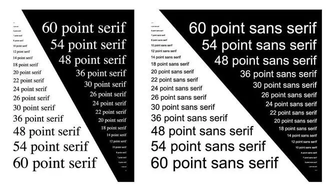
A font size chart is a helpful tool that displays the various sizes of fonts in relation to each other. You can use it to determine the font size for a particular document, such as a resume or marketing material.
The chart typically includes different font sizes and styles, such as bold or italicized text, and may also include examples of how the text will look at each size. Using a font size chart, you can ensure that your text is legible and easy to read while maintaining a consistent style throughout your document.
Types Of Font Size Charts
There are several different types to choose from when it comes to font size charts. One popular type is a basic font size chart that displays the different sizes of a single font. Another option is a comparison chart that shows how different fonts and sizes compare to one another.
There are also accessibility-focused charts that display font sizes in relation to readability for individuals with visual impairments. Additionally, some charts may display recommended font sizes for specific mediums, such as print or digital screens. Ultimately, you will choose the type of font size chart based on your specific needs and the purpose for which you will use the chart.
How To Use A Font Size Chart
A font size chart can help ensure that text is legible and visually appealing. When selecting the right font size from the chart, consider the medium it will display. For instance, for printing purposes, use default font sizes between 10-12 pt, while for desktop browsers or email clients, use pixels (px), rems or ems instead of points (pt) to specify the size of fonts. Always experiment with different fonts, typefaces and styles to find what works best for your specific project or audience’s preferences.
What Is The Importance Of Font Size?
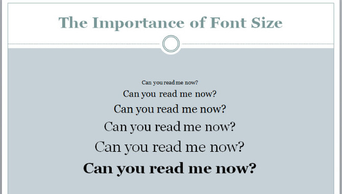
Font size may seem like a small detail, but it can greatly impact your written communication’s readability and overall effectiveness. Choosing the right font size is essential to ensure your message is clear and easy to read. If your font size is too small, readers may strain their eyes or lose interest in your content.
On the other hand, if your font size is too large, it can be distracting and make your content appear unprofessional. Finding the perfect balance between legibility and aesthetics is key when choosing a font size for any written communication, whether a presentation, website copy or marketing materials.
Font Size Chart Choosing The Right Size
Choosing the appropriate font size is crucial for enhancing readability and user experience. It is essential to consider your target audience’s preferences when selecting a suitable font style and size. We recommend using a default font size of at least 12 points for print materials.
Adjust your font size on websites or digital platforms for better visibility on different screen sizes, such as desktops or mobile phones. Additionally, it is advisable to use larger fonts for headings and other important information to make them stand out.
The Do’s And Don’ts Of Choosing Font Sizes For Desktop
Choosing the appropriate font size for a desktop can be tricky, but following some simple guidelines can help you choose wisely. Opt for a legible font that doesn’t negatively impact readability. Ensure that your font size strikes an ideal balance between being neither too small nor too large. Also, pay heed to line spacing and contrast between text and background for optimal readability. Finally, test different font styles and sizes to find the perfect match.
Improving Readability With Proper Font Size Selection
Improving your content’s readability should be a priority for making your content engaging for readers. Properly selecting a suitable font size is key in this aspect. You must ensure that the text size suits the medium or screen where it will be displayed and adequately emphasizes essential information using hierarchy in font sizes. Don’t forget that users prefer legible fonts that don’t strain their eyes. So avoid settling for either too small or too large fonts to keep readers engaged with your content.
How To Increase Or Decrease Font Size?

Changing the font size can be a quick and easy way to make the text more readable or to emphasize certain words or phrases. To increase the font size, highlight the text you want to change and use the keyboard shortcut “Ctrl + Shift + >” (for Windows) or “Command + Shift + >” (for Mac).
To decrease the font size, use the keyboard shortcut “Ctrl + Shift + < “(for Windows) or “Command + Shift + < “(for Mac). You can also access the font size options through the formatting toolbar in most word-processing programs. Remember that increasing the font size too much may make your document appear unprofessional, so use it sparingly and with intention.
Different Fonts Available In Different Sizes
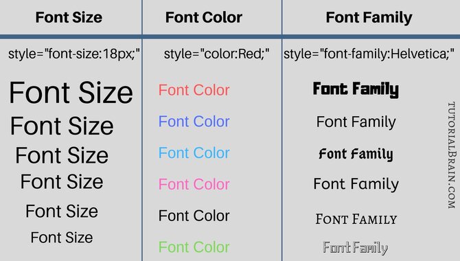
Selecting an appropriate font size is critical for enhancing readability and user experience. When choosing a font size, consider the medium to display the text. Remember that different fonts come in different sizes, and every typeface impacts font size.
To choose an appropriate font size, assess the purpose of the text and target audience. Test and adjust your font sizes to ensure optimal readability across multiple devices on digital platforms like Twitter or Facebook.
Tips For Selecting The Right Font Size
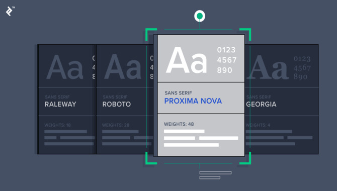
When selecting the right font size for your document or design, there are a few tips to keep in mind. First and foremost, consider the purpose of your text. A larger font size will be necessary if it is meant to be read from a distance, such as on a billboard or sign. A smaller font size can be used if the text is meant to be read up close, such as in a book or on a website.
Additionally, consider the audience for your text. Larger font size may be necessary for readability if you are designing for older individuals or those with visual impairments. Finally, don’t forget to test your font size on different devices and screens to ensure it is readable in all contexts. By keeping these tips in mind, you can select the right font size for your specific needs and ensure that your text is effective and accessible.
Conclusion
Choosing the right font size is important to creating visually appealing and readable content. A font size chart can be a helpful tool in determining the best size for your specific project. When choosing a font size, consider the medium in which it will be displayed, such as print or digital, and the intended audience.
If you are designing a poster to be displayed from a distance, you may want to choose a larger font size to ensure it is easily legible. On the other hand, if you are creating content for an older audience with visual impairments, a larger font size may also be necessary. Ultimately, finding the right font size requires balancing legibility with aesthetic appeal.
Frequently Asked Questions
What Are Examples Of Font Sizes?
Font sizes range from 8pt to 16pt, with headings using larger sizes like 18pt or 20pt. Font size can also be measured in pixels, ranging from 10px to 24px. Body text usually falls between 10pt and 14pt but can vary depending on design and readability.
What Are Standard Font Sizes?
The typical font sizes for body text range from 10-12 pt. Headings and subheadings may vary from 14-24 pt depending on the design and hierarchy. Larger fonts can be used for emphasis or display purposes, but legibility and readability should always be considered when choosing a font size.
What Font Size Is Most Commonly Used?
The standard font size is 12 points, but the ideal size depends on the medium and purpose. Print materials may require a larger font for readability, while digital platforms should use responsive design to ensure legibility across devices.
What Should My Font Size Be?
Choosing the right font size depends on the document’s design and content. For body text, 10-12 points are typical, while headings can be bigger (14-24 points). Keep in mind readability and legibility when selecting font size.
What Are The Standard Font Sizes For Different Types Of Content?
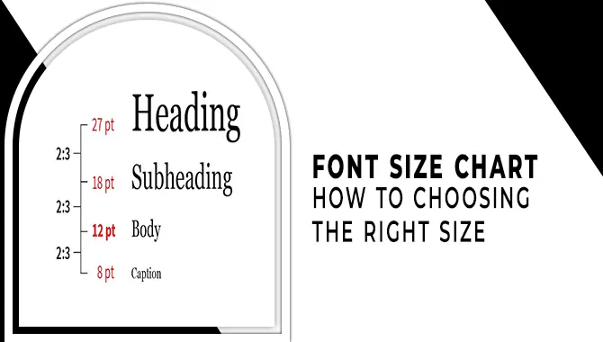
Regarding font sizes, body text should typically be between 10-12pt. Headings and subheadings can vary from 14-48pt based on their significance. Captions and footnotes are usually smaller at around 8pt. However, font size can differ depending on the content’s goal and medium.

David Egee, the visionary Founder of FontSaga, is renowned for his font expertise and mentorship in online communities. With over 12 years of formal font review experience and study of 400+ fonts, David blends reviews with educational content and scripting skills. Armed with a Bachelor’s Degree in Graphic Design and a Master’s in Typography and Type Design from California State University, David’s journey from freelance lettering artist to font Specialist and then the FontSaga’s inception reflects his commitment to typography excellence.
In the context of font reviews, David specializes in creative typography for logo design and lettering. He aims to provide a diverse range of content and resources to cater to a broad audience. His passion for typography shines through in every aspect of FontSaga, inspiring creativity and fostering a deeper appreciation for the art of lettering and calligraphy.

