Regarding typography, font size is crucial in determining text’s legibility and overall appearance. 12-point font refers to the size of a particular typeface, where each character occupies approximately 1/6th of an inch in height.
People commonly use this font size in various documents, such as academic papers, business reports, and professional correspondence. It balances readability and space efficiency, making it a popular choice for many written materials. However, We will explain what it is, how it relates to other font sizes, and why it plays a crucial role in formatting.
Additionally, we’ll explore different standards for what is 12 point font. And provide tips on choosing the right font size for your content. Finally, we’ll discuss the impact of the 12-point font on readability and accessibility.

What Is 12 Point Font? Answers
Do you know What is 12 point font? 12-point font refers to the size of a specific typeface, measured in points. In typography, a point is equal to 1/72 of an inch. Therefore, 12-point font means that each character or letter within the font is approximately 1/6 of an inch in height.
People commonly use this font size for body text in documents because it balances readability and space efficiency. It is important to note that different fonts may appear slightly different in size, even if set to 12 points, as the font’s design can affect how it looks on the page.
Understanding Font Sizes
Font size plays a crucial role in typography, influencing the legibility and aesthetic appeal of written content. Understanding font sizes is vital for creating visually appealing and accessible materials. Among various font sizes, one commonly used is a 12-point font, approximately 4.23 millimeters or 1/6th of an inch in height.
People frequently employ this site for body text in printed materials like books and documents because it offers a standard and easily readable format for readers. It balances legibility and space utilization, ensuring an optimal reading experience.
When using 12-point font, it’s essential to consider that variations may exist due to the font’s specific typeface and design characteristics. By selecting the right font size, you can enhance your content’s readability and overall impact.
The Importance Of 12-Point Font In Formatting

People commonly use 12-point font in formatting documents, and they should not underestimate its importance. The standard for readability widely accepts this font size. And legibility, making it ideal for various written materials such as essays, reports, and presentations. Using 12-point font ensures that your text is easy to read without straining your readers’ eyes.
It strikes a balance between being large enough to be readable and small enough to fit a reasonable amount of text on a page. Additionally, many academic institutions and organizations require documents to format in 12 point font, so using this size can help ensure that your work meets the necessary requirements.
Different Standards For 12-Point Font
Regarding 12-point font, different standards can follow. In the printing industry, 12 point font refers to a specific size of typeface, where each character is approximately 1/6th of an inch tall. This standard is commonly used in books, newspapers, and other printed materials.
However, in the digital realm, the size of a 12 point font can vary depending on the screen resolution and settings. For example, on a computer screen with a high resolution, a 12 point font may appear smaller than on a lower resolution screen. It’s important to remember these variations when working with 12 point font to ensure consistency and readability across different mediums.
How To Choose The Right Font Size For Your Content

Choosing the appropriate font size is crucial when creating content to ensure maximum readability and user satisfaction. When considering font size options, one commonly used choice is 12 point font. This particular font size refers to the height of the characters in a typeface, with each character measuring approximately 1/6th of an inch tall.
Therefore, 12 point font is commonly employed in various documents, including essays, reports, and professional papers, achieving a balance between legibility and efficient use of space. To ensure proper utilization of 12 point font. It’s essential to adhere to specific formatting guidelines, such as maintaining consistent spacing and margins.
Exploring The Impact Of 12 Point Font On Readability And Accessibility
The impact of 12 point font on readability and accessibility in printed materials such as books, newspapers, and magazines is worth exploring. The efficiency of this font size in conveying the intended message depends on several factors.
It is important to remember that readability and accessibility can affect by visual impairments and reading difficulties. Therefore, individuals with such conditions may require larger fonts for optimal readability. Additionally, the choice of font itself can have an impact on accessibility.
It is essential to consider factors like line spacing, letter spacing, and line length, which can influence the legibility of text, regardless of the chosen font size. By carefully considering the target audience. And the intended reading environment, appropriate font sizes can select to enhance the overall readability and accessibility of written content.
Conclusion
12-point font refers to a font size in a document or piece of text. It is a common and widely used font size that balances legibility and readability. Using a 12-point font, each character is approximately 1/6th of an inch tall, making it easy to read on printed materials and digital screens.
This font size is often used for body text in documents such as essays, reports, and articles. However, 12-point font is a widely used and standard font size that ensures readability.
And accessibility in various content formats. Understanding the importance of font sizes and, specifically, the impact of 12-point font on readability is crucial for creating visually appealing and easily comprehended content.
Whether you’re formatting a document, designing a website, or creating marketing materials, choosing the right font size, such as 12-point font, plays a key role in delivering your message effectively. We hope now you understand what is 12 point font
Frequently Asked Questions
1.What Is The Standard Size Of 12 Point Font?
Ans: The standard size of 12 point font is around 1/6th of an inch or 0.17 inches, although it can vary slightly depending on the typeface and style. In digital formats, it is typically equivalent to 16 pixels in height. Due to its readability, 12 point font is commonly used for body text in print materials.
2.How Does Font Size Affect Readability And Legibility?
Ans: Font size plays a crucial role in readability and legibility. Smaller sizes can strain the eyes, especially for those with visual impairments. Larger sizes are generally easier to read, but excessively big fonts can be overwhelming. Striking a balance between font size and legibility is key to ensuring your text is easily readable by your target audience.
3.Are There Any Recommended Fonts To Use With A 12-Point Size?
Ans: When using a 12 point font, popular choices include Times New Roman, Arial, Calibri, and Verdana. These fonts are widely used and easy to read in smaller sizes. It’s crucial to select a legible and context-appropriate font for your document. Feel free to try different fonts until you find the one that suits your needs best.
4.How Can I Change The Font Size To 12 Points In Different Software Applications?
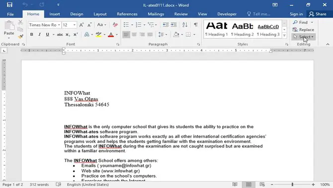
Ans: In Microsoft Word, simply select the text and choose 12 from the font size options. In Google Docs, access the “Format” menu, go to “Paragraph Styles,” select “Normal Text,” and change the font size to 12.
Adobe Photoshop, adjust the font size in the Character panel for the selected text layer. In Microsoft PowerPoint, click the Font Size dropdown menu within the text box and select 12.
5.What Are Some Common Uses For 12 Point Font In Various Industries?
Ans: In various industries, 12 point font finds common use in print publications like books, newspapers, and magazines. It is also widely seen in academic papers, research journals, and advertising materials such as brochures and flyers. And professional documents like business letters and resumes for better readability.

David Egee, the visionary Founder of FontSaga, is renowned for his font expertise and mentorship in online communities. With over 12 years of formal font review experience and study of 400+ fonts, David blends reviews with educational content and scripting skills. Armed with a Bachelor’s Degree in Graphic Design and a Master’s in Typography and Type Design from California State University, David’s journey from freelance lettering artist to font Specialist and then the FontSaga’s inception reflects his commitment to typography excellence.
In the context of font reviews, David specializes in creative typography for logo design and lettering. He aims to provide a diverse range of content and resources to cater to a broad audience. His passion for typography shines through in every aspect of FontSaga, inspiring creativity and fostering a deeper appreciation for the art of lettering and calligraphy.

