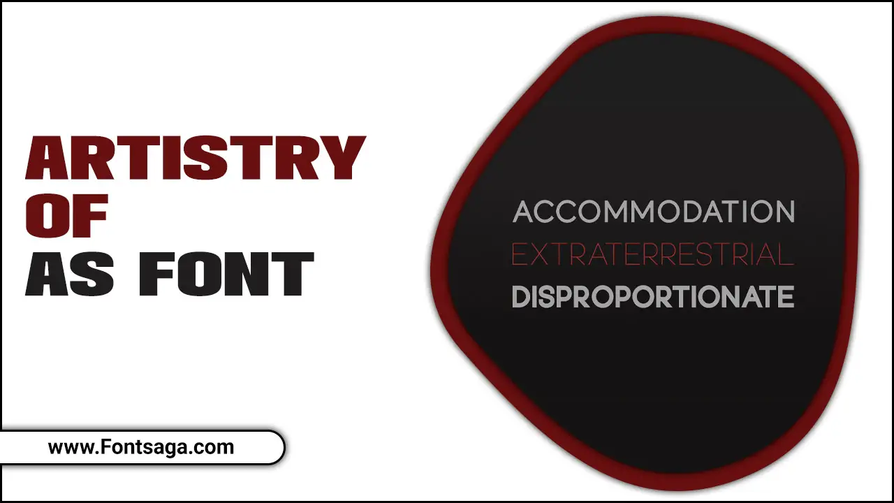
Typography plays a significant role in the design, communicating messages in a way that words alone cannot. And with so many font options available, choosing the right one for your project can be daunting.
Here we will explore the artistry of AS font, diving deep into what Font means and the different types of fonts available. We will discuss tips to remember while selecting the perfect AS Font for your project, including the importance of choosing the correct typeface and considerations for your audience.
Plus, we will explore the creative uses of AS fonts in design and how to save a copy of an AS font file. So, let’s get started and discover the power of typography with AS font.
What Is Font?
Font refers to a specific typeface style used to display text. Typography is arranging a type to make it readable, appealing, and visually engaging. Font weight, on the other hand, is the thickness and weight of glyphs or graphemes. Font weight is important when choosing a font for a specific context, such as when designing a logo or branding materials.
Several font formats are available such as .ttf, .otf, .woff, or .pfb+pfm. When determining matching fonts, wider or narrower values are checked first, depending on the given value of “font-stretch.” In general, bold weights indicate faces with heavier weights, while light weights indicate faces with lighter weights.
It’s important to consider variations in style names across locales when inferring weights. To get the most out of typography, it’s essential to understand these different elements and use them in the right combination for the specific application to create typography that pops up and appeals to your audience.
Types Of Fonts
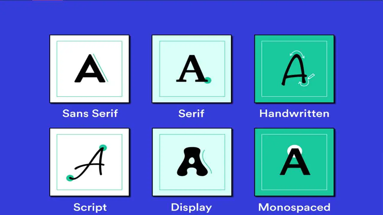
The world of Typography is vast and complex, and the types of fonts available are numerous. Font weight can vary in style names, depending on geography, which must be considered when using them. To conserve page bandwidth, creating composite fonts for different scripts using multiple @font-face rules with different Unicode ranges is possible.
Different languages and cultures have unique typography traditions, making font classification more challenging. The font-synthesis property enables the browser default to synthesize bold or italic faces for fonts with an insufficient variation.
It is also essential to note that fonts are more complex than mere letterforms, as they contain the data required to map characters to them. This functionality permits intricate letter-to-character mappings.
Tips For Selecting The Perfect As Font For Your Project
Selecting the perfect As Font for your project is a task that requires attention to detail. To create a font, use a plugin such as Fontself or Birdfont. These plugins convert your Adobe .ai file into a font format such as TTF or OTF.
Google Page Speed Insights can help identify which fonts should be preloaded to ensure your website loads quickly. Creating a new font style in Microsoft Word is as simple as saving a selection as a new quick style. However, creating a font from an Adobe .ai file can be a complicated and expert task.
The AI file shared might not be in a standard format like TTF or OTF, making it more complex to use as a font. Ultimately, selecting the perfect As Font balances design and functionality.
The Importance Of Choosing The Correct As Typeface For Your Project
Selecting the perfect As Font for your project is important in ensuring your design is visually appealing and effective. It’s important to remember the importance of choosing the correct typeface for your project. While it may seem like a simple decision, selecting the right typeface requires expertise and an understanding of the intricacies of typography.
Using a standard Font format is crucial for a typeface to work properly, and choosing a non-standardized typeface can cause compatibility issues. If choosing a typeface is difficult, typesetting by hand can save time and lead to more tailored results.
It is also important to note that fonts and typefaces are not interchangeable, with the former being a subset of the latter. Considering these factors will set you on the right path toward selecting the perfect As Font for your project.
Choosing AS Typeface That Is Appropriate For Your Audience
When selecting the perfect As Font for your project, it’s important to consider the appropriateness for your audience. Hand-selecting a specific typeface may be necessary in some cases, and the font-style property allows italic and oblique faces to be selected.
It’s important to note that if a weight is specified for which no face exists, a nearby weight will be used, and the font-synthesis property controls if synthetic faces are allowed.
However, care must be taken with variations in style names across different locales. By keeping these tips in mind, you can select an As Font that is visually appealing and appropriate for your specific project and audience. Ultimately, the power of typography lies in how it can convey a message and enhance the overall aesthetic of your work.
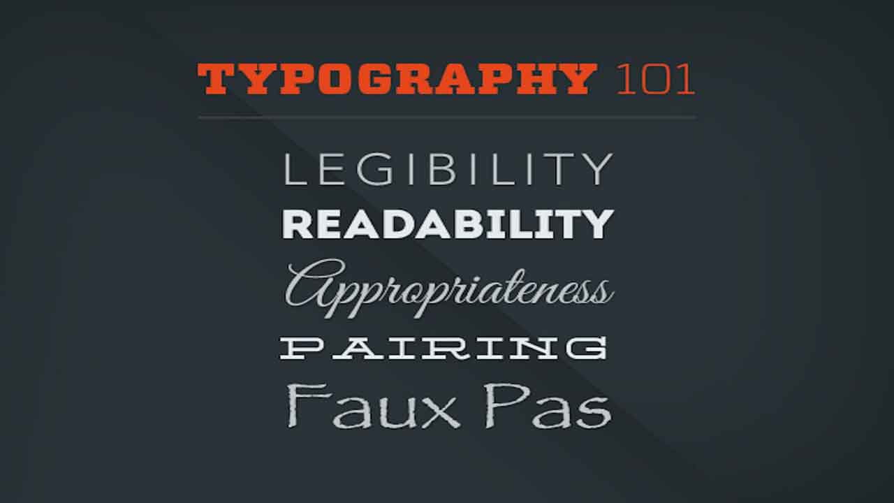
The Importance Of Legibility And Readability
When selecting the perfect As Font for your project, it’s important to consider factors such as font-stretch and font style to ensure the closest matching width and style. Additionally, legibility and readability are crucial elements in font selection.
The recommended legible and widely available fonts for APA Style papers include sans serif and serif fonts. Screen resolutions can typically accommodate either serif or sans serif fonts for online works. But it’s essential to remember the importance of legibility and readability for ease of reading.
The font-synthesis property also plays a role in font selection. Controlling the ability of user agents to synthesize bold or italic font faces. By considering these factors, you can select the perfect As Font for your project to achieve both style and functionality.
The Different Types Of Typefaces And Their Uses
When selecting the perfect As Font for your project, there are a few things to consider. First, it’s important to understand the different types of typefaces and their uses. Fonts can be distinguished by the anatomy of their letterforms, such as serifs. Additionally, Japanese typefaces have their own similar groupings.
It’s also important to keep in mind that fonts contain letterforms and the data needed to map characters to these letterforms. Designers create typefaces with specific uses in mind, such as readability or aesthetic appeal.
When selecting an As Font, consider the overall tone of your project and what typeface might best convey that tone. Experiment with a few different options to see what works best for your specific needs.
Creative Uses Of As Fonts In Design
The use of As Font in design can be both creative and impactful. The typography traditions of different cultures influence the variations in letterforms with the use of diacritic marks to create distinct fonts.
It’s important to understand the difference between typefaces and fonts, as many people tend to use the two terms interchangeably. Fonts are editable text, while typefaces are graphic objects.
OpenType fonts have additional features such as ligatures, swashes, and automatic fractions that add depth and creativity to design. Additionally, font families have variations in thickness, weight, and overall proportions of letterforms, allowing for endless possibilities when it comes to creative design using As Font.
How To Save A Copy Of An As Font File
Font incorporates many OpenType features, such as ligatures and contextual alternates, making it a highly sophisticated typeface. Matching the Postscript or full font name for file saving helps in having a saved copy of the As font file, which is important. When using the As Font, we recommend pre-declaring fonts in the manifest to avoid delays in layout inflation and resource retrieval.
Preloading fonts is another technique that can significantly improve load time and perceived performance. For pre-fetching fonts, use meta-data tags to declare a resource array in the manifest. By following these simple steps, you can leverage the power of the As font for your designs while optimizing your website’s performance.
Conclusion
In conclusion, typography isn’t just about choosing a font, it’s about carefully selecting the right one that will communicate your message effectively to your audience AS fonts have proven to be the most versatile and widely used typography in design due to their uniqueness and elegance.
Whether you are designing for print or the web, selecting the perfect typeface is crucial in achieving a well-crafted design that resonates with your target audience. Remember to focus on legibility, readability, and appropriateness of the AS font for your project. If you want to know more about the power of typography and how to incorporate AS fonts into your design, save a copy of our AS font guide now.
Frequently Asked Questions
What Is As Font?
A font is a set of characters with a consistent design and style. Computers recognize fonts that use a standard Font format, such as TTF, OTF, or WOFF. The font-weight property determines the blackness or stroke thickness of glyphs, which should align with the nine-step CSS scale when inferred from style names.
What Is The Difference Between Truetype And Opentype?
While TrueType and OpenType fonts generally interchange, they handle font matches differently. We test font-stretch and font style in a specific order when checking for matches. In terms of Unicode codepoint values, the range must be between 0 and 10FFFF.
Which One Should I Use, Truetype Or Opentype?
Individuals ultimately choose between TrueType and OpenType font formats based on personal preference since they are considered equivalent. When selecting fonts for APA Style papers, we recommend choosing legible options from both sans serif and serif categories. Fontfabric provides professional fonts for both commercial and personal projects.
How Do I Set Up My Computer To Use It Properly?
To set up your computer for proper use, it’s important to consider font rendering. Not all fonts are created equal, so it’s important to understand font families and other properties. OpenType features can also be specified for optimal typographic rendering.
What Are Some Other Uses For As Font Besides Just Typography?
Besides being used for typography, fonts can also serve other purposes. For example, font variations can include flourishes, serifs, and tapered strokes. OpenType features like ligatures and swashes can be specified to add even more decorative effects.

David Egee, the visionary Founder of FontSaga, is renowned for his font expertise and mentorship in online communities. With over 12 years of formal font review experience and study of 400+ fonts, David blends reviews with educational content and scripting skills. Armed with a Bachelor’s Degree in Graphic Design and a Master’s in Typography and Type Design from California State University, David’s journey from freelance lettering artist to font Specialist and then the FontSaga’s inception reflects his commitment to typography excellence.
In the context of font reviews, David specializes in creative typography for logo design and lettering. He aims to provide a diverse range of content and resources to cater to a broad audience. His passion for typography shines through in every aspect of FontSaga, inspiring creativity and fostering a deeper appreciation for the art of lettering and calligraphy.