Have you ever noticed how some text on a website or document is easier to read than others? That’s because of the font size. The definition of font size refers to measuring the height of the text in a font.
The font size can make a HUGE impact on the readability of your documents, websites, and even presentations. We’ll cover everything you need to know about font size, from the different types of font sizes to units of measurement to use while changing it, how it affects readability, and the tricks to picking the right size for a particular project. We’ll also walk you through how to adjust font size on different devices and operating systems for everything you need to create the perfect text experience.
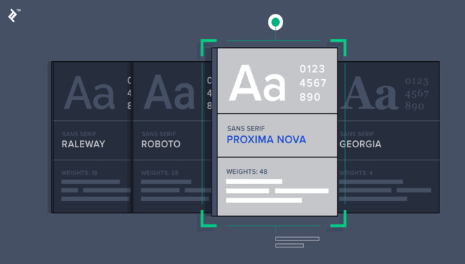
What Is Font Size?
The font size is the size of the text in a document or on a web page. Font size can be controlled in various ways, including the text size setting in your web browser or word processor. The font size can also impact the overall legibility and readability of a given document or website.
Most websites default to a small font size, which can make it more difficult to read for some users. Users can adjust their browser settings or use a magnifier tool to increase the font size for easier reading. Understanding font size is crucial for any designer or content creator looking to make their work more accessible and readable to a wider audience.
Types Of Font Sizes
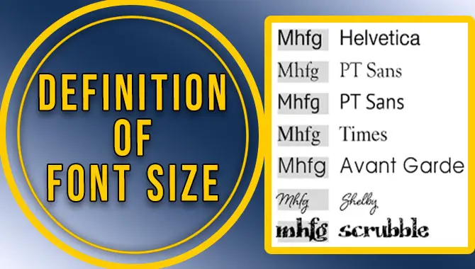
There are several different font sizes, each tailored to a specific need. For example, small text is best used for headings and captions in books and articles, while large text is best for body copy. Medium-sized fonts are good for creating a balance between large and small text. Finally, larger fonts are great for printing on billboards or posters. They can also be used for creating an impactful message or statement.
One of the main considerations when choosing a font size is the readability level required by the audience. You should always choose a readable font size that will not strain your readers’ eyes. Remember that a poorly chosen font size can lead to poor readability, which could be a serious problem if you try reaching a wider audience with your content.
The Definition Of Font Size Refers To The Measurement Of The Height Of Text In A Font
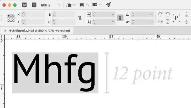
The definition of font size refers to measuring the text height in a font. Depending on the typeface, it is measured in points, pixels, or millimeters. Some typographers use different units for different sizes of text (e.g., 1 point = 72 pixels).
The size of a font significantly impacts its readability, leading to variations in font size among books, newspapers, and magazines. A large font may be more comfortable to read on an old-fashioned typewriter, while a small font may be appropriate for a smartphone screen. The best way to choose the right font size is to consider your target audience and readability level.
For example, if you create an email newsletter for general audiences, choose a readable but still legible font size (usually between 12 and 16 points). On the other hand, if you are creating a book or magazine for a specific target audience with specific needs and reading level expectations, you should consider using larger fonts (usually between 24 and 36 points).
How To Change Font Size?
Changing the font size is essential in formatting any document, and it is easy to do it using different attributes. You can change the font size on a web page by using the “font” attribute. The “content-type” header can adjust the email font size.
Instant messaging supports the “text/html” media type to alter the font size. Regarding a PDF document, the font size is changed using the “application/pdf” media type. You can use the “text/plain” media type in a word document to adjust the font size.
With the knowledge of changing the font size, you can make your documents more readable by adjusting the fonts accordingly. Remember that your font size should complement the design and be legible to your audience.
What Is The Unit Of Measurement For Font Size?
The font size measures the height of characters in a particular font. The unit of measurement for font size is called a “point,” and it’s denoted as pt. In most cases, 1pt equals 1/72 of an inch. The default font size on most browsing tools is 12 points. However, this can be changed.
On most browsers, use the “text size” button or keyboard shortcut to increase or decrease the font size. On Macs, use System Preferences > Accessibility > Text Size to adjust your font size to a more comfortable viewing experience. Understanding the unit of measurement of font size and how it can be adjusted can help you personalize how you read and create content.
How Font Size Affects Readability

The font size plays a crucial role in the readability and accessibility of website content. Smaller font sizes may work better on mobile screens, but they can be too small for computer screens, making it difficult for users to read the content. On the other hand, larger font sizes may be more readable on larger screens, but it can be overwhelming on smaller devices, ultimately making navigation cumbersome.
It is important to adjust font size appropriately for all devices, using the “text size” setting to make the content user-friendly on all devices. Additionally, it is better to use slightly larger font sizes than default settings for enhanced readability. Nowadays, many browsers offer different features to adjust the font size, making customization easier for users.
How To Adjust Font Size On The Computer

Changing the font size on your computer is a simple process. To begin, open the document you wish to modify and click on the “Page Setup” tab. From there, navigate to the “Font” section and select the desired font size from the drop-down menu. Save your changes by clicking on “Apply”.
To apply changes to all documents simultaneously, click “File” and select “Page Setup”. Finally, select “All Documents” under the “Font” section to apply the changes globally. With these steps, changing the font size on your computer becomes effortless.
How To Adjust Font Size On A Smartphone
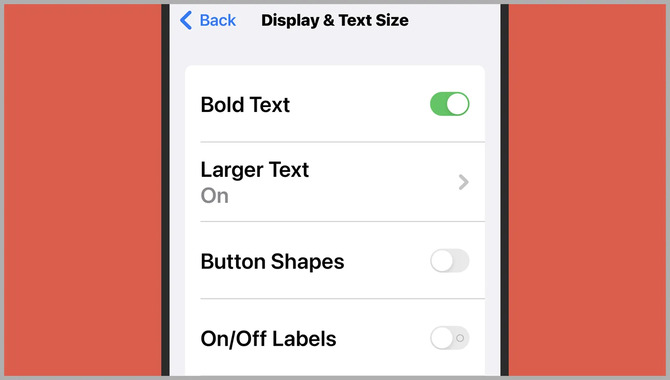
Adjusting font size on a smartphone is easy and can help you read your text more comfortably. Go to your smartphone’s Settings app and tap the Font Size option. You can adjust font size from small to large or vice versa. Adjusting line height, text alignment, and letter spacing can also improve readability.
You can change the font color for a personalized touch by selecting a different color from the palette. If you’d like to revert to the original settings, tap on the Reset button at the bottom of the screen. Now that you know how to adjust font size on your smartphone, you can read comfortably without straining your eyes.
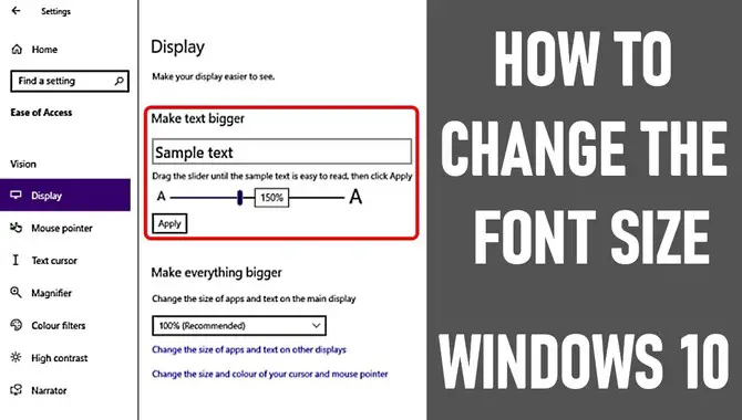
How To Adjust The Font Size In Windows?
Adjusting font size is a fundamental design choice requiring a keen eye to get it right. In Windows, you can quickly adjust the font size by clicking the Font icon in the Control Panel and selecting the “Text Size” tab. Alternatively, you can use the keyboard shortcut Ctrl+F to increase or decrease the font size.
Internet Explorer and Firefox also allow you to adjust the font size in their settings. Changing font size in Google Chrome is easy: Press Ctrl+Shift+Plus (Cmd+Shift+Minus) to increase or decrease the font size. Remember that adjusting the font size is important for improving readability on your computer, websites, or other documents.
How To Adjust The Font Size In Macos?
Have you ever found yourself squinting at your computer screen because the font size is too small? Adjusting the font size on your Mac or Windows computer is an easy solution to this problem. On a Mac, open System Preferences, select the Desktop & Screen Saver icon, and click the Fonts tab.
You can choose the desired font size from the Size drop-down menu for the text or object you want to change. Similarly, on Windows, right-click on any text or object and select “Properties”, and on the “Font” tab, select the “Size” option. You can then choose a new font size from the slider. Adjusting the font size makes reading and working on your computer more comfortable and efficient.
Tips For Choosing The Right Font Size
It’s a common misconception that bigger is always better, but in terms of typography, the right font size is just as important as the right font choice. Small font sizes can make a text difficult to read and vice versa. Here are some tips for choosing the right font size:
- First and foremost, choose a typeface that you like the look of, and that feels comfortable to read. Your choice may depend on your taste or the context in which you plan to use it.
- Next, think about the overall design of your content or website. Will someone display it on a computer screen or a printed document? Will someone view it primarily on a smartphone or a tablet? These factors will affect your choice of typeface.
- Consider its dimensions (known as “kerning” in typography) once you have chosen the typeface. A common rule of thumb is maintaining a ratio between letter height and line spacing of 1:1.4 to 1:1.7 (i.e., one inch equals one-quarter of an inch). This ensures that all letters appear equally large on the page without being too small or too big.
Conclusion
Font size is an essential aspect of typography that directly affects the readability and legibility of text. Proper and consistent font size ensures that readers can comfortably engage with the content without causing any strain on their eyes. There are multiple ways to change font sizes according to different platforms, including computers and smartphones and systems like Windows and macOS.
Remember to choose a font size that complements your content, making it stand out while maintaining readability. We have been discussing the definition of the font size. By doing so, readers can better understand the different types of font sizes and how to choose the right one for their needs.
Frequently Asked Questions
What Is The Difference Between Type Size And Font Size?
The difference between type and font size lies in their definitions. Type size is the physical measurement of a letterform, while font size is a digital setting that determines the text size on the screen or in print. People usually measure type size in points, while they measure font size in pixels, ems, or percentages. The type size of a font can remain the same across multiple font sizes, while the font size changes according to the desired legibility or visual hierarchy.
What Are Some Common Font Sizes That Web Designers Use Today?
Web designers commonly use font sizes ranging from 12px to 18px for body text, while headlines and subheadings may use larger font sizes ranging from 24px to 72px, depending on the design. To ensure legibility and accessibility for all users, font sizes can be adjusted using responsive design techniques for different devices and screen sizes. Choosing a font size that is easy to read and does not strain the eyes is important.
How Do You Choose A Good Font Size For Your Text?
When choosing a font size for your text, consider the purpose and audience of the content. Larger font sizes may be used for headings or important information, while smaller sizes may be used for body text. Testing the readability of different font sizes on various devices is important to ensure legibility.
Ultimately, the font size choice should prioritize ease of reading and understanding for the intended audience. Considering these factors, you can choose a font size that best suits your content and effectively communicates your message.
Are There Any Recommended Font Sizes For Web Design?
The recommended font size for web design is typically between 16px-18px, easily legible on all devices. However, the appropriate size may vary depending on the font style used. Experimenting with different font sizes is important to find your website’s most readable and aesthetically pleasing option. Ultimately, the font size should be easy to read for all users, regardless of screen size or resolution.
How Can I Change The Font Size In Various Programs And Software?
Changing font size varies depending on your program or software. In Microsoft Word and Google Docs, you can select the text and adjust font size using the drop-down menu. Use Ctrl and + or – for web browsers to zoom in or out.
For Adobe Photoshop or Illustrator, select the text and adjust font size using the options in the toolbar. Using these simple steps, you can adjust the font size according to your preference and create more readable documents and designs.

David Egee, the visionary Founder of FontSaga, is renowned for his font expertise and mentorship in online communities. With over 12 years of formal font review experience and study of 400+ fonts, David blends reviews with educational content and scripting skills. Armed with a Bachelor’s Degree in Graphic Design and a Master’s in Typography and Type Design from California State University, David’s journey from freelance lettering artist to font Specialist and then the FontSaga’s inception reflects his commitment to typography excellence.
In the context of font reviews, David specializes in creative typography for logo design and lettering. He aims to provide a diverse range of content and resources to cater to a broad audience. His passion for typography shines through in every aspect of FontSaga, inspiring creativity and fostering a deeper appreciation for the art of lettering and calligraphy.