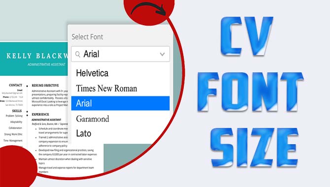
A well-crafted CV can make a significant difference in landing your dream job, and font size is crucial in creating a good impression. The wrong font size can make your CV difficult to read, and too small or too large fonts can put off employers.
When creating your curriculum vitae or CV, every detail counts. Your CV is often your first impression on potential employers, so you want to ensure it’s perfect. One aspect of your CV you may not have thought much about is font size.
The right font size can make your CV look clean and professional, while the wrong one can make it difficult to read and unappealing to potential employers. Here, we’ll explore everything you need about CV font size. By the end of our information, you’ll better understand choosing the right font size for your CV and ensuring it looks professional and visually appealing.
What Is An Appropriate Cv Font Size?
There is no definitive answer to this question, as the appropriate font size for your CV will depend on several factors, including the type of job you are applying for, the industry you are in, and the company you are applying to. However, there are some general guidelines that you can follow to ensure that your CV is easy to read and makes a good impression.
You should aim for a font size between 10 and 12 points. This will ensure that your CV is easily read without being too small or too large. You should also avoid using excessively small or large fonts, which can make your CV look unprofessional.
When choosing a font for your CV, you should also consider the type of job you are applying for. For example, if you are applying for a creative industry job, you may want to use a more creative font. However, if you apply for a job in a more traditional industry, you will want to use a more conservative font.
Finally, you should also consider the company you are applying to. Some companies have specific guidelines for CV font size, so it is always worth checking before you submit your application.
Following these guidelines should help you to choose an appropriate font size for your CV. However, if you are still unsure, it is always best to err on caution and go for a slightly larger font size. After all, it is better to have a CV that is too large than too small.
How Can I Change The Font Size On My CV?
If you want to change the font size on your CV, there are a few different ways to do this.
- Open up your CV in a word processing program like Microsoft Word or Google Docs.
- Click on the Format menu and then select Font.
- You can change the Font’s size, style, and color in the Font dialogue box.
- Once you’ve made your changes, click OK to save them.
Here’s a before and after example of what changing the font size on a CV can look like:
As you can see, increasing the font size can make a big difference in the readability of your CV. If you’re sending your CV out to potential employers, it’s worth taking the time to make sure the font size is legible and easy to scan.
What Is The Best Font Size For A CV?
When it comes to your CV, size does matter. The Font you use can greatly impact how potential employers perceive your CV. So,
The answer may surprise you – no one-size-fits-all answer to this question exists. The best font size for a CV depends on several factors, including the type of job you are applying for, the length of your CV, and the level of experience you have. Here are some general guidelines to help you choose the best font size for your CV:
A smaller, more delicate font may be appropriate if you are applying for a job requiring attention to detail, such as a design or editing position.
A larger, bold Font may be more appropriate if you are applying for a more fast-paced or less formal job, such as a sales or marketing position. If you have a lot of experience and your CV is on the longer side, then a smaller font may be more appropriate so that your CV is not overwhelming to potential employers.
If you are starting in your career and your CV is shorter, then a larger font may be more appropriate so that your CV stands out. Ultimately, the best font size for a CV is the one that makes your CV easy to read and gives it a professional look. If you are unsure which font size to use, try using a size in the middle – not too small or too large.
One last tip: no matter what font size you use on your CV, ensure the Font is easy to read. This means avoiding fancy, decorative fonts that may be difficult to read and stick to simple, clean ones. Now that you know the best font size for a CV, it’s time to start creating your own. Use these tips to create a CV that will make a great impression on potential employers.
How Do I Make My CV Font Size Stand Out?
Making your CV’s font size stand out can be the difference between getting noticed and getting lost in the shuffle. Here are four tips to make your CV font size work for you:
1. Use A Large Font Size For Your Name
Your name is the first thing that will catch a recruiter’s eye, so make sure it’s in a font size that’s easy to read. We recommend using a font size of 16-18 for your name.
2. Use A Smaller Font Size For The Rest Of Your CV

Once you’ve got the recruiter’s attention with your name, it’s time to start selling yourself with the rest of your CV. Use a font size of 10-12 for the body of your CV so that it’s easy to read without being overwhelming.
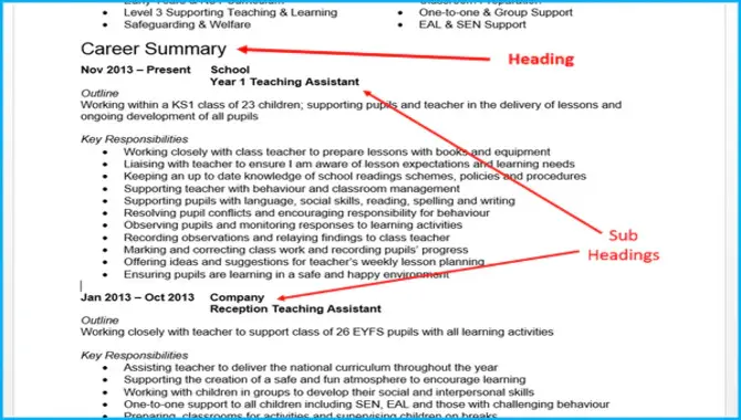
3. Use Bold Or Italics To Highlight Key Information
If you want to ensure that certain information on your CV stands out, use bold or italics to highlight it. For example, you might want to use a bold font for your job titles or for the names of companies you’ve worked for.
4. Use White Space To Your Advantage
Finally, don’t be afraid to use white space on your CV. Leaving some blank space around your text can make it easier to read. Just be sure not to go overboard – you don’t want your CV to look too sparse. Following these tips will help you create a CV that’s both easy to read and visually appealing. And that’s sure to help you get noticed by recruiters.
What Is The Largest Font Size I Can Use On My CV?
When it comes to your CV, bigger is not always better. Using a large font size could hurt your chances of getting an interview. Here’s why:
- It can look unprofessional A CV is a professional document, and as sold use p,rofessioprofessionalnts that are too big or too small look unprofessional, and even chili
- It can be not easy to read If the Font is too large, it can be difficult for the reader to process the page information. On the other hand, if the Font is too small, it can be equally difficult to read.
- It can take up too much space If you use a large font, you risk your CV looking cluttered and overcrowded. This can be a turn-off for busy recruiters scanning through dozens (or even hundreds) of CVs.
- It can make you look desperate Using a large font can make you look desperate for attention. This is the last impression you want to give off! So,
What’s The Largest Font Size You Can Use On Your CV?
As a general rule of thumb, we recommend using a font size that is easy to read and takes up a reasonable amount of space on the page. For most people, this means using a font size between 10 and 12. Of course, there are always exceptions to the rule.
If you have a lot of experience and qualifications, you may need to use a smaller font to fit everything on one page. Similarly, if you have limited work experience, you may need to use a larger font to fill the page. The best font size is the one that strikes the perfect balance between being easy to read and taking up enough space on the page.
Conclusion:
To sum up, selecting the right font size for your CV is an important aspect to consider in creating a professional and well-designed document. While it may seem like a small detail, the font size you choose for your CV can significantly impact how it’s received. It’s important to remember that readability is key, and finding the right balance between CV font size, font type, and layout can make all the difference.
Remember, your CV is often the first impression a potential employer will have of you, so taking the time to ensure that it is polished and easy to read can increase your chances of landing that dream job. We hope following these tips; you’ll be well on your way to creating a standout CV that showcases your qualifications and skills.
FAQs
Why Is Font Size Important When Formatting A Resume?
Font size is important when formatting a resume because it affects the readability and overall appearance of the document. Using a font size that is too small can make the resume difficult to read, while using a font size that is too large can make the document appear unprofessional.
What Font Is Best Used For A Resume?
The best font to use for a resume is one that is professional, easy to read, and widely available on most computers. Examples of such fonts include Times New Roman, Arial, and Calibri.
What Is The “Bodies Corporate” Font?
Bodies Corporate” is not a recognized font name. It is possible that it is a misspelling of “Bodoni Corporate,” which is a modern serif font commonly used in corporate branding and marketing materials.
What Font Is Best To Use On A Resume?
The best font to use on a resume is one that is professional and easy to read. Some examples of good fonts for resumes include Calibri, Arial, Times New Roman, and Garamond.
What Font Is Easiest To Read?
The font that is easiest to read is a font that is clear, legible, and has good spacing between letters and words. Some examples of easy-to-read fonts are Arial, Helvetica, Verdana, and Georgia.

David Egee, the visionary Founder of FontSaga, is renowned for his font expertise and mentorship in online communities. With over 12 years of formal font review experience and study of 400+ fonts, David blends reviews with educational content and scripting skills. Armed with a Bachelor’s Degree in Graphic Design and a Master’s in Typography and Type Design from California State University, David’s journey from freelance lettering artist to font Specialist and then the FontSaga’s inception reflects his commitment to typography excellence.
In the context of font reviews, David specializes in creative typography for logo design and lettering. He aims to provide a diverse range of content and resources to cater to a broad audience. His passion for typography shines through in every aspect of FontSaga, inspiring creativity and fostering a deeper appreciation for the art of lettering and calligraphy.