The font size is usually based on the document’s or website’s purpose. For example, a document intended to be read by a large audience would likely be printed in a larger font than a document meant for a smaller group.
The font size can also be based on the preferences of the person creating the document or website. However, most documents are generally printed in 10 Point Font Size. This size is large enough to be easily readable but not so large that it takes up too much space on the page. A 10-point font is also a good size for website text. It is large enough to be easily readable on a computer screen but not so large that it looks out of place.
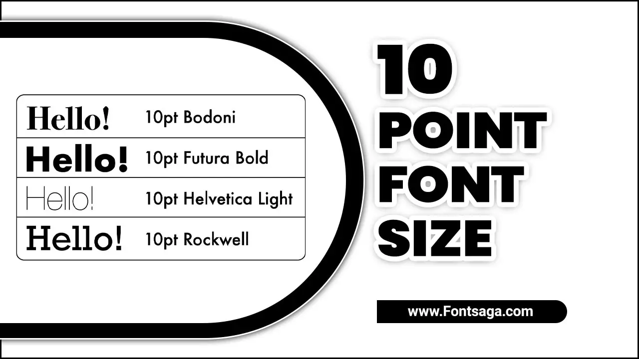
An Overview of 10 Point Font Size
A 10-point font size is a commonly handy font size in various types of documents. It refers to the height of the characters in a font, with 1 point equal to 1/72 inch. While it may seem small, a 10 Point Font Size can be legible with the appropriate typeface and spacing. It is often handy for body text in printed materials such as books, magazines, and newspapers. However, it is important to consider the readability and accessibility of content when using a smaller font size, as it may be more difficult for some individuals to read.
Features Of 10 Point Font Size
A 10-point font size is a popular choice for many printed materials, as it balances readability and space efficiency. Using a 10-point font size can be a practical choice for certain situations. This font size is commonly used in academic papers, legal documents, and other types of formal writing where space may be limited or specific formatting requirements are in place. Here are some key features of using a 10-point font size:
- Readability: While smaller than the standard 12-point font size. A 10-point font is still generally easy for most people with good eyesight. It can be particularly effective in documents with shorter paragraphs or bullet points.
- Space Efficiency: Due to its smaller size, a 10-point font allows more text to fit within a given space. This can be beneficial when condensing information or working with limited page space.
- Professional Appearance: A 10-point font can give a document or design a clean and polished look when used appropriately. It can be especially useful in business settings where concise and professional communication is important.
- Considerations: It’s important to note that not all fonts are created equal, and some may appear larger or smaller at the same point size. Additionally, it’s essential to consider your target audience and their potential visual limitations when choosing a font size.
Standard 10-Point Font Size

Regarding fonts, there is no such thing as a standard size. Fonts come in all sorts of sizes, from tiny to huge. The size of a font is usually measured in points. One point is equal to 1/72 of an inch. So, a 10-point font is 10/72 of an inch tall.
The size of a font is often relative to the size of the paper it will be printed on. For example, a font that is 10 points tall will look much larger on an 8.5×11-inch piece of paper than it would on a business card. This is because there is more space on a larger piece of paper.
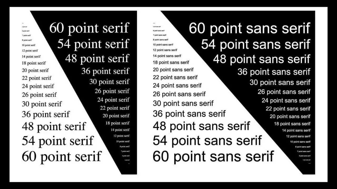
There are two main types of fonts: serif and sans serif. Serif fonts have small lines attached to the ends of the main strokes of the letters. Sans serif fonts do not have these lines.
People print most books in serif fonts because they are easy to read. However, sans-serif fonts are often handy for titles and headings because they are easy to see from a distance. So, there is no such thing. The font size is relative to the size of the paper it will be printed on and the type of Font used.
Largest 10-Point Font Size
Regarding font size, people consider 10 points to be on the smaller side. However, the largest 10-point font size will depend on the specific typeface. Different typefaces have different proportions and spacing, so the size of a 10-point font can vary.
It is always best to test different typefaces and sizes to find the one that offers the best legibility and readability for your needs. Additionally, it’s worth noting that using larger font sizes may impact the overall design and layout of your document or website, so it’s important to consider the aesthetics and the readability when choosing a font size.
Smallest 10-Point Font Size
Those who are new to the world of graphic design and typography often ask this question. The answer may seem simple, but a lot goes into determining the smallest 10-point font size.
First, it is important to understand the difference between points and pixels. Print design typically uses points as a unit of measurement, while digital design uses pixels as a unit of measurement. In general, one point is equal to approximately 1/72 of an inch. Most people generally consider a 10-point font size as the smallest size that is still legible in terms of font size. This is because the average person has a resolution of 20/20 vision, which means they can see letters as small as 10 points.
Why Would I Ever Need A Font That Big?
” Well, there are a few instances where using a font size of 72 points may be necessary. For example, let’s say you’re creating a sign for a store window that needs to be visible from a distance. Or, maybe you’re designing a poster for an event that people will view from across a room. In these cases, using a large font will ensure your text is legible and easy to read.
So, there you have it—the next time you need to use a really big font size, go ahead and size up to 72 points. Don’t go any bigger than that—unless you’re looking to break the world record for the largest banner size font size used in a document.
How Do I Change The 10-Point Font Size In My Word Processor?
To change the 10-point font size in your word processor, follow these steps:
- Open your word processor and open the document or create a new one.
- Select the text to change to a different font size. You can do this by clicking and dragging your cursor over the desired text or using the keyboard arrow keys while holding down the Shift key.
- Once the text is selected, look for the font size option in your word processor’s toolbar or menu bar. It may be labeled as “Font Size” or simply a number followed by “pt” (e.g. “10 pt”).
- Click on the font size option and choose a new size from the drop-down menu or type in a specific size.
- After selecting the new font size, the text will automatically update to reflect the change. You can also adjust the font size using keyboard shortcuts, such as Ctrl + Shift + < for decreasing the font size or Ctrl + Shift + > for increasing the font size.
Is 10 Point Font Size Too Small For A Resume?
Regarding font size on a resume, 10 points might be pushing the limits of legibility. While experts generally recommend sticking to a font size between 10.5 and 12 points, there isn’t a hard and fast rule about what font size to use.
A smaller font size can make your resume difficult to read, especially for those with vision impairments or older hiring managers. Remember, the goal of your resume is to communicate your skills and qualifications effectively, so it’s important to prioritize readability. Consider using a slightly larger font size to ensure your resume is easy to skim and understand.
Conclusion
Choosing the right font size is essential for ensuring your content is legible and easy to read. While there are no hard and fast rules, a 10-point font size can be a good starting point for many types of content. It strikes a balance between being large enough to read comfortably and small enough to fit a decent amount of text on a page.
However, it’s important to remember that readability can vary depending on font style, line spacing, and overall design. So, while 10 Point Font Size may work well in some cases, it’s always worth considering your specific audience and content when making font size decisions.
Frequently Asked Questions
Is 10 Pt Font Readable?
Yes, 10 10-point font is generally readable, but readability can vary depending on the font type and the individual's eyesight. Reading text in a smaller font default size may be more challenging for some people, especially those with visual impairments.
How Tall Is 10 Point Font In Inches?
The height of the 10-point Font is approximately 0.14 inches. Typically, people measure font type size in points, where one point equals 1/72 of an inch. Therefore, a 10-point font would be approximately 10/72 or 0.14 inches tall.
What Is A 12-Point Font Size?
A 12 point font size refers to the height of the characters in a font, with one point being approximately 1/72 of an inch. It is commonly handy for body text in printed documents or computer screens, balancing readability and space efficiency.
Is The 10-Point Font Too Small?
Whether a 10-point font is too small depends on the context and the intended audience. Generally, the 10-point Font can be considered small for printed materials, especially for body text.
What Is 20 Point Font Size?
20-point font size refers to the height of the characters in a text. Typography uses a measurement to determine how large or small the text appears on a page or screen.

David Egee, the visionary Founder of FontSaga, is renowned for his font expertise and mentorship in online communities. With over 12 years of formal font review experience and study of 400+ fonts, David blends reviews with educational content and scripting skills. Armed with a Bachelor’s Degree in Graphic Design and a Master’s in Typography and Type Design from California State University, David’s journey from freelance lettering artist to font Specialist and then the FontSaga’s inception reflects his commitment to typography excellence.
In the context of font reviews, David specializes in creative typography for logo design and lettering. He aims to provide a diverse range of content and resources to cater to a broad audience. His passion for typography shines through in every aspect of FontSaga, inspiring creativity and fostering a deeper appreciation for the art of lettering and calligraphy.